
Evaluation of Visualization Concepts for Explainable Machine
Learning Methods in the Context of Manufacturing
Alexander Gerling
1,2,3
, Christian Seiffer
1
, Holger Ziekow
1
, Ulf Schreier
1
, Andreas Hess
1
and Djaffar Ould Abdeslam
2,3
1
Business Information Systems, Furtwangen University of Applied Science, 78120 Furtwangen, Germany
2
IRIMAS Laboratory, Université de Haute-Alsace, 68100 Mulhouse, France
3
Université de Strasbourg, 67081 Strasbourg, France
{alexander.gerling, djaffar.ould-abdeslam}@uha.fr
Keywords: Machine Learning, Explainable ML, Manufacturing, Domain Expert Interviews.
Abstract: Machine Learning (ML) is increasingly used in the manufacturing domain to identify the root cause of product
errors. A product error can be difficult to identify and most ML models are not easy to understand. Therefore,
we investigated visualization techniques for use in manufacturing. We conducted several interviews with
quality engineers and a group of students to determine the usefulness of 15 different visualizations. These are
mostly state-of-the-art visualizations or adjusted visualizations for our use case. The objective is to prevent
misinterpretations of results and to help making decisions more quickly. The most popular visualizations were
the Surrogate Decision Tree Model and the Scatter Plot because they show simple illustrations that are easy
to understand. We also discuss eight combinations of visualizations to better identify the root cause of an
error.
1 INTRODUCTION
Machine Learning (ML) is increasingly used in
manufacturing to reduce cost (Hirsch et al., 2019; Li
et al., 2019). Along the entire production line, ML is
necessary to monitor the quality of a product.
Additionally, it is used to predict the outcome of
product tests. The objective of a quality engineer and
data scientist is to predict a product error in the
production line as soon as possible. The model behind
these predictions is not easy to understand, especially
for novice users of ML. So-called Explainable ML
strives to bring understandable results to a broader
group of users e.g., the above-mentioned quality
engineers. A quality engineer has in-depth knowledge
of a product, but based on the product data, only
limited ways to understand the reasons behind an
error. A way to identify errors in the production
process is described in previous research (Ziekow et
al., 2019). In our project PREFERML, we predict
production errors with the help of AutoML methods.
Additionally, we use Explainable ML technics to
provide understandable results to our target groups.
In this paper, we investigate model-agnostic and other
visualization methods and evaluate the state-of-the-
art of explainable ML methods for identifying
product errors in production. For evaluation of the
visualizations, we conducted several interviews with
quality engineers and a group of students.
The paper is organized as follows: Section 2
describes our use case in the manufacturing domain.
In section 3 we provide an overview of similar
projects or applications in production. Our
methodology and data set are described in section 4,
followed by a description of the used plots in section
5. The questions and a summary of our interviews are
described in section 6. In section 7 we discuss the
given answers from the previous section. In section 8
we conclude and provide avenues for future research.
2 USE CASE DESCRIPTION
A product often passes multiple tests in the
production process. Every test station must check
defined properties of each product to verify the
quality. In case a product fails a test, it will be
categorized as corrupt. To identify the root cause for
Gerling, A., Seiffer, C., Ziekow, H., Schreier, U., Hess, A. and Abdeslam, D.
Evaluation of Visualization Concepts for Explainable Machine Learning Methods in the Context of Manufacturing.
DOI: 10.5220/0010688900003060
In Proceedings of the 5th International Conference on Computer-Human Interaction Research and Applications (CHIRA 2021), pages 189-201
ISBN: 978-989-758-538-8; ISSN: 2184-3244
Copyright
c
2021 by SCITEPRESS – Science and Technology Publications, Lda. All rights reserved
189

the corruption, a quality engineer must check the data
of the specific product and the product group using
various techniques or software. Identifying an error
can be difficult and time consuming, especially with
a large number of product features. Most solutions are
not adapted to the requirements of a quality engineer
and can provide only basic approaches for a solution
or an explanation. A quality engineer can use ML to
predict errors in the production and to understand the
reason for an error. However, not all ML models
provide a simple “glimpse behind the scenes”. If more
complex models are used to get better predictions, the
explainability of the ML model is negatively affected.
A first approach to solve this would be to use simple
ML models like Decision Trees. Recently developed
explainability techniques for ML promises better
alternatives. Model-agnostic methods to explain the
decision of an ML model are ANCHOR (Ribeiro et
al., 2018), SHAP (Lundberg and Lee, 2017), Partial
Dependencies Plot (PDP) (Zhao and Hastie, 2019),
Accumulated Local Effects (ALE) (Apley and Zhu,
2016) and Permutation Feature Importance (Fisher et
al., 2018). A distinction is made between global and
local explainable methods. A local method such as
ANCHOR would be used to explain selected product
instances or specific product parts. The advantage of
this method is that we get rules for each selected
product instance and that the given results are often
simple to understand. In contrast, a global method
such as ALE explains every selected feature of a
product and visualizes its range based on a chosen
method. With the above-mentioned methods, we
want to provide novice users in the area of ML a
simple and usable solution to understand product
errors.
3 RELATED WORK
In (Elshawi et al., 2019) several model-agnostic
explanations are used for the prediction of developing
hypertension based on cardiorespiratory fitness data.
The background of this work is that medical staff
struggle to understand and trust the given ML results,
because of the lack of intuition and explanation of ML
predictions. For this research, Partial Dependence
Plot, Feature Interaction, Individual Conditional
Expectation, Feature Importance and Global
Surrogate Models were used as global interpretability
techniques. Additionally, Shapley Value and Local
Surrogate Models are used as local interpretability
techniques. As result, global interpretability
techniques, which help to understand general
decisions over the entire population were provided.
Local interpretability techniques have the advantage
of providing explanations for instances, which in this
case are patients. Therefore, the explanations required
depend on the use case. It was concluded that in this
specific use case, the clinical staff will always be
remaining as the last instance to accept or to reject the
given explanation.
In (Roscher et al., 2020) explainable ML was
reviewed with a view towards applications in the
natural sciences. Explainability, interpretability and
transparency were identified as the three core
elements in this area. A survey of scientific works that
uses ML together with domain knowledge was
provided. The possibility of influencing model design
choices and an approach of interpreting ML outputs
by domain knowledge and a posteriori consistency
checks were discussed. Different stages of
explainability were separated with descriptions of
these characteristics. The article provided a literature
review of Explainable ML.
In (Bhatt et al., 2020) it was investigated how
organizations use Explainable ML. Around twenty
data scientists and thirty other individuals were
interviewed. It was discovered that most of the
Explainable ML methods are used for debugging.
Other findings were that feature importance was the
explainability technique used most and that Shapley
values were the type of feature importance
explanation for data features most frequently utilized.
The interviewed persons said that sanity checks
during the development process are the main point to
use Explainable ML. A limitation for Explainable ML
is the lack of domain knowledge. Without a deep
understanding of data, a user cannot check the
accuracy of the results
(Arrieta et al., 2020) gives an overview of
literature and contributions in the field of Explainable
Artificial Intelligence (XAI). Previous attempts to
define explainability in the field of Machine Learning
are summarized. A novel definition of explainable
Machine Learning was provided. This definition
covers prior conceptual approaches targeting the
audience for which explainability is pursued. Also, a
series of challenges faced by XAI are mentioned e.g.,
intersections of explainability and data fusion. The
proposed ideas lead to a concept of Responsible
Artificial Intelligence, which represents a
methodology for the large-scale implementation of
AI methods in organizations with model
explainability, accountability, and fairness. The
objective is to inspire future research in this field by
encouraging newcomers, experts and professionals
from different areas to use the benefits of AI in their
CHIRA 2021 - 5th International Conference on Computer-Human Interaction Research and Applications
190

work fields, without prejudice against the lack of
interpretability.
4 METHODOLOGY & USED
DATA
To investigate how we can use efficient explainable
visualizations for the product quality engineer, we
conducted interviews with four quality engineers.
Furthermore, we interviewed a group of students and
some additional test subjects, which were a total of 10
participants. Two participants are currently
employees at a university and are simultaneously
Ph.D.-students in the field of ML. Two participants
recently graduated from university, who had studied
in the field of computer science with a ML
background. The remaining six participants are
university students of business informatics. This
group of participants had no knowledge about
manufacturing quality control, but most of the
subjects had background knowledge of ML.
Therefore, this group can represent the opinion of a
data scientist. For this student group, we explained
the tasks of a quality engineer. The interviews were
carried out in Q1 2021. The interviews had a
predefined procedure in which the participants were
shown the explanations of the visualizations by pre-
recorded videos. The explanation for all participants
and the visualizations shown can be found in chapter
5. The procedure of the interviews was identical and
the order of the pre-recorded videos the same. We
held semi-structured interviews with the participants.
On average, an interview took about one and a half
hours. As an introduction we described the data and
explained the suggested benefit of the visualizations
provided. We evaluated the responses and aggregated
the answers from each individual group. A summary
of all answers will be provided in section 6.
To create the visualizations, we used artificially
generated data, which imitates real-world production
data. Therefore, we knew the ground truth and could
adjust the data to our experimental design. The
features and value ranges of the dataset are:
Feature 1, value range -> 0,1 - 100
Feature 2, value range -> 10 - 74
Feature 3, value range -> 0 - 99
Feature 4, value range -> 30 - 49
Feature 5, value range -> 7 – 19,9
We used five features in the dataset with 1000
instances. 97 out of 1000 instances represent a
corrupted product in the data. Most of the errors occur
when feature 1 is in the value range 90+. Feature 5
also relates to a small number of errors in the value
range 18+. Features 2, 3 and 4 are not responsible for
any errors. For example, feature 1 could represent the
voltage value of an electrical component or the
measured laser power in an optical sensor. This
dataset has three purposes, (a) it should demonstrate
correlations between features or a clear cause for a
corrupt product. (b) it should be usable for experts
and non-domain experts. (c) it should help to
understand the visualizations and their purpose.
5 EXPLANATION OF
VISUALIZATIONS
In this section we describe the chosen visualizations
for our interview. Most of the visualizations are state-
of-the-art visualizations but not evaluated for this
particular use case. Further, we adjusted some
visualizations for our use case. For the sake of
readability, we use a zoom function with a red border
for Figure 8, 9 and 15.
Figure 1: ANCHOR Plot [Prediction for a single instance].
The visualization in Figure 1 is an ANCHOR Plot
(Ribeiro et al., 2018). This plot is created by the ML
model for all correctly predicted product defects. The
top center shows, the class to which this instance is
predicted. Class 1, which is colored orange,
represents a correctly predicted product defect. The
objective is to find out which rules help to predict the
product defect correctly. In the upper right corner of
the visualization is a rule that all elements must match
to correctly predict class 1. Furthermore, it shows the
percentage of how sure the model is to predict this
instance to a certain class if all conditions of the rule
apply. In the lower part, two examples are shown
based on rules when the ML model decides to predict
an instance to class 1 and when it does not.
Evaluation of Visualization Concepts for Explainable Machine Learning Methods in the Context of Manufacturing
191
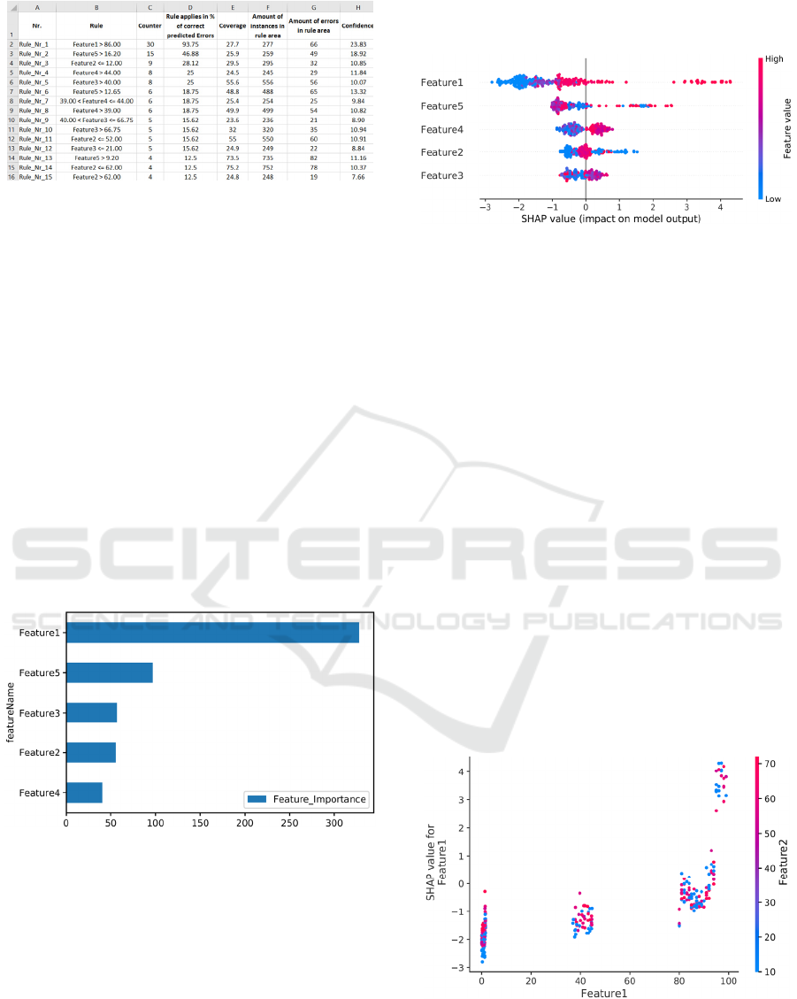
Figure 2: Rule Base [Prediction for all instances].
The rule list shown in Figure 2 is based on the
previous ANCHOR visualizations. Here, all elements
of a rule that were decisive for a correct error
prediction are summarized and listed by means of a
counter. The higher a subrule is in the list, the more
important it could be for error detection. Column B
shows a subrule and column C indicates how often
this subrule was part of a correctly detected product
defect. Column D visualized the percentage of how
often a subrule applied correctly for a detected
product error. Column E shows the percentage of the
total instances affected by this subrule. Column F is
the absolute number of instances which lie within the
applicable range of the rule. In column G the number
of instances from column F are represented which
have a product defect. Column H visualized the
percentage of product defects that are within the
range of values.
Figure 3: Feature Importance Plot [Prediction for all
features].
The importance of each feature is shown in Figure
3, also known as Feature Importance Plot (Abu-
Rmileh, 2019). In this plot we used the total gain
metric as feature importance. The larger the bar for
each feature, the more important that feature is in
predicting a product defect. While the names of the
different features are listed along the y-axis, the x-
axis shows the score of a feature based on a
predetermined metric. The features shown are
ordered in descending order of importance from top
to bottom.
Figure 4: SHAP Summary Plot [Prediction for all
instances].
A SHAP Summary Plot is a summary
visualization (Lundberg and Lee, 2017) and can be
seen in Figure 4. It shows the significance of the
combination of features and the associated feature
effects. SHAP is a method of explaining a prediction
of an individual instance. SHAP explains prediction
by calculating the contribution of each feature to
prediction. The SHAP values show the effect of each
feature on the prediction outcome of an instance. In
the visualization, the y-axis shows the name of the
feature and the x-axis shows the associated SHAP
value. The features are ordered by importance from
top to bottom. Each dot shown on the visualization is
a SHAP value for a feature and an instance. The color
of a dot represents the feature value of the feature
from low to high. High SHAP values have an
influence on the determination of class 1 (FAIL).
Overlapping instances are distributed in the direction
of the y-axis. Hence, the position on the y-axis is
randomly distributed upwards or downwards. This
creates an impression of the distribution of the SHAP
values per feature.
Figure 5: SHAP Dependence Plot [Prediction for two
features].
The SHAP Dependence Plot shows the effect that
a feature has on the predicted outcome of an ML
CHIRA 2021 - 5th International Conference on Computer-Human Interaction Research and Applications
192

model (Lundberg and Lee, 2017), which is shown in
Figure 5. This visualization is a detailed
representation for one feature of the SHAP Summary
Plot. The x-axis shows the value of feature 1 and the
y-axis shows the associated SHAP value. Here, a dot
indicates a measured value. The coloring of the
instances indicates the value of feature 2. feature 2 is
the feature that interacts most with feature 1 and is
shown on the right side of the y-axis. An interaction
occurs when the effect of one feature depends on the
value of another feature. In this visualization,
attention should be paid to cluster formations in
which a value range of the strongest interacting
feature is found, i.e., only blue or red.
Figure 6: SHAP Single Instance Plot [Prediction for a single
instance].
The SHAP Single Instance visualization shows
one instance, which was correctly identified as a
product defect by the ML model (Lundberg and Lee,
2017) in Figure 6. Here are shown which features and
how strongly they influenced the decision for a class.
The features shown in red increase the SHAP value
and thus the assignment for class 1 (FAIL). The
features marked as blue represent the opposite and
tend towards class 0 (PASS). A probability measure
for a prediction (output value) of this instance is
shown on the axis. In this case, a positive value is
assigned and a tendency towards class 1 (FAIL) can
be seen. The base value shows the value of all average
predictions for the instance.
Figure 7: Partial Dependency Plot [Prediction for two
features].
A Partial Dependency Plot represents the
correlation between a small number of values of a
feature and the predictions of an instance (Pedregosa
et al., 2011). The Figure 7 shows how the predictions
are partially dependent on the values of the features.
The x-axis shows the range of values of feature 1 and
the y-axis shows the range of values of feature 5. The
z-axis represents the strength of the partial
dependence on a product failure (FAIL). Here it can
be seen that the range with high error values have a
large partial dependence.
Figure 8: Individual Conditional Expectation Plot
[Prediction for a single feature].
The Figure 8 shows an Individual Conditional
Expectation (ICE) Plot (Pedregosa et al., 2011). The
x-axis represents the range of values of a feature and
the y-axis the percentage prediction of the ML model
for a class. The yellow-black line shows the course of
the average prediction. The lower area shows the
percentage distribution of the instance. In this plot,
the value 0 on the y-axis represents a good instance
and the value 1 (which represents the maximum
achievable value of a prediction) represents a corrupt
instance. Here it is easy to see that from the value
range 89 the predictions for a product defect increase
slightly and from value range 94 strongly. This shows
that product defects occur more frequently in these
value ranges. The individual lines in the diagram
show the relationship between the feature 1 and the
prediction.
Figure 9: Partial Dependencies Interaction Plot [Prediction
for two features].
Evaluation of Visualization Concepts for Explainable Machine Learning Methods in the Context of Manufacturing
193

A Partial Dependencies Interaction visualization
is a representation for two features (Jiangchun, 2018).
In Figure 9, the average value of the actual
predictions is shown by different feature value
combinations. The x-axis shows assigned value
ranges of feature 1 and the y-axis shows assigned
value ranges of feature 5. The number of observations
has a direct influence on the bubble size. The most
important insight from this visualization comes from
the color of the bubble, where darker bubbles mean
higher probabilities of a product defect, while lighter
bubble colors represent flawless products. This
visualization shows the behavior of the used data. In
feature 1 and feature 5 we can find the product defects
in the marginal area.
Figure 10: Partial Dependencies Prediction Distribution
Plot [Prediction for a single feature].
The name of this visualization is Partial
Dependencies Predictions Distribution Plot
(Jiangchun, 2018) and is shown in Figure 10. In this
visualization, two areas are shown. The lower area
shows the different value ranges of a feature with the
number of instance records within this value range.
The upper area also shows the same value ranges and
additionally visualizes the predicted values for the
individual value ranges. In our syntactic data, the
product errors for feature 1 increase in the rear value
range, which reflects this visualization.
Figure 11: LIME Plot [Prediction for a single instance].
The visualized LIME Plot in Figure 11 is
generated for all correct predicted product failures
(Ribeiro et al., 2016). The plot on the left shows how
likely this instance is predicted to be good (PASS) or
bad (FAIL). How strongly a feature influenced the
decision to a class is shown in the middle of the
figure. The right-hand side shows the values of the
instance and their color assignment to a class.
Figure 12: Heatmap [Prediction for two features].
The listed Heatmap shows the value ranges of two
features (Waskom, 2021). In Figure 12, the x- and y-
axis show the two features with their value ranges.
The grey boxes represent value ranges without data.
The red numbers in the boxes represent the number of
product defects. Furthermore, the intensity of the
coloring shows how many product defects are present
in this value range in percentage.
Figure 13: Surrogate Decision Tree Model [Prediction for
all instances].
Figure 13 represents a Surrogate Decision Tree
Model (Pedregosa et al., 2011). A surrogate model
approximates the real ML model. The real ML model
can be a complex neural network that is not
comprehensible to humans. In this case, the surrogate
model helps to understand the decision based on
simple rules. The individual ovals represent so-called
nodes. These nodes show the rules that are important
for the classification. A blue line following a node
indicates the further course a condition applies to. A
red line following a node shows which course a
condition does not apply to. The lowest level
represents the leaves. These show how sure the ML
model is that a given instance is predicted as a product
error. The leaf values shown can be in the positive and
negative range. Values that are positive above 0 tend
to predict a product failure.
CHIRA 2021 - 5th International Conference on Computer-Human Interaction Research and Applications
194

Figure 14: Scatter Plot [Prediction for a single feature].
The Scatter Plot shown in Figure 14 highlights the
value of all instances in the synthetic data based on a
selected feature (Hunter, 2007). Good products are
visualized with a blue dot and defect products with a
red dot. The x-axis shows the value range of the
feature and the y-axis shows the time aspect. The
higher a point is represented on the y-axis, the more
up to date an instance is in terms of time. This plot
should help to understand in which value range and at
which time approximately the product defects
occurred.
Figure 15: Histogram [Prediction for a single feature].
A histogram is shown in Figure 15 and represents
the complete value range of a product feature (Hunter,
2007). On the x-axis, the value range is divided into
several columns. The columns are colored darker
depending on the percentage of defects. As an aid, the
number of absolute product defects and the
percentage of product defects within the separated
value range are shown above the column. The y-axis
shows the number of instances in a natural logarithm
to provide a better visual representation.
6 INTERVIEW QUESTIONNAIRE
CONTENT AND ANSWERS
In this section we describe our questionnaire and the
used questions based on the above introduced
visualizations. This gives a brief overview of the
conducted interviews and the opinion of all
participants. The interview had three parts with
questions. In the first part we asked about the
participant's experiences with ML and their
requirements. The second part served to evaluate each
visualization. In the last part, we asked the
participants for the opinion of the visualizations and
the usability of them. To not force an answer,
participants were allowed to skip answers.
At the start of the questionnaire, we asked every
participant two general questions:
1.1) Have you had experience with ML?
1.2) What requirements would you have for ML to
support you in your work?
Afterward, we asked for their opinion on each
visualization. The first two questions should be
answered with yes or no. Further, we asked pro and
contra arguments for each visualization.
2.1) Is the visualization understandable?
2.2) Could information from the visualization be
used?
2.3) Pro argument for the visualization
2.4) Contra argument for the visualization
In the final section of the interview, the participants
evaluated the provided visualizations:
3.1) What are your top three visualizations?
3.2) Which visualizations did you find unnecessary
or not helpful? And why?
3.3) Which visualizations would you still like to see?
And why?
3.4) Could you imagine implementing
improvements in manufacturing with the help of
the visualizations provided?
3.5) How might these visualizations influence your
everyday work (Only for quality engineers)?
The summary of the given answers is divided in three
parts. First, we give an overview of the general
questions, followed by the discussion about the
visualizations. As last part, we report on the
evaluation of the visualizations. The answers for the
quality engineers (G1) and the student sample (G2)
are listed separately. Overall, we interviewed four
quality engineers and 10 students.
General Questions:
(Q 1.1) The experience of the participants are: (G1)
Two participants had no experience and two were
involved in a project in which ML was used. (G2)
four out of 10 participants had deep knowledge about
ML and five out of 10 participants, attended an ML
course. Only one participant had no ML background.
(Q 1.2) Requirements for ML are: (G1) Predictions
should determine where the errors in the data have
occurred or indicate the origin of the error. The
Evaluation of Visualization Concepts for Explainable Machine Learning Methods in the Context of Manufacturing
195
differences to flawless products should be visible.
ML should be intuitively, operable and configurable.
Further, it should be possible to narrow down the
error search space. The results of the products test
should be shown in real time. If anomalies occur in
the data, they should be pointed out. No major data
processing should be necessary. Monitoring of the
measured data would be desirable to recognize
possible concept drifts in the measured values. (G2)
A visualization should be intuitively
interpretable/understandable. Furthermore, it should
be self-explanatory to prevent misunderstandings in
the results. Also, it should show when and if there is
a product error in the data. If an error is found, the
origin in addition to the reason for the error should be
shown. The rules learned from the model should
apply to the error with the highest possible accuracy.
In this context, the rules of the model must be shown
so that, for example, they would be auditable or
legally compliant. Therefore, the desire for
transparency was mentioned, which the selected
model must present. Ideally, a visualization should be
interactive to quickly select or analyze other features.
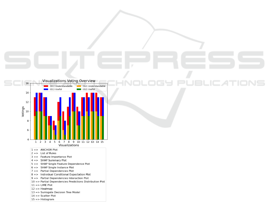
Understanding of Visualizations: Figure 16 shows
which visualizations were understandable for the
participants (Q 2.1) and from which visualizations
information could be used (Q 2.2). The maximum
obtainable value on the y-axis is 14 with votes from
G1 and G2.
Figure 16: Visualizations Voting Overview.
In the following part we show the results for pro
(Q 2.3) and contra (Q 2.4) arguments of each
visualization. We summarized the participants
answers for these questions and present them as one
answer. (1A) represent a single answer. If a group is
not shown, there was no comment.
ANCHOR Plot Pro: (G1) •Conclusion based on data
•Reflect a percentage value •Decision is
understandable and rise confidence (G2) •Easy to
process and interpret the information •Confidence of
rules for decision are provided •Values for pass or fail
decision are shown Contra: (G1) •(1A) visualization
not immediately intuitive •Difficult to understand
without an explanation (G2) •Slightly overloaded and
redundant information •Few example are meaningful.
List of Rules Pro: (G1) •Error space can be derived
•Shows how effective the rules are •Shows existing
rules from Model and can be analyzed "more deeply"
•Sorted list and prediction accuracy (G2) •Shows
number of instances and the values ranges •Good
overall view and points out the errors in the value
ranges •Shows how much of the instances are covered
by a specific rule •Errors in a prediction can be
reproduced •Acts like a construction kit of rules and
immediately obvious which is important •Confidence
level shows how sure the model is about a rule.
Contra: (G1) •(1A) just a list of rules and it takes
some time to get used to it for daily work •Not all
columns are intuitive (G2) •A lot of information is
presented at once •Too much information could lead
to a problem if there are too many rules listed •An
explanation of the terms and columns should be
provided •A graphical visualization is often easier
Feature Importance Plot Pro: (G1) •Could be used
in daily work for distribution of errors over the
features •Immediately visible, on which feature we
should focus and how high the influence of an
individual feature is •Simple and meaningful,
therefore helpful for follow-up actions (G2) •Could
be used for highly predictable attributes to show the
most important features •Immediately apparent how
important each attribute for the predicting is
•Attributes are sorted according to their importance.
Contra: (G1) •(1A) scaling was not clear (G2) •Does
not provide a high information value and can only be
used for very clear correlations •Calculation of the
score should be provided •A useful metric should be
utilized to calculate the feature importance •Score of
a feature should be shown to distinguish between
many similar features
SHAP Summary Plot Pro: (G1) •A lot of
information is shown and with good understanding, it
can be interpreted easily •A feeling of the distribution
can be built up and represents each measurement
point (G2) •Clear at first glance •Shows which
instances are decisive for a measured value to have an
error •The order shows how important each feature is
CHIRA 2021 - 5th International Conference on Computer-Human Interaction Research and Applications
196

and how its values are distributed •Color scale helps
to understand •Individual instances are shown •The
overall picture of the instance distribution is
visualized, thus enabling a comparison with different
instances Contra: (G1) •Needs an explanation and is
not intuitive •The complexity is not beneficial
•Would be too complex for a layman (G2) •Difficult
to understand without an explanation •The measured
values would still have to be read •Not clear whether
the instances shown were an anomaly •Not clear how
the information could be utilized.
SHAP Single Feature Dependence Plot Pro: (G1)
•Quickly recognized by the colors whether a
dependency is present •Correlation between two
features can be shown (G2) •Two features can be
shown at once and how the correlate between them
•Clusters can be recognized and the dependency of
the feature is shown •Colored representation helps for
interpretation Contra: (G1) •Not easy to understand
•Not intuitive and SHAP values are not known or
understandable (G2) •The colored dots overlap,
which leads to misinterpretation for many instances
•Difficult to recognize the values of individual
instances •Many graphics would have to be created
and separately checked for various features •Too
much information is displayed •An explanation for
the visualization is needed, as it is not intuitive.
SHAP Single Instance Plot Pro: (G1) •Features and
their values a simple visualized •The influence of
each feature is shown for the classification
•Possibility to trace individual instances and their
results (G2) •Shows how strong the contribution of a
feature and its value is on the prediction •Shows under
which conditions an instance tends to belong to a
class •Colors further contribute to an information gain
and shows the affiliation to a class •Visualization is
self-explanatory in this case Contra: (G1) •(1A)
displayed values were not understandable (G2)
•Shows only one instance and only suitable for a
detailed analysis •SHAP value is not known in
general and therefore offers little information •Output
value could not be directly understood •Difficult to
interpret and not intuitive.
Partial Dependencies Plot Pro: (G1) •Good
representation and dependency can be identified
•Shows if two features have a correlation and their
influence (G2) •Two features are presented
simultaneously and how their values influence the
prediction •It is possible to determine in which value
ranges an error occurs and offers a good overview
•The 3D representation is positively perceived and
the colors help understanding Contra: (G1) •(1A) not
every value area can be seen (G2) •Not immediately
understandable and for some participants too much
information •The exact values to form boundaries are
also missing •The color representation cannot be
assigned to an exact value •A stronger color
differentiation would be helpful •For many features,
various plots had to be created.
Individual Conditional Expectation Plot Pro: (G1)
•Simple overview in which value range something
happens •Shown where the biggest influencing
factors for pass or fail lies (G2) •Exact value ranges
in which a product tends to have an error •Legend
shows the different value ranges and the average
value can be used as a guide •Information is clearly
visible and the most important information can be
determined at one glance •The distribution of the
instances over the value ranges is shown Contra:
(G1) •(1A) only the borders must be shown (G2)
•Overloaded and overlays individual predictions with
other lines shown •Difficult to filter or track
individual predictions •The y-axis should be adjusted
from 0 to 1 and is not self-explanatory.
Partial Dependencies Interaction Plot Pro: (G1)
•Very detailed with many information and it can be
seen where the priority is •Simple and quick to grasp
(G2) •It can be clearly located where the product
defects are and how strongly they are distributed
•Colored representation is helpful •Shown in which
value range the prediction tends towards an error •The
number of instances in each value range are shown in
form of bubble size •It can be seen, how strong the
two features interact and how important they are
•Easy to read and suitable for an overview Contra:
(G1) •(1A) not intuitive and the participant had to
deal with the colors/numbers (G2) •Value ranges
should be more distinguishable and are somehow
confusing •A lot of information is presented on a 2D
graphic and is not 100% intuitive.
Partial Dependencies Predictions Distribution
Plot Pro: (G1) •It can be observed where the mean
value is and where the outliers are •With the Boxplot
a lot of information can be shown •Clearly shows the
distribution of the value ranges while at the same time
representing the influences on the result •Easy to
grasp as it uses a common statistical representation
(G2) •Shows the measured values and prediction in
the respective areas •Gives a good overview of the
values and the prediction is comprehensible •The use
of the bar chart is positive and very clear •The number
of instances in the respective areas is given Contra:
(G1) •(1A) was not intuitive and would need a further
explanation •(1A) only provides the information
where the problem occurs (G2) •Not possible to
understand which measured value is involved •Can
Evaluation of Visualization Concepts for Explainable Machine Learning Methods in the Context of Manufacturing
197

only be used for one feature •Not obvious where the
focus of the prediction lay.
LIME Plot Pro: (G1) •Individual instances are
shown and provide insights regarding how decisions
are made •Presents three parts and the percentage for
pass/fail •Features are weighted •Looks clearly
structured and is visually appealing (G2) •Very clear
and the most important information can be seen at a
glance •Colored representation supports
understanding and helps with categorization
•Influence, class affiliation and value of each feature
can be seen •Due to the good visualization and simple
explanation, it can be understood by a layperson
Contra: (G2) •Only shows one instance at a time and
is intended for detailed analyses •Do not show how
additional instances are classified •It requires an
extended description for the visualization.
Heatmap Pro: (G1) •Good representation where the
main points with the greatest influence factor on the
errors are located •Color scheme can be quickly
grasped •Can be seen how the interaction between the
two features took place and the frequency of failures.
(G2) •Shows error distribution and areas where no
measured values are •Colors help to identify the error
frequencies •Error quantities are shown in absolute
and percentage numbers • Two features can be used,
to show the value range of the errors that occurred •A
subdivision of the measured values is displayed and a
good overview is provided. Contra:
(G1) •(1A)
explanation would be necessary (G2) •An
explanation for the visualization should be given
•Need a legend with further information.
Surrogate Decision Tree Model Pro: (G1)
•Correlations are well presented and further shown
which feature had the most important influence •The
correlations, values and important criteria are given
•Decision tree is just an approximation but can be
used to comprehend the decision-making process
(G2) •Important information can easily be seen
•Effects of individual values for the prediction are
shown •Decisions are comprehensible, interpretable
and rules can be recognized •The value ranges in
which the rules operate can be recognized •Nodes can
be traced to understand the classification •More
meaningful than a simple rule. Contra: (G2)
•Decision tree should not be too big or wide and the
colored arrows should be explained •Only an
approximation of the real model •With large decision
trees, misinterpretation can occur if the analysis takes
place in a hectic environment •Not well visualized to
show all values and to have an overview of all values
•Comprehension is no longer present after a certain
point (tree size).
Scatter Plot Pro: (G1) •Overview of all measured
values with the information if an instance has pass
and fail •Time progression is included, which is an
important factor •Over time the production may
change and this is important to see.
(G2) •Error distribution can be seen and assigned to
individual instances •It can be seen when an error
occurred •Time aspect is shown via the instance
number •The color display can be used to recognize
when an error has occurred. The value range of the
error can be seen Contra: (G2) •Overview could be
lost if too many instances are plotted •Only one
measured value is shown and only can be used for a
detailed analysis •Exact value ranges are not
displayed and can only be roughly read •Could not
depict complex interrelationships.
Histogram Pro: (G1) •Simple and clear visualization
of a feature distribution and the influence on the result
•Numbers are displayed at the top of a bar, which
passes as additional info (G2) •Value distribution is
shown and the associated measurement errors •Value
ranges that do not occur are also shown •Due to the
color coordination and display of the errors, the error
distribution can be better understood •Simple and
easy to understand Contra: (G1) •(1A) colored
design is not ideal with uniform gray • (1A) numbers
could be misinterpreted (G2) •It could become tiring
in the long run if each measured value must be
considered separately •Natural logarithm was not
understandable.
Evaluation of Provided Visualizations:
In this
subsection we summarize how participants evaluated the
visualizations (Q 3.1 - Q 3.5). Each participant named the
three best visualizations (Q 3.1). These are show in are
shown in Table 1:
Table 1: Best Voted Visualizations.
Name of visualization Voting Counts
Surrogate Decision Tree Model 1 (G1) + 5 (G2)
Scatter Plo
t
3 (G1) + 3 (G2)
Partial Dependencies
Interaction Plot
1 (G1) + 3 (G2)
Lime Plot 0 (G1) + 3 (G2)
Feature Importance Plo
t
1 (G1) + 2 (G2)
SHAP Single Instance 1 (G1) + 2 (G2)
The Surrogate Decision Tree Model and the
Scatter Plot are the most favored visualizations. This
is because a Surrogate Decision Tree Model is easy
to understand. The Scatter Plot is also easy to
understand and shows the time aspect. In third place
was the Partial Dependencies Interaction Plot. This
plot shows the distribution of errors based on two
features. The fourth favored plot was the LIME Plot.
The LIME Plot visualizes the important information
CHIRA 2021 - 5th International Conference on Computer-Human Interaction Research and Applications
198

about a classification of a product instance.
Therefore, it is clear and quickly understandable. The
fifth place is shared by two visualizations.
In Table 2, each participant also named three
visualizations that were not purposeful (Q 3.2).
Table 2: Worst Voted Visualizations.
Name of visualization Voting Counts
SHAP Summary Plot 3 (G1) + 3 (G2)
Partial Dependencies Plot 1 (G1) + 3 (G2)
Partial Dependencies Prediction
Distribution Plot
1 (G1) + 2 (G2)
Heatmap 0 (G1) + 2 (G2)
ICE Plot 0 (G1) + 2 (G2)
This result shows that the least liked plot was the
SHAP Summary Plot, followed by the Partial
Dependencies Plot. The SHAP Summary plot was
mentioned here because the participants felt that this
visualization was not intuitive and not easily to
comprehend. The problem with the Partial
Dependencies Plot is that the participants could not
see every area of the fixed plot and had no relation to
the partial dependence. The Partial Dependencies
Prediction Distribution Plot was considered the third
poorest visualization. The interview participants had
a hard time understanding this visualization and it
was less useful than the others.
(Q 3.3) Which additional visualizations would
you still like to see: (G1) One of the participants
would like to see a network diagram as a further
visualization. Especially, because it can illustrate
more than two features at the time. (G2) An overview
of all features would be helpful for the first look at the
visualization. Distinctions with colors would be
desirable to be able to distinguish different parts of
the visualization (feature/predictions). The temporal
aspect was positively received. Furthermore, a 3D
view of e.g., the top three features could be helpful.
An interactive visualization could also be helpful
here, in which features, time periods and products
could be selected directly. Furthermore, counter
factual explanations were mentioned, which show the
difference between good and bad instances.
(Q 3.4) Implementing improvements with the help
of the provided visualizations: (G1) Dependent on the
information in the visualizations, improvements
could be implemented. Further, it can help to find the
origin of an errors. The visualizations must be used in
a task-related way and automatically point to the
relevant features. (G2) The participants are all
confident, that the provided visualizations could be
used for the identification of product errors. It was
positively noticed that value ranges were shown in
which the production error occurs. Furthermore, the
rules that lead to the elimination of production errors
were also shown. However, a clear reference to each
production error should be established and it should
be clearly defined how the error arose. The most
important features and their measured values that lead
to the production defect should be visualized. It
should further be shown which features can be
excluded from the analysis. Moreover, it is beneficial
to show correlations between features. The time
aspect was mentioned several times to identify when
a product error occurred. With the synthetic data it
could be clearly observed to which features and value
range the product error tends.
(Q 3.5 [only for G1]) How the visualizations
influence your work: It could make the work and
simplify complex issues. Additionally, it would be
easier to work with different teams. Visualization
could be shown to other colleagues and interesting
aspects could be pointed out. Therefore, it would
reduce the workload. Information can be found that
was not known before. These would increase the
production or efficiency.
7 DISCUSSION
We can conclude from the answers of all participants
in section 6, that simplicity and easy interpretability
is the most important requirement for a visualization
in the target application. This will reduce the
probability of faulty conclusions. This answer applies
to both participant groups. A simple visualization
could be used to show the cause of the error to non-
experts, colleagues or higher management. Therefore,
it is important that the visualizations are easy to
understand and quick to comprehend. The error cause
with the highest probability should be clearly
indicated. Also, the decisions made by the model
should be as comprehensible as possible. The
participants also expressed the wish to use interactive
visualizations. These were not used in this interview
but show another possibility towards XAI. The most
favored plots were the Surrogate Decision Tree
Model and the Scatter Plot because they are easy to
understand and use. The Scatter Plot was especially
important for group G1. This Plot provides the benefit
of an overview of the measured values with the
associated test results. The measured values are
shown over time and thus also potential changes in
the production. The Surrogate Decision Tree Model
is more preferred by group G2 because it reflects the
decision over several features in a comprehensible
way. Here, both decisions are reflected in the
characteristics of the two groups. The Scatter Plot
Evaluation of Visualization Concepts for Explainable Machine Learning Methods in the Context of Manufacturing
199

shows the demand for the development of a product
feature, which can be assigned to the tasks of a
product manager. The Surrogate Decision Tree
Model shows how a Model made it decision and
therefore, reflect to the tasks of a data scientists.
Nevertheless, we want also to discuss the worst
visualizations. Most difficult to understand were the
SHAP Summary Plot for both groups and Partial
Dependencies Plot for G2. The color of the instances
of the SHAP Summary plot was especially unclear.
Furthermore, participants could not interpret or
understand the actual SHAP value. The Partial
Dependencies Plot was problematic because the
participants had no connection to the term “partial
dependence” and how this could be used. Moreover,
a static 3D visualization could hide important value
areas. However, G1 felt this visualization was more
usable. We therefore suggest to not use these
visualizations in isolation without further aids.
Especially easy to understand were the following
visualizations (unordered) for the corresponding
groups: (G1) Feature Importance Plot, Partial
Dependencies Interaction Plot, LIME Plot, Surrogate
Decision Tree Model, Scatter Plot, Histogram. The
strength of these illustrations is that information can
be captured quickly and unambiguously. At the same
time, these presentations have a simple design and are
not overloaded with information. The negative
arguments belong to the details of the visual
representation. However, the diagrams can be
adjusted. (G2) Feature Importance Plot,
Dependencies Interaction Plot, LIME Plot, Surrogate
Decision Tree Model, Scatter Plot. The visualizations
mentioned here are similar to the response of G1. This
also applies to the advantages of them. The negative
arguments of G2 address like G1 the particulars of the
presentations. In addition, for the LIME Plot and
Histogram, it was noted that only one instance or
feature can be seen. This indicates a preference for a
global overview.
Further, we want to discuss possible combinations
of visualizations that can be used to identify the origin
of an error. Based on the results of the interview and
our personal assessment, we suggest the following
eight combinations. These combinations were not
confirmed by the interviews.
Feature Importance Plot & Histogram: To get a
brief overview of all features in the dataset, we first
use the Feature Importance Plot to find the most
relevant features. Based on relevant features, we
investigate further with the histogram. The histogram
provides details of a feature to analyze further.
SHAP Summary Plot & ICE Plot: The SHAP
Summary Plot can be used to provide a first
impression of the results. Here we can see if there are
outliers or cluster formations in the results. With this
information we analyze the most promising features
with the ICE Plot. The ICE Plot shows the value
ranges of a selected feature and the ranges in which
the probability of error increases.
Feature Importance Plot & Scatter Plot: The
Feature Importance Plot can be used once again to get
an overview of the features. Afterwards we select the
most important features and analyze it with a Scatter
Plot. Hence, we can see the value ranges and, most
importantly, the time aspect of the feature is provided.
Therefore, we can observe in which time range the
error has occurred.
Surrogate Decision Tree Model & ICE Plot: The
Surrogate Decision Tree Model provides individual
rules in the leaf nodes. These could be used for a
further analysis. Each rule of the leaf node could be
taken and checked with the ICE Plot. This could be
used to check how a model predicted the feature in
various value ranges.
SHAP Summary Plot & SHAP Single Instance
Plot: For the overview we would use the SHAP
Summary Plot. Within this plot, we can focus on the
outliers or the data clusters. We select the needed
instances from the SHAP Summary Plot. With the
SHAP single instance we can analyze single instances
from the dataset to get an insight into how strongly
the individual features played a role in classification.
Rule Base & Histogram: The Rule Base will be used
as an overview for the possible error causes. Each rule
could be used for a single investigation. Based on the
rule and the feature it contains, we use the histogram
for a detailed view.
Feature Importance Plot & Partial Dependencies
Interaction Plot: For an overview we use the Feature
Importance Plot. With the most important feature we
check the best correlation of the feature by looking at
the Partial Dependencies Interaction Plot. At the same
time, the distribution of the errors could be evaluated.
Feature Importance Plot & Histogram, followed
by a Scatter Plot: We use the Feature Importance
Plot as an overview. The histogram will be used as a
detailed view on a specific feature. Followed by the
Scatter Plot to identify the time range of the error
occurrence and whether it occurred in the near past.
8 CONCLUSION
In this paper we contribute to the understanding of
how well different Explainable ML methods and
CHIRA 2021 - 5th International Conference on Computer-Human Interaction Research and Applications
200

visualizations work for error analysis in the
production domain. Our insights are based on
interviews with students as well as practitioners from
production quality management. We created
synthetic data with predefined feature value ranges
for errors. Based on the synthetic data we created 15
different visualizations. We discussed requirements
and wishes for visualization to identify corrupted
products based on the provided data. We summarized
the results from the interviews and discuss them, to
show the best and worst visualizations. One of the
favored visualizations was the Surrogate Decision
Tree Model, because it reflects the requirements for a
plot that is easily understandable and interpretable.
The Scatter Plot is also useful as an easy-to-
understand visualization and ties with the Surrogate
Decision Tree Model on the first place. Furthermore,
we contribute with eight possible combinations to use
the visualizations. These should help to analyze the
data more precise and identify the error cause. We
also identified a desire to use interactive
visualizations by the participants. Therefore, future
investigation should address this aspect. Further, it
has to be tested how useful the presented
visualizations are in practice.
ACKNOWLEDGEMENTS
This project was funded by the German Federal
Ministry of Education and Research, funding line
“Forschung an Fachhochschulen mit Unternehmen
(FHProfUnt)“, contract number 13FH249PX6. The
responsibility for the content of this publication lies
with the authors. Also, we want to thank the company
SICK AG for the cooperation and partial funding.
Further, we thank Mr. McDouall for proofreading.
REFERENCES
Abu-Rmileh, A. (2019, February 20). Be careful when
interpreting your features importance in XGBoost!
Medium. https://towardsdatascience.com/be-careful-
when-interpreting-your-features-importance-in-
xgboost-6e16132588e7.
Apley, D. W., & Zhu, J. (2016). Visualizing the effects of
predictor variables in black box supervised learning
models.
Arrieta, A. B., Díaz-Rodríguez, N., Del Ser, J., Bennetot,
A., Tabik, S., Barbado, A., ... & Chatila, R. (2020).
Explainable Artificial Intelligence (XAI): Concepts,
taxonomies, opportunities and challenges toward
responsible AI. Information Fusion, 58, 82-115.
Bhatt, U., Xiang, A., Sharma, S., Weller, A., Taly, A., Jia,
Y., ... & Eckersley, P. (2020, January). Explainable
machine learning in deployment. In Proceedings of the
2020 Conference on Fairness, Accountability, and
Transparency (pp. 648-657).
Elshawi, R., Al-Mallah, M. H., & Sakr, S. (2019). On the
interpretability of machine learning-based model for
predicting hypertension. BMC medical informatics and
decision making, 19(1), 146.
Fisher, A., Rudin, C., & Dominici, F. (2018). Model class
reliance: Variable importance measures for any
machine learning model class, from the “Rashomon”
perspective. arXiv preprint arXiv:1801.01489,68
Hirsch, Vitali, Peter Reimann, and Bernhard Mitschang.
“Data-Driven Fault Diagnosis in End-of-Line Testing
of Complex Products.” 2019 IEEE International
Conference on Data Science and Advanced Analytics
(DSAA), 2019.
Hunter, J. (2007). Matplotlib: A 2D graphics environment.
Computing in Science & Engineering, 9(3), 90–95.
Jiangchun, L. (2018). SauceCat/PDPbox. GitHub.
https://github.com/SauceCat/PDPbox.
Li, Zhixiong, Ziyang Zhang, Junchuan Shi, and Dazhong
Wu. “Prediction of Surface Roughness in Extrusion-
Based Additive Manufacturing with Machine
Learning.” Robotics and Computer-Integrated
Manufacturing 57 (2019): 488–95.
Lundberg, S., & Lee, S. I. (2017). A unified approach to
interpreting model predictions. arXiv preprint
arXiv:1705.07874
Pedregosa, F., Varoquaux, G., Gramfort, A., Michel, V.,
Thirion, B., Grisel, O., Blondel, M., Prettenhofer, P.,
Weiss, R., Dubourg, V., Vanderplas, J., Passos, D.,
Brucher, M., Perrot, M., & Duchesnay, E. (2011).
Scikit-learn: Machine Learning in Python. Journal of
Machine Learning Research, 12, 2825–2830.Ribeiro,
M. T., Singh, S., & Guestrin, C. (2016). "Why
Should I Trust You?". Proceedings of the 22nd ACM
SIGKDD International Conference on Knowledge
Discovery and Data Mining.
https://doi.org/10.1145/2939672.2939778
Ribeiro, M. T., Singh, S., & Guestrin, C. (2018, April).
Anchors: High-precision model-agnostic explanations.
In Thirty-Second AAAI Conference on Artificial
Intelligence.
Roscher, R., Bohn, B., Duarte, M. F., & Garcke, J. (2020).
Explainable machine learning for scientific insights and
discoveries. IEEE Access, 8, 42200-42216.
Waskom, M. L. (2021). seaborn: statistical data
visualization. Journal of Open Source Software, 6(60),
3021.
Zhao, Q., & Hastie, T. (2019). Causal interpretations of
black-box models. Journal of Business & Economic
Statistics, 1-10.
Ziekow, H., Schreier, U., Saleh, A., Rudolph, C., Ketterer,
K., Grozinger, D., & Gerling, A. (2019). Proactive
Error Prevention in Manufacturing Based on an
Adaptable Machine Learning Environment. From
Research to Application, 113.
Evaluation of Visualization Concepts for Explainable Machine Learning Methods in the Context of Manufacturing
201
