
Visualization of Activity Data from a Sensor-based Long-term
Monitoring Study at a Playground
Tobias Bolten
1
, Regina Pohle-Fr
¨
ohlich
1
, Dorothee Volker
2
, Clemens Br
¨
uck
2
, Nicolas Beucker
2
and Hans-G
¨
unter Hirsch
1
1
Institute of Pattern Recognition, Niederrhein University of Applied Sciences, Reinarzstr. 49, Krefeld, Germany
2
Competence Center for Social Urban Design, Niederrhein University of Applied Sciences,
Frankenring 20, Krefeld, Germany
Keywords:
Activity Visualization, Heat Map, Long-Term Monitoring, Dynamic Vision Sensor.
Abstract:
In the context of urban planning, a detailed knowledge of the considered space and its utilization is essen-
tial. However, manual observations are often not performed due to cost. Whereas sensor-based systems are
often not installed due to possible constrains caused by data protection laws and user privacy-concerns. We
addressed these concerns and developed a privacy-aware, sensor-based processing pipeline for detecting ob-
jects based on an analysis of signals from several sensors. These detections are used for their mapping and
visualization in a global bird eye view.
Besides a data normalization, which is crucial considering sections of different lengths, multiple variations of
activity visualization applying heat maps are described. This includes the utilization of background represen-
tations with different levels of details, different accumulations of object detections through the adjustment of
the performed spatial binning as well as applying different colormaps. Both sequential colormaps and diverg-
ing colormaps with and without perceptually uniform distances were considered.
These variations were evaluated in a conducted online survey addressing professional urban planners as well
as interested citizens. The results of this survey were used to determine a meaningful default setup for visual-
izing the activities in an interactive graphical user interface. This interface is intended to make the results of
the performed long-term monitoring generally accessible.
1 INTRODUCTION
In order to realize an user-oriented perspective for
planning and designing public spaces, urban planners
need detailed knowledge about the future or current
users of an urban space. For this reason, a long-
term observation of the behavior of the different user
groups in the public space is necessary.
Until now the analysis of interaction in public
space is generally still based on analogue methods,
which leads to rather expensive user studies. Man-
ual methods are mainly preferred because of ethical
standards concerning pattern recognition and the sur-
plus of ad hoc interpretation by professional observers
(Gehl and Svarre, 2013). Depending on very differ-
ent international legislations, monitoring by means of
classic CCTV systems is often associated with high
regulatory requirements. Regardless of the legal con-
straints, these CCTV systems can also be associated
with user concerns regarding data protection aspects.
In this paper, we present generated activity vi-
sualizations resulting from a sensor-based long-term
study conducted in a living lab context of a pub-
lic children’s playground. Within this study, the
aforementioned user concerns were considered and
addressed through an alternative, privacy-compliant
sensor selection. The goal is to use these evidence-
based activity observations as a resource to evaluate
spatial use and optimize urban design considerations.
Due to the long-term aspect of this monitoring and
the utilization of multiple sensors, a large amount of
data is generated in this process. Therefore, it is nec-
essary to visualize it in a suitable manner. The key is a
presentation in a way that decision makers can under-
stand and interpret the diverse collected information.
For this purpose, we are examining several aspects of
activity visualization and investigate them using ex-
amples through a conducted user study among profes-
sional decision makers in the urban planning environ-
ment. Furthermore we are exploring the visualization
146
Bolten, T., Pohle-Fröhlich, R., Volker, D., Brück, C., Beucker, N. and Hirsch, H.
Visualization of Activity Data from a Sensor-based Long-term Monitoring Study at a Playground.
DOI: 10.5220/0010798700003124
In Proceedings of the 17th International Joint Conference on Computer Vision, Imaging and Computer Graphics Theory and Applications (VISIGRAPP 2022) - Volume 3: IVAPP, pages
146-155
ISBN: 978-989-758-555-5; ISSN: 2184-4321
Copyright
c
2022 by SCITEPRESS – Science and Technology Publications, Lda. All rights reserved

of various data based insights in one interface in or-
der to generate a user friendly overview of complex
situations.
The paper is structured as follows. Section 2 sum-
marizes related work in the context of activity visual-
ization. A detailed description of the monitored area
and the processing pipeline used for activity detection
follows in Section 3. In Section 4 the investigated
visualizations, as well as their creation is described.
First results of the user study are summarized in Sec-
tion 5. Finally, an overall summary and outlook for an
integrated user friendly interface is provided in Sec-
tion 6.
2 RELATED WORK
There are different approaches for the visualization of
space-time data in the literature. For example, mea-
sured parameters can be used to color individual ob-
jects of the observed infrastructure. However, the ob-
served playground in this study is designed as a nature
experience space and therefore does not contain clas-
sic playground equipment, but rather different areas
in which the children can playfully interact with nat-
ural materials. Therefore, in this practical case, play-
ground equipment representations cannot be used for
visualization.
More popular is the visualization of the measured
values from the user’s perspective by creating usage
maps. It can be observed that abstract 2D represen-
tations are preferred compared to 3D representations.
This is certainly also due to the fact that 2D repre-
sentations do not require any additional interaction
when interpreting the data. In some projects, such as
(Rezaei and Azarmi, 2020), both options are used to
visualize tracking and distance maps.
In addition to conveying the acquired data by
means of coloring as 2D or 3D heat map, there
are also many examples on the web that use simple
shapes such as circles, spheres, or cubes to represent
site-specific information (Geospatial, 2021). Depend-
ing on the type of available data and the desired type
of information to be conveyed, human movements in
public spaces are visualized in different ways. For
example, to visualize the paths of individual visitors,
Cuellar chooses a single flow representation (Cuel-
lar et al., 2020), while Laureyssens chooses non-
personalized flow maps (Lauressens, 2005) to display
pedestrian lanes in a public square. In the flow map in
(Nielsen et al., 2014), it is possible to assign the flow
lines to individual moving people. An extension of
flow maps can be found in (Peysakhovich and Hurter,
2017). Here, in addition to the path of the movement,
the direction of the movement is also used in a flow
direction map to display the results of eye tracking.
Scatterplots are used to visualize fewer recorded
events at a location, such as showing manually
counted people in a street segment within a limited
time period. This is for example described by Whyte
in (Whyte, 1979), who was a pioneer of systematic
user analysis in urban planning. Very often, heat maps
can also be found to represent captured people when
automatic data collection is performed, e.g., in (Ra-
jasekaran et al., 2020) to represent group activities
in student dormitories. In (Rashed et al., 2016) heat
maps are used to analyze which exhibit in a museum
is particularly popular for visitors. Bolleter also uses
heat maps to present his results of Wi-Fi tracking in
public spaces to count people and map their stays and
movements at the district level (Bolleter, 2017).
When using heat maps, it should be noted that the
selection of an appropriate color table and a scaling
adapted to the problem are crucial for the subsequent
interpretation of the data (Eghteabs et al., 2017). In
addition, when selecting the color tables, it is impor-
tant to consider that color-blind people can also inter-
pret the data and that older people are less sensitive to
colors (Silva et al., 2011).
Different types of generation for colormaps are
described in the literature (Zhou and Hansen, 2015).
Colormaps can be generated procedurally, with the
goal of being able to interact with as many different
data sets as possible. For some tasks, user studies ex-
ist that were used to develop suitable colormaps. Fur-
thermore, perception-based rules learned in the course
of life exist for certain applications. An example of
this is the communication of the measured tempera-
ture via a blue-red scale. For our monitoring applica-
tion, the data-driven generation is relevant to make
both, the short-time and the long-term data, inter-
pretable in a similar way with an adapted colormap.
For visualization of such ordinal data, sequential per-
ceptually uniform maps should be used that reflect nu-
merically equal distances between values for equally
perceived color differences (Moreland, 2009).
3 DATA ACQUISITION AND
PROCESSING
This section presents the developed processing chain
from the activity recording performed by multiple
sensors to the derived coordinates for a joint visual-
ization.
Visualization of Activity Data from a Sensor-based Long-term Monitoring Study at a Playground
147
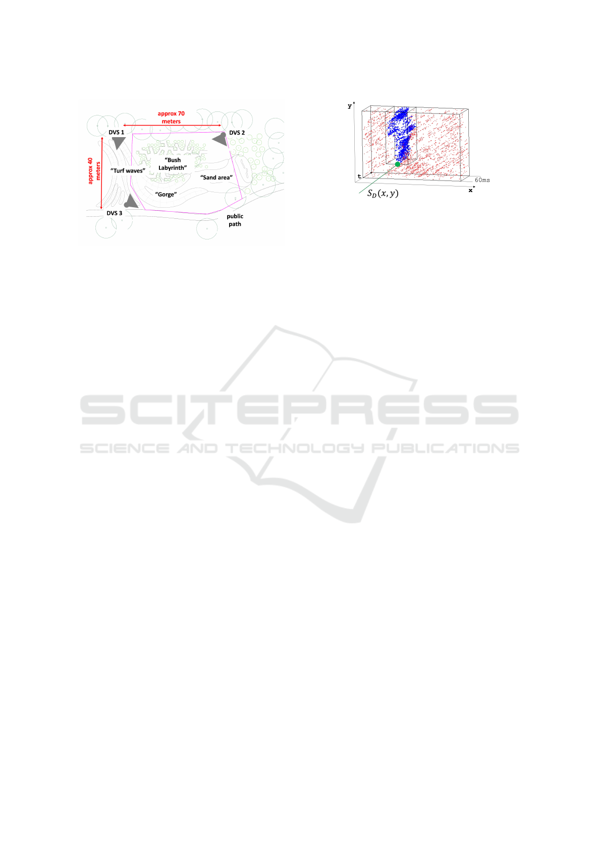
Figure 1: Schematic plan of the measuring area and sensor
positioning (adapted from (Bolten et al., 2021b)).
3.1 Living Lab
The schematic plan of the children’s playground,
which serves as a study area within the living lab, is
shown in Figure 1. This area has an approximate size
of 2800 square meters and is covered by three perma-
nently mounted sensors. The recording scenario of
this long-time observation corresponds to the techni-
cal setup of (Bolten et al., 2021b) and can be summa-
rized and quoted as follows.
Each of the sensors is mounted on a pole at a
height of approximately 6 meters with an angle of in-
clination of approximately 25 degrees to the ground.
The positioning of the sensors was chosen in such
a way that blind spots created by the terrain (trees,
bushes, hills) are minimized as far as possible. Fur-
thermore, it was tried to cover all areas by more than
one sensor. The recording period of each sensor cov-
ered the timespan from 10am to 8pm a day all week,
which results in a very large amount of data that
serves as a basis for visualization.
3.2 Privacy-aware Activity Data
Collection
Activity on the playground was captured using three
CeleX4 Dynamic Vision Sensors (DVS) (Guo et al.,
2017), each equipped with a 8mm wide-angle lens.
Compared to conventional cameras, these sensors do
not record intensity frames, but capture only changes
in brightness as a sparse stream of so called events.
Each pixel of a DVS operates independently and
asynchronously from each other and triggers an out-
put event when a brightness change above a thresh-
old has been detected. An event e = {(x , y),t, p} con-
tains only the spatial position (x,y) of the triggered
pixel, a timestamp t and the polarity p of the bright-
ness change.
Figure 2: Semantic segmentation result of DVS event
stream with derived object detection coordinate S
D
(x,y).
These types of vision sensors offer a fundamental
advantage in terms of data privacy aspects, as no gray
or color values need to be processed in any software
logic to evaluate the activity within the scene. These
inherent hardware-based sensor characteristics allow
DVS technology to be used under significantly lower
legal data protection requirements compared to tradi-
tional CCTV systems. Furthermore, the DVS tech-
nology also offers reduced data redundancy through
the data-driven output paradigm of the sensor, as well
as a higher dynamic range, lower power consumption
and higher temporal resolution compared to classic
CCD/CMOS imagers. The utilized CeleX4 sensor of-
fers a spatial resolution of 768 × 640 pixels, of which
768 × 512 pixels are effectively used due to technical
limitations.
To analyze the event stream, an event-wise seman-
tic segmentation is carried out for contiguous tempo-
ral windows of the data streams, each of 60ms du-
ration. This segmentation is achieved by applying a
PointNet++(Qi et al., 2017) deep neuronal network
structure, which is especially designed for the pro-
cessing of unordered point clouds. Thus, each event
is assigned a label out of a set of 10 classes in to-
tal. In addition to the classes person, dog, bicycle
and sportsball, which represented objects of interest
in the performed monitoring, six classes for environ-
mental influences, such as bird, insect, tree crown,
tree shadow, rain, and shadows were considered. This
segmentation step is based on (Bolten et al., 2021a)
and their published models. According to the evalua-
tion provided in this paper, the PointNet++ processing
achieves an occurrence frequency weighted F1-score
of ≈ 93% over all mentioned classes on the DVS-
OUTLAB dataset (Bolten et al., 2021b), which was
recorded in the same application context as this work.
Within the segmented event stream, the events of
classes of interest are clustered and thereby the detec-
tion coordinates S
D
(x,y) relative to field of view from
sensor S are determined. As an example, a detected
person is shown in Figure 2.
In addition to the data collected with the DVS,
IVAPP 2022 - 13th International Conference on Information Visualization Theory and Applications
148
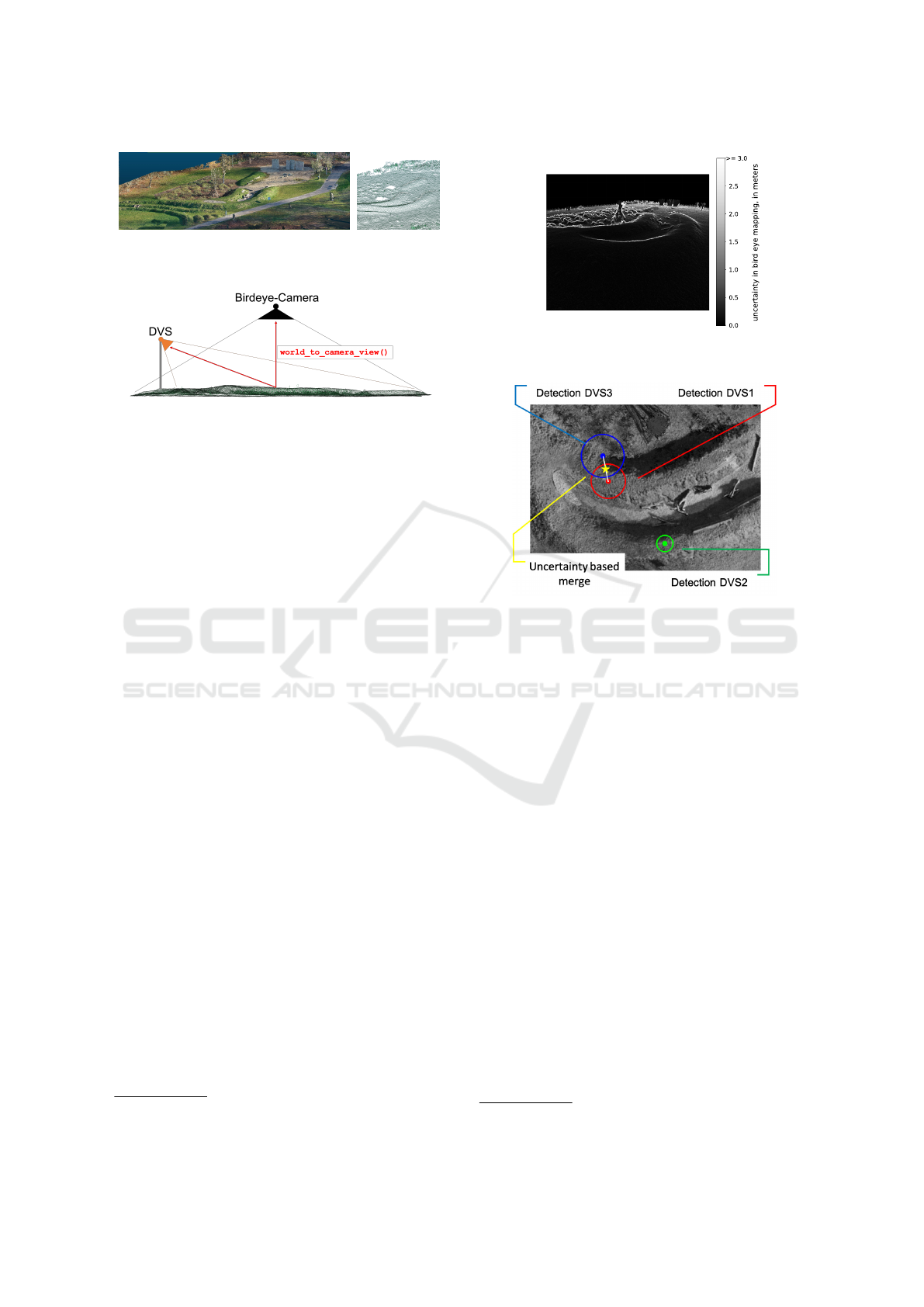
(a) 3D Rendering (b) Wireframe
Figure 3: Calculated SFM 3D model of the playground.
Figure 4: 3D model based coordinate lookup table genera-
tion.
weather data was also recorded to be included in the
planned interface as illustrated in Figures 13. This
data can contribute to a better estimation of the use of
the play area at a certain time, as fewer users can be
expected during cool rainy weather than during warm
sunny weather.
3.3 3D Model-based Bird’s Eye View
Mapping
The next step within the processing pipeline used for
visualization is to map the object detections S
D
(x,y),
which are relative to the sensor field of view, into a
global representation such as a top or blueprint view
like Figure 1.
The mapping of these object detection coordinates
is not a trivial task due to the heavy terrain modeling
(like hills and valleys) of the monitored playground
area. Due to these terrain properties, a simple affine
transformation between the sensor field of view and
the map representation leads to very large inaccura-
cies, since no flat surface plane is given.
To achieve a more accurate estimate, we cal-
culated a 3D model of the playground area, and
performing the mapping based on this model. In this
way, the terrain modeling is included in the applied
transformation. This 3D model was generated using
285 images from a drone overflight. In these overlap-
ping images, the camera positions are estimated based
on determined corresponding points using structure
from motion (SFM) technique. Based on these
camera positions, the 3D points of the model are cal-
culated. We used the commercial software AgiSoft
1
for this purpose. A 3D rendering of the created model
1
https://www.agisoft.com/
Figure 5: Uncertainty visualization of performed S
D
(x,y) to
B
D
(x
0
,y
0
) point mapping, exemplary for one sensor.
Figure 6: Cropped and zoomed example of uncertainty
based merging of projected bird eye detections.
is shown in Figure 3a, where Figure 3 highlights the
included terrain characteristics of the model.
Afterwards the calculated 3D model of the play-
ground is used in a 3D simulation created with
Blender
2
. Within this simulation, camera objects
were positioned and aligned with the same parameters
as the used DVS sensors (such as sensor size, resolu-
tion, focal length). In addition, a bird eye camera B
was positioned. Through this simulation, the relation
of the 3D model mesh vertices to the respective pixel
coordinates in the DVS view or bird eye view can be
determined. In this way, a lookup table was gener-
ated that allows a mapping from S
D
(x,y) to B
D
(x
0
,y
0
)
within the rendered top view. This processing is illus-
trated in Figure 4.
3.4 Fusion of Detections from Multiple
Sensors
The described method achieves a high quality map-
ping between the (x,y) coordinates in the sensor view
to corresponding points in the bird eye top view.
However, due to the terrain modeling, there are still
leaps in this bird eye view mapping. Figure 5 shows
2
https://www.blender.org/
Visualization of Activity Data from a Sensor-based Long-term Monitoring Study at a Playground
149

this as an example for one of the sensors. Here the
maximum distance in the bird eye projection is shown
for each point S
D
(x,y) of the sensor view, which re-
sults when projecting the coordinates within the 8-
connected neighborhood S
D
(x ± 1,y ± 1) around this
point. On the ridges of the terrain modeling projec-
tion distances of several meters can result by shifting
the sensor detection by only one pixel. This distance
is taken into account as an “uncertainty factor” when
merging the detections from all sensors into a joint
representation.
For temporal synchronous detections from differ-
ent sensors, it is tested whether there are overlaps to
other detections within these uncertainty distances.
This procedure is illustrated in Figure 6. In this ex-
ample, the filled circles correspond to synchronous
detections from the sensors and the outer circles in-
dicate the corresponding uncertainty distances of the
bird mapping. The radii of the detections of DVS1
and DVS3 overlap in this case and are therefore com-
bined into one detection.
4 STUDIED VISUALIZATIONS
In the following, the accumulation logic for a con-
solidated visualization of the merged object detec-
tions is presented. This includes data binning as
well as normalization. Subsequently, different gener-
ated and studied visualizations variants are presented.
All generated activity plots were created using the
matplotlib library(Hunter, 2007).
4.1 Spatial- and Temporal Detection
Binning
In order to visualize the activity level on the play-
ground area, the bird eye view is divided into several
sub-areas in the form of a spatial binning. For each
subarea, the activity is then determined and plotted.
The grid for this spatial partitioning is approximately
0.5 to 1 square meter per bin. This selection was made
in order to be able to identify slight location differ-
ences in the usage-frequency despite the overall size
of the monitored area.
Within the performed long-term observations,
there are periods of very different lengths in which an
activity has taken place on the site. Since both short-
time and long-term aspects are of interest within the
evaluation, the ability to visualize time intervals of
different lengths is essential. This results in the chal-
lenge that the displayed activity levels (low to high)
must be comparable with each other when visualizing
periods of different lengths by using the same color
values. For this reason, we apply the following nor-
malization technique.
In addition to the described spatial binning of
the observed area, a further temporal binning is per-
formed. For each spatial bin, the detections of that
area are sorted temporally. The complete temporal in-
terval considered for visualization is then divided into
smaller sections and the count of these smaller tempo-
ral sections containing at least one object detection is
determined. In this way, a percentage normalization
between [0,1] is realized as a function of the consid-
ered total duration.
For example, a considered observation time for vi-
sualization of one hour and a division into temporal
bins of one minute length results in a scaling of x/60,
with x being the number of populated one minute de-
tection time blocks. The division into these short time
segments (e.g. one minute) is possible because the se-
mantic analysis of the DVS event stream is performed
in much shorter time windows of only 60ms duration,
as explained in Section 3.2.
4.2 Considered Heat-map Variations
Then the merged, binned and normalized object de-
tection data is visualized in the form of heat maps to
give decision-makers an intuitive and quick overview
and to make significant areas of usage easily recog-
nizable.
Different variations in the generation of these heat
maps were considered and evaluated:
Level of Detail in Bird Eye View (LoD)
For a spatial orientation of the visualized activity
detections, a representation of the monitored area
is crucial. However, the background image used
as site representation can be carried out in differ-
ent levels of detail.
Photorealistic rendered variants from the created
3D Blender model simulation, as well as further
abstracted sketches of the considered area were
evaluated in our work. Examples of these back-
ground image variants in color, as well as in
grayscale, are shown in Figure 7.
2D vs 3D Display Dimensionality
Display variants with a 2-dimensional and a 3-
dimensional rendering of the plot were created.
In the case of the 3D display, the activity is rep-
resented by the height of a three-dimensional sur-
face in addition to the used color. An example of
this is given in Figure 8a. Since a change of the
viewport is necessary to interpret these 3D views,
animations were created containing a 360 degree
rotation of the plot.
IVAPP 2022 - 13th International Conference on Information Visualization Theory and Applications
150
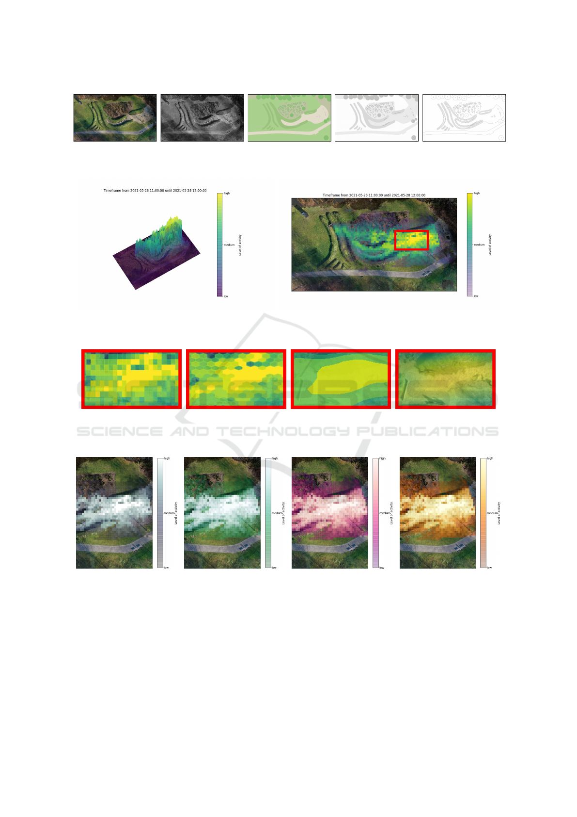
(a) RGB Rendering (b) Greyscale
rendering
(c) RGB sketch (d) Greyscale
sketch
(e) Simplified
sketch
Figure 7: Used level of detail in bird eye view.
(a) 3D with animated viewport (b) 2D projection
Figure 8: Spatial display variants in 2D and 3D.
(a) Rectangles (b) Hexagons (c) Contour (d) Continuous density, result-
ing from KDE
Figure 9: Applied spatial binning and display variants (highlighted region from Figure 8b).
(a) Bone (b) BuGn (c) RdPu (d) YlOrBr
Figure 10: Applied sequential colormaps.
A representation as a two-dimensional image, on
the other hand, allows the data to be interpreted
without this type of animation or interaction. A
corresponding example for this visualization is
given in Figure 8b.
Spatial Binning Variants
Besides the straightforward variant of the spatial
(x,y)-binning into rectangular tiles we also ap-
plied a tessellation by regular hexagons, as dis-
played in Figures 9a and 9b. In addition, a
contour-based representation was implemented,
which shows areas with approximately similar us-
age appropriately grouped together (Figure 9c).
The variants mentioned so far have a discontinuity
of the generated representation in common. To
provide an alternative for this, a Kernel-Density-
Visualization of Activity Data from a Sensor-based Long-term Monitoring Study at a Playground
151
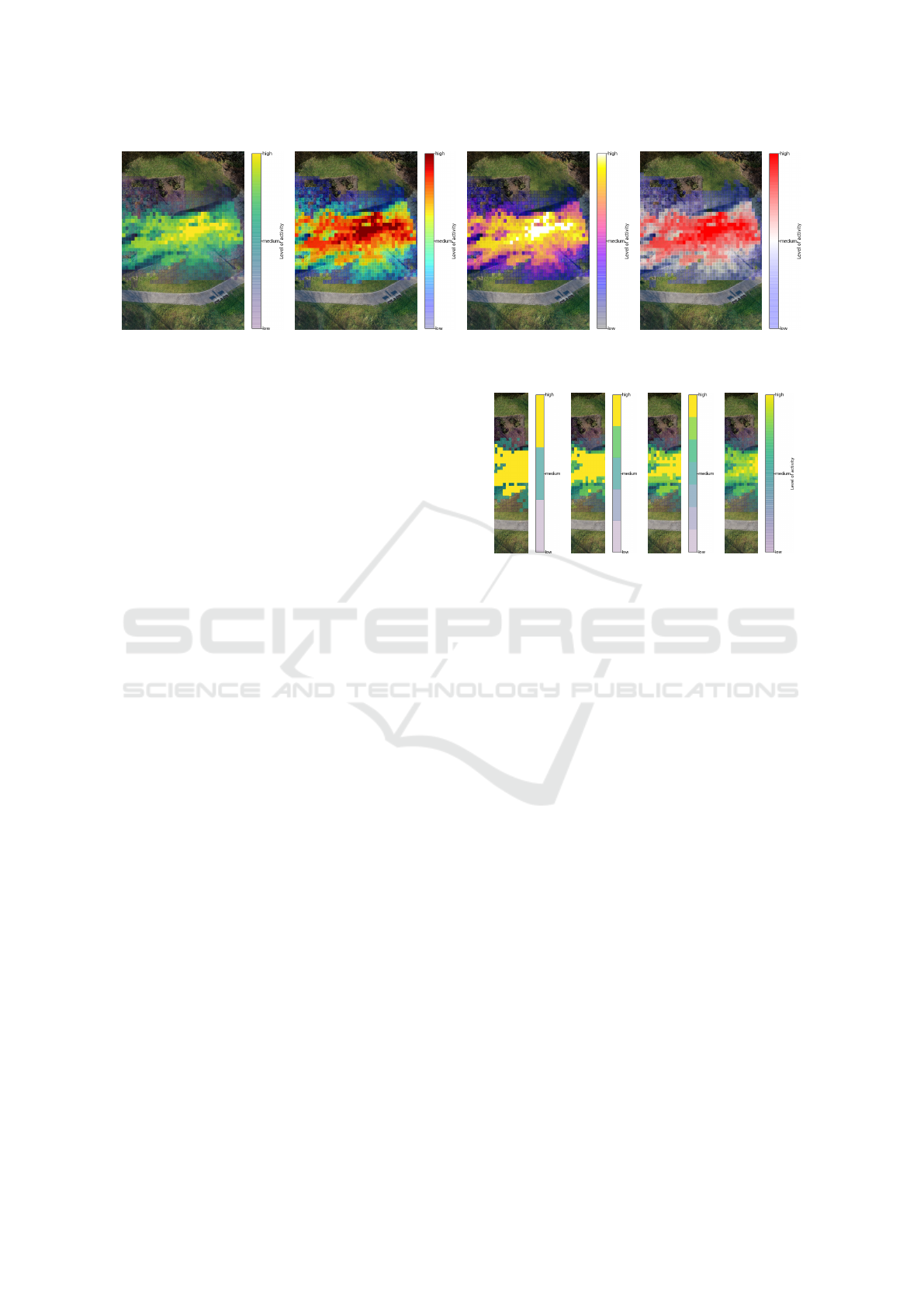
(a) Viridis (b) Jet (c) Gnuplot2 (d) Bwr
Figure 11: Applied diverging colormaps.
Estimation (KDE) based variant was also created,
which allows a gradually smooth representation
of the activity level. An example of this is given
in Figure 9d.
Colormap Variations
Compared to long-learned and daily applied col-
ormaps (e.g. in weather forecasts), the question is
which colormap is best suitable, interpretable and
to intuitively associated with a level of activity by
the addressed decision makers.
For this purpose, various simple sequential col-
ormaps (Figure 10), as well as further diverging
colormaps (Figure 11) were examined. In case
of the diverging colormaps, contrary to usual use-
cases, the common application of a center-point
within the double-ended color gradient was omit-
ted. This results in a continuous color fading of
the normalized activity level from low to high
through this center point.
Perceptually uniform perceived colormaps were
also taken into account in this colormap consid-
eration. In addition the direction of the used col-
ormap to encode the activity level, i.e. from dark
to bright or vice versa, were also considered.
A linear alpha-blending with higher transparency
factors for lower activity levels was used within
the colormap to overlay the generated activity vi-
sualizations over the selected plot background im-
age.
5 USER STUDY
The previously described representations of the ac-
tivity heat maps were evaluated in an online survey.
The carefully selected participants came from profes-
sional backgrounds in urban planning and interaction
design, but also interested citizens were involved in
order to reflect the layman’s perspective. The sur-
vey was designed to check the comprehensibility of
(a) 3 (b) 5 (c) 7 (d) 255
Figure 12: Used level of detail in activity colormap through
further binning it into n blocks.
the generated activity representations by heat maps,
which were created based on design assumptions re-
garding readability and experiential knowledge, and
to identify adequate default settings for upcoming vi-
sualizations and applications. Sixteen participants
took part in the online survey. They had the opportu-
nity to rate the different visualizations and were asked
to comment their decisions.
The results show trends and confirm previously
made assumptions. Table 1 summarizes numerically
the survey results described below.
5.1 Visualization of the Playground
The RGB rendering of the bird eye image (Figure 7a)
was selected as the preferred variant. But the com-
ments revealed that the displayed user activity could
not be related precisely as the heat maps covered the
image with solid colors.
Regarding the 3D rendering, it can be stated that
a high user activity is displayed with a large distance
from the map, which makes the assignment more dif-
ficult.
5.2 Colormaps and Binning
In terms of color, it can be summarized that color
maps with diverging colors are preferentially associ-
IVAPP 2022 - 13th International Conference on Information Visualization Theory and Applications
152

Table 1: Summarized overview of response rates of the user survey.
Aspect of question
Options
RGB
Rendering
Grey
Rendering
RGB
Sketch
Grey
Sketch
Simpl.
Sketch
None
LoD Bird eye view (Fig. 7) 9 0 1 2 3 1
3D ani-
mated
2D RGB 2D Grey
2D RGB
Sketch
2D Grey
Sketch
2D Simpl.
Sketch
3D / 2D representation (Fig. 8) 0 9 1 1 4 1
Rectangles Hexagons Contour KDE
Spatial binning (Fig. 9) 7 1 3 5
Bone BuGn RdPu YlOrBr None
Sequential colormaps (Fig. 10) 3 5 4 2 2
Viridis Jet Gnuplot2 Bwr
Diverging colormaps (Fig. 11) 2 9 3 2
3 Blocks 5 Blocks 7 Blocks Full
Colormap binning (Fig. 12) 2 0 4 10
ated with user activity. One assumption why these
diverging colormaps were preferred over the sequen-
tial ones is that they offer a higher contrast and are
thus, also for older users, more clearly distinguish-
able. This contrast discrepancy is further enhanced
by the amplified alpha blending factor used at lower
activity levels (compare to Section 4.2).
However, contrary to the widespread assumption
from the literature (Moreland, 2009), no perceptually
uniform colormap was preferred. The color map jet
(Figure 11b) was preferred by the participants. We as-
sume that this color map preference indirectly draws
on experiential knowledge (weather representation,
from blue to red), leading to a corresponding asso-
ciation and increased intelligibility.
For the spatial binnings, the representation of user
activity in rectangles was selected by most of the re-
spondents (Figure 9a). This preference matches with
established representations. Similar rectangular grids
were already used by the pioneer of spatial obser-
vations William H. Whyte who investigated human
behavior in urban environments in the early 1970s.
Whyte was the first researcher using a video camera
for long term spatial observations. His study proto-
cols are still leading information graphics in the field
of urban studies (Whyte, 1980).
Regarding the applied colormaps a further simpli-
fication was evaluated within the user survey. This
approach consists of quantizing the continuous activ-
ity scale into coarser sections, as illustrated in Figure
12. The idea here was to clearly divide the activity
into referenceable blocks from “low” to “high”. How-
ever, the participants of the study clearly preferred the
full color gradient with 255 colors (compare to Fig-
ure 12d). Therefore, a division of the color scale has
not been considered further, since this also goes ahead
with a loss of information and makes it more difficult
to identify hotspots on the plot.
5.3 Plausibility and Implemented
Changes
In the online survey, the plausibility was checked last.
The users were shown a map with three marked ar-
eas. They were asked to select in which marked area
the highest user activity was measured. 15 out of 16
people chose the correct answer. This confirms the
comprehensibility of the presentation as well as the
presentation in the top view.
With the results from the survey, the visualiza-
tion was adjusted, and the sketch-drawing of the play-
ground was placed as an overlay on the rendering and
the user activity (compare with heat map in Figure
13). This allows the exact assignment of the user ac-
tivity.
6 CONCLUSION
In the conducted research we successfully explored
methods of collecting anonymized data that allow the
tracing of spatial use. The studied visualizations offer
a basis for the design of an integrated interface that
can be used by urban planners to evaluate the inter-
action within a determined area. The project aims to
Visualization of Activity Data from a Sensor-based Long-term Monitoring Study at a Playground
153
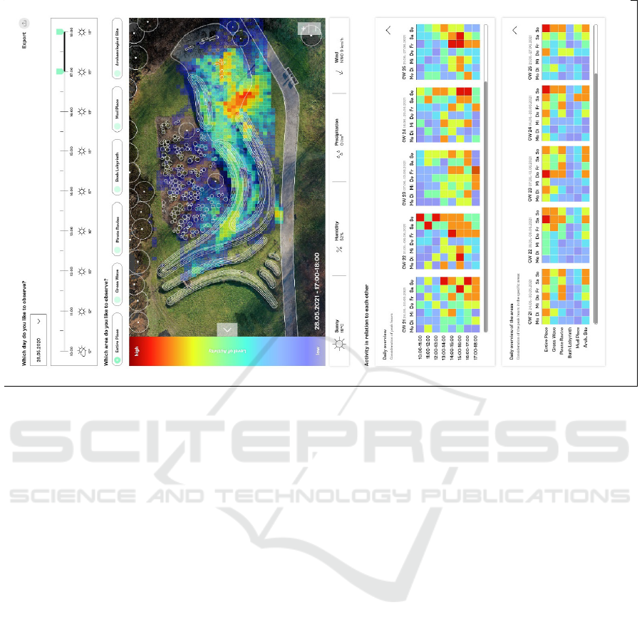
Figure 13: Example for prototyped user-interface.
collect open data in the terms of the Smart City to in-
form stakeholders and thus to provide an objective ba-
sis for discussion of decisions and changes. The com-
plex results are to be made available to urban planners
and interested citizens in an interactive interface.
This interface, an example is given in Figure 13,
will give the opportunity to select individual time
frames, spatial focus and further details of weather
conditions and other measurements that are easily
available and give insights about the circumstances
during the use of the site.
Outlook
In the current visualizations, only the measured ac-
tivity level of a single class (PERSON in the exam-
ples shown in this work) is considered and displayed.
Therefore, one aspect for further work is the evalu-
ation of methods for a consolidated visualization of
activity caused by a set of multiple classes. One goal
here would be to allow a further differentiation of the
underlying activity levels per class. This could be
achieved through the interactive usage of different vi-
sualization layers or the integration of spatial icons in
this activity visualization.
A second step in the further development would
be the improvement of the sensor signal processing
pipeline to achieve a continuous object tracking in-
stead of a semantic segmentation. This leads to the
question of how a long-term aggregated representa-
tion of these directed object movements should be vi-
sualized. These aspects should also be evaluated sub-
sequently in the form of another user-study.
ACKNOWLEDGEMENTS
We thank Felix Lentzen for his technical support and
work related to the described Blender based bird eye
view mapping.
Funding
This work was supported by the European Re-
gional Development Fund under grant number EFRE-
0801082 as part of the project “plsm” (https://plsm-
project.com/).
REFERENCES
Bolleter, J. (2017). Counter intelligence: evaluating wi-
fi tracking data for augmenting conventional pub-
lic space–public life surveys. Australian Planner,
54(2):134–144.
Bolten, T., Lentzen, F., Pohle-Fr
¨
ohlich, R., and T
¨
onnies,
K. D. (2021a). Evaluation of deep learning based
IVAPP 2022 - 13th International Conference on Information Visualization Theory and Applications
154

3d-point-cloud processing techniques for semantic
segmentation of neuromorphic vision sensor event-
streams. arXiv.
Bolten, T., Pohle-Fr
¨
ohlich, R., and T
¨
onnies, K. D. (2021b).
Dvs-outlab: A neuromorphic event-based long time
monitoring dataset for real-world outdoor scenarios.
In Proceedings of the IEEE/CVF Conference on Com-
puter Vision and Pattern Recognition (CVPR) Work-
shops, pages 1348–1357.
Cuellar, K., Jambor, E., Sorornejad, P., and Talpey, S.
(2020). Improving visitor evaluation at the british mu-
seum. Worcester Polytechnic Institute.
Eghteabs, C., Ritter, B., Parikh, A., and Lischke, L. (2017).
Effects of color and threshold on user perception of
heat maps. In Proceedings of the 2017 ACM Con-
ference Companion Publication on Designing Inter-
active Systems, pages 275–279.
Gehl, J. and Svarre, B. (2013). How to Study Public Life.
Island Press, Washington, Covelo, London.
Geospatial, C. T. P. D. (2021). Use cases. https://cesium.
com/use-cases/. Online; accessed 2021-08-20.
Guo, M., Huang, J., and Chen, S. (2017). Live demonstra-
tion: A 768 x 640 pixels 200meps dynamic vision sen-
sor. 2017 IEEE International Symposium on Circuits
and Systems (ISCAS), page 1.
Hunter, J. D. (2007). Matplotlib: A 2d graphics environ-
ment. Computing in Science & Engineering, 9(3):90–
95.
Lauressens, T. (2005). Pedestrian levitation.net. http:
//www.visualcomplexity.com/vc/project.cfm?id=255.
Online; accessed 2021-08-20.
Moreland, K. (2009). Diverging color maps for scientific
visualization. In International Symposium on Visual
Computing, pages 92–103. Springer.
Nielsen, S. Z., Gade, R., Moeslund, T. B., and Skov-
Petersen, H. (2014). Measuring human movement pat-
terns and behaviors in public spaces. a method based
on thermal cameras, computer vision, and geographi-
cal information system technologies. Measuring Be-
havior 2014.
Peysakhovich, V. and Hurter, C. (2017). Scanpath visual-
ization and comparison using visual aggregation tech-
niques. Journal of Eye Movement Research, 10(5).
Qi, C. R., Yi, L., Su, H., and Guibas, L. J. (2017). Point-
net++: Deep hierarchical feature learning on point sets
in a metric space. In Proceedings of the 31st Interna-
tional Conference on Neural Information Processing
Systems, NIPS’17, pages 5105–5114, Red Hook, NY,
USA. Curran Associates Inc.
Rajasekaran, R., Rasool, F., Srivastava, S., Masih, J., and
Rajest, S. S. (2020). Heat maps for human group ac-
tivity in academic blocks. In Business Intelligence
for Enterprise Internet of Things, pages 241–251.
Springer.
Rashed, M. G., Suzuki, R., Yonezawa, T., Lam, A.,
Kobayashi, Y., and Kuno, Y. (2016). Tracking visi-
tors in a real museum for behavioral analysis. In 2016
Joint 8th International Conference on Soft Computing
and Intelligent Systems (SCIS) and 17th International
Symposium on Advanced Intelligent Systems (ISIS),
pages 80–85. IEEE.
Rezaei, M. and Azarmi, M. (2020). Deepsocial: Social dis-
tancing monitoring and infection risk assessment in
covid-19 pandemic. Applied Sciences, 10(21):7514.
Silva, S., Santos, B. S., and Madeira, J. (2011). Using color
in visualization: A survey. Computers & Graphics,
35(2):320–333.
Whyte, W. H. (1979). New york and tokyo: A study in
crowding. Real Estate Issues, 4(2):117.
Whyte, W. H. (1980). The social life of small urban spaces.
Conservation Foundation, Washington, D.C.
Zhou, L. and Hansen, C. D. (2015). A survey of colormaps
in visualization. IEEE transactions on visualization
and computer graphics, 22(8):2051–2069.
Visualization of Activity Data from a Sensor-based Long-term Monitoring Study at a Playground
155
