
A Human-centric Accessible eHealth Booking Web Portal
Zhidian Lin
a
, Hourieh Khalajzadeh
b
, Humphrey O. Obie
c
, Jennifer Mcintosh
d
and Kwangsu Choi
e
Faculty of Information Technology, Monash University, Clayton, Victoria, Australia
Keywords:
Human-centric Issues, Human Factors, eHealth, e-Booking, Web-based Booking System, Elderly, Language,
Culture, Accessibility.
Abstract:
The use of eHealth web portals is rapidly increasing with the extensive demand for eHealth services and
established benefits of using health-related software. Unfortunately, most of these applications underestimate
or even ignore Human-centric issues (HCIs) and thus result in a system that is not fit-for-purpose. This
emphasises the importance of allowing for diverse end-users characteristics, such as age, gender, culture,
occupation, and cognitive impairment, when designing eHealth web portals. In this paper, we describe a study
we conducted involving a preliminary survey in three languages to determine different users’ needs, taking into
account their human-centric issues. We designed an e-booking prototype and evaluated it with user studies.
Our results suggest that age and language are the most crucial human-centric aspects to be considered when
developing an eHealth web portal. The study also provided recommendations for appropriate web design
elements for building human-centric eHealth applications.
1 INTRODUCTION
With the expansion of the World Wide Web 2.0,
awareness of and demand for eHealth has increased
dramatically. People use eHealth applications to de-
rive valuable health information or services and man-
age health conditions (Schnipper et al., 2008; Van
Gemert-Pijnen et al., 2013). However, eHealth ap-
plications that do not consider human-centric issues
(HCIs) are less likely to be fit-for-purpose (Grundy
et al., 2020) and commonly fail because they were
developed without carefully considering HCIs during
their deployment stages (Shamsujjoha et al., 2021).
This study presents how human-centric aspects
might be incorporated in the design of eHealth portals
with a specific focus on accessibility. We aim to iden-
tify the significant gaps among human-centric aspects
in eHealth web portals, increase inclusiveness for di-
verse users, and provide recommendations for apply-
ing the essential human-centric aspects into eHealth
web development. Fundamental human-centric as-
pects such as age, gender, culture, occupation, and
a
https://orcid.org/0000-0003-3271-8458
b
https://orcid.org/0000-0001-9958-0102
c
https://orcid.org/0000-0002-6322-2984
d
https://orcid.org/0000-0002-6655-0940
e
https://orcid.org/0000-0001-6005-2863
cognitive impairment are the main target factors in
analysis. The research focuses on end-users, usually
the primary user groups, during the application life
cycle.
To capture a snapshot of the current state-of-play,
we reviewed a set of 44 existing eHealth web portals
in July of 2021 and compared the results to prelimi-
nary survey results from 138 diverse end-users. The
survey was designed in three languages to increase
the entries of people from different backgrounds and
collect their preferences on colour tone, icon de-
sign, navigation style, and typography. We found
that most eHealth websites were yet to meet different
users’ needs. We implemented an e-booking proto-
type based on the user preferences and requirements
in the survey and evaluated the human-centric issues
through 16 user studies.
By analysing the HCIs, we introduced an in-
tegrated “Accessibility Helper” to increase diverse
users’ access to eHealth web portals. We considered
which features (e.g. changing primary colour, enlarg-
ing font size) were the most popular and necessary
settings, and which design elements (e.g. skeuomor-
phism, flat, material) were the most practical design.
Based on the results, the research findings improved
the user experience of different users and increased
the efficiency and frequency of eHealth services. The
Lin, Z., Khalajzadeh, H., Obie, H., Mcintosh, J. and Choi, K.
A Human-centric Accessible eHealth Booking Web Portal.
DOI: 10.5220/0010992800003176
In Proceedings of the 17th International Conference on Evaluation of Novel Approaches to Software Engineering (ENASE 2022), pages 73-84
ISBN: 978-989-758-568-5; ISSN: 2184-4895
Copyright
c
2022 by SCITEPRESS – Science and Technology Publications, Lda. All rights reserved
73

main contributions of this research are as follows:
• We explored the essential human-centric issues
which led to the eHealth web portals failing to fit
different people’s needs and how these issues af-
fected users’ experience.
• We collected the real-world eHealth websites that
were frequently used in three different countries
when conducting this research and summarized
their general web design elements.
• We identified the different preferences on design
elements, such as colour, navigation, iconogra-
phy, considering different users’ needs.
• We developed an all-built-in-one assistant, “Ac-
cessibility Helper”, for integrating multiple web
accessing features to fulfil different users’ needs.
2 BACKGROUND
2.1 eHealth Web Portals
In the 1990s, the term “eHealth” was defined as a
combination of Information Communication Tech-
nology (ICT) and healthcare (Oh et al., 2005). The
demand for online healthcare has seen explosive
growth since the rise of Web 2.0, in which 80% of
online users seek out health services, particularly in
times of health crises (Akerkar and Bichile, 2004; Van
Gemert-Pijnen et al., 2013). The benefits of eHealth
applications are highlighted as i) avoiding delays in
detection of potential diseases and reducing possible
human errors in treatments (Schnipper et al., 2008);
ii) replacing heavy paper-based records and manag-
ing healthcare data efficiently for nurses and profes-
sionals (Goel et al., 2011); and iii) increasing access
to share or discuss similar symptoms among potential
users and reducing time sourcing health information
(Ancker et al., 2011). All of these benefits increase
the possibilities for large-scale health research and an
improvement in health.
In particular, eHealth web portals are widely
together with mobile health-care apps, namely
mHealth, due to i) engaging data visualization and in-
teraction for the end-users (Boulos, 2003); ii) author-
itative healthcare information or services provided by
professionals (Das et al., 2015); and iii) increasing
accessibility for more senior users who seek health-
care guidance via portals (Gordon and Hornbrook,
2018). Web-based booking systems, a win-win so-
lution for patients and medical clinics, are the starting
point for most non-urgent healthcare services. The
e-scheduling software brings specific positives such
as a reduced no-show rate, decreased waiting time
and staff labour, and increased decision-making free-
dom for patients’ preferred time and/or medical pro-
fessional (Par
´
e et al., 2014; Zhao et al., 2017). Un-
like appointments via phone, booking via emails or
health-related applications is an much preferred alter-
native for some patients, for example autistic people
since they may have limited verbal capacity and ex-
perience anxiety when communicating with strangers
(Bradshaw et al., 2019).
2.2 Human-centric Issues on eHealth
Web Portals
Applications and software systems should be de-
signed and built to allow for human individuality
(Kotronis et al., 2019). In terms of human-centric
aspects, they refer to age, gender, language, culture,
emotions, personality, education, occupation, physi-
cal and mental challenges, and cognitive impairment
(and other traits) (Grundy et al., 2020). Human-
centric issues (HCIs) refer to the problems brought
about by a failure to consider and adapt software for
human-centric aspects (Shamsujjoha et al., 2021).
For instance, there is an increased prevalence
of cognitive degeneration associated with ageing
(G
´
ongora Alonso et al., 2020), people aged 65 and
over (Au et al., 2017) who, in Australia, are mainly
female. Given most software developers are male in
their 20’s (Grundy et al., 2020), who are less likely
to develop software that identifies distinctive charac-
teristics for diverse end-users (Venkatesh and Morris,
2000; Schnipper et al., 2008; Smail-Crevier et al.,
2019), it is not uncommon for software to be less in-
clusive for older Australians. The lack of access to fit-
for-purpose software to monitor their health can lead
to a negative user experience and potentially worse
health outcomes as a consequence. Specific cases in-
clude patients with cancer who have identified a pref-
erence for personalised eHealth tools, as many have
identified they are no personalised settings in the tools
they used (Van Gemert-Pijnen et al., 2013).
Apart from the eHealth background in academic
literature, reflecting available online health systems
in the open market as part of the research is vital
(Maramba et al., 2019). We collected 44 eHealth
websites that were mostly used in Australia, Korea
and China and comparing the design of those web-
sites with a preliminary survey we conducted to col-
lect different users’ preferences on eHealth web por-
tals, more details of which will be discussed in the
following section.
ENASE 2022 - 17th International Conference on Evaluation of Novel Approaches to Software Engineering
74
3 METHODOLOGY
Questionnaires are still the most frequent approach
of usability evaluation in the eHealth field, followed
by task completion and the ‘Think-Aloud’ method
(Maramba et al., 2019). For this reason, the research
was conducted using quantitative and qualitative anal-
ysis. The workflow of this study is i) A preliminary
survey was conducted in three languages to under-
stand diverse users’ preferences/needs and how they
feel about the current eHealth portals; ii) The survey
results were compared with the collection of the top
eHealth webs to see the gaps on real-world eHealth
webs; iii) An eHealth web prototype designed based
on the survey responses; and iv) Several user studies
for the prototype using a ‘Think-Aloud’ protocol. We
guide the study by answering the following research
questions:
• What human-centric aspects are essential for
eHealth webs? (Section 4)
• How a prototype take into account these human-
centric aspects? (Section 5)
• How to evaluate such a prototype considering
human-centric aspects? (Section 6)
4 RQ1: WHAT HUMAN-CENTRIC
ASPECTS ARE ESSENTIAL
FOR eHEALTH WEBS?
4.1 Preliminary Survey
4.1.1 Data Collection
An anonymous survey was conducted via Google
Forms in English and Korean, and Wenjuanxing
1
in
Chinese to explore a range of answers from peo-
ple from diverse backgrounds. We invited eHealth
web stakeholders such as medical practitioners, re-
searchers, and general users from diverse cultures,
ages, genders and occupations. There were no exclu-
sion criteria at this stage.
The preliminary survey was designed and divided
into three parts as follows: i) The participants re-
sponded if they had used an eHealth website: if YES,
they were asked to leave their impression - using emo-
tional language like trust, surprise, neutral, fear, anger
- and comments about the eHealth website they had
used recently; if NOT, they were asked their per-
spectives of three sample health-related websites sug-
1
Wenjuanxing: Online survey platform. Retrieved from:
https://www.wjx.cn/
gested by the authors. The three samples were se-
lected because of their different user interface de-
signs; ii) We provided screenshots of different online
eHealth setting examples in the questionnaire. The
participants were asked the purpose of their eHealth
application use, and to choose their preferences re-
garding the colour theme, font size, navigation design
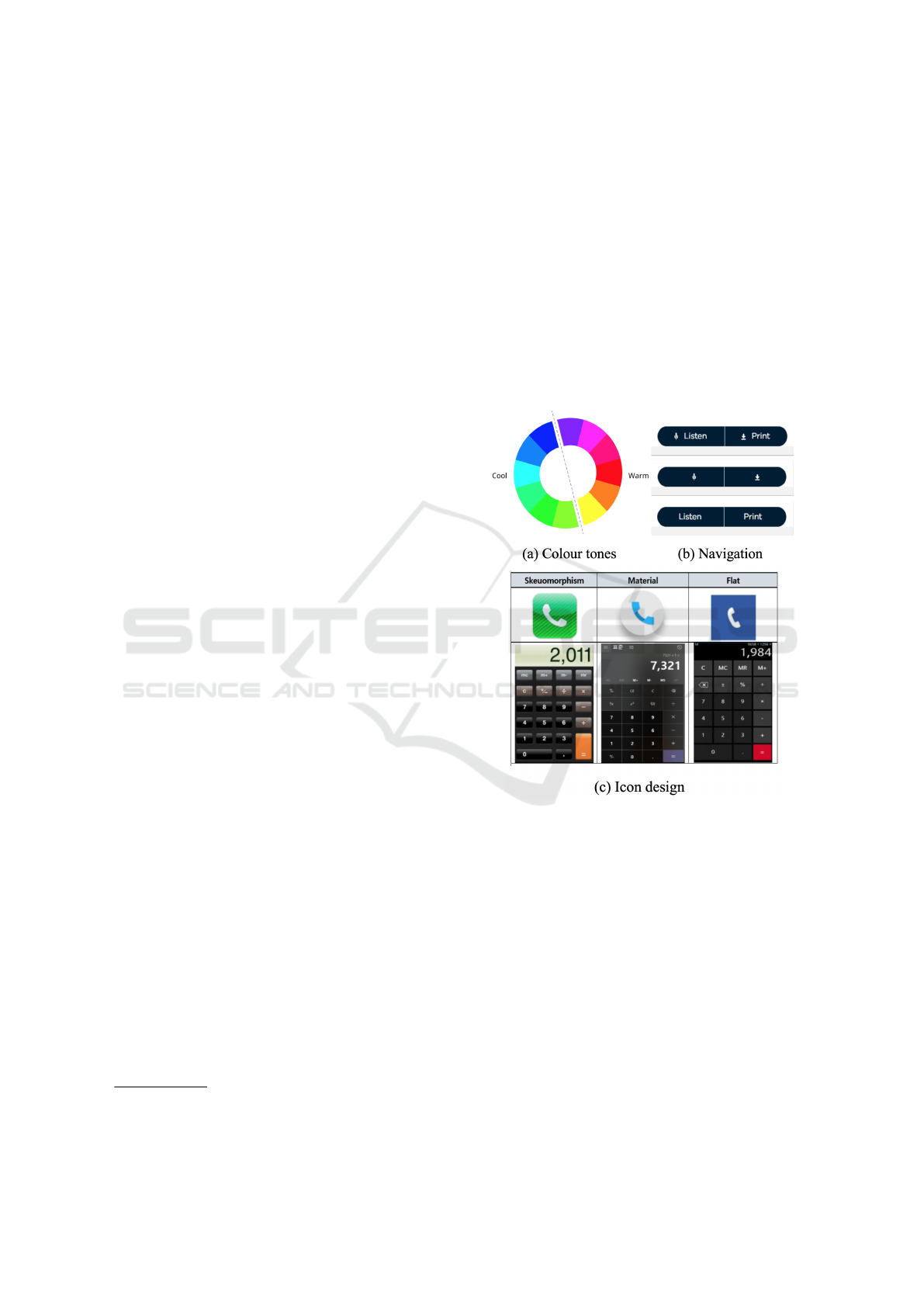
and icon design (see Figure 1). They were asked to
provide information about their specific devices be-
forehand as the font size may vary depending on their
responsive devices; and iii) Data about their demo-
graphics such as age, gender, education, language,
occupation, and whether they had any chronic health
conditions, were collected.
Figure 1: Screenshot of part of the preliminary survey, ask-
ing for UI preferences.
The aim was to analyze and understand which
human-centric aspects should be considered when de-
veloping an eHealth application based on the data and
preferences of the end-users preferences. We received
146 responses within two weeks of posting the ques-
tionnaire on Social media platforms such as Linkedin,
Wechat, and Kakao Talk. Extracted responses were
recorded on a spreadsheet for data preparation, with
each row representing one participant’s entry. The
study was approved by the Monash University Human
Research Ethics Committee.
A Human-centric Accessible eHealth Booking Web Portal
75
4.1.2 Data Analysis
Firstly, the researcher whose main language is Chi-
nese/Korean translated the responses from the Chi-
nese and Korean surveys into English and merged
them into the English survey for data preprocessing.
Of all the returned questionnaires, eight were deleted
because two were test answers before officially re-
leasing the surveys, and six were invalidated answers
that revealed inconsistency among responses demon-
strating possible biases between occupation and fre-
quency of online access. At this stage, we had a fi-
nal set of 138 valid responses for further data anal-
ysis. We cleaned the dataset using Microsoft Excel
and performed quantitative analysis using Python and
SPSS
2
with Chi-square. Each human-centric aspect
was analysed individually to see which arguments had
significant results and to determine any relationships
between multiple arguments.
4.2 Survey Results
4.2.1 Demographics
Except for two participants who preferred not to iden-
tify their gender, the distribution of gender was 61%
female and 38% male, 55% of them were aged from
18 to 35, while 45% were aged over 35. Among all
the participants, 84% of them had experience with
eHealth applications, and 22.5% disclosed a self-
reported chronic health condition.
People from nine different nationalities filled in
the survey. They reported having 18 occupations such
as government employee, IT developer, home duties,
health professional, researcher, student, and retired.
Among the sample, 83% lived in urban areas, and
66% self-reported their Internet speed as fast to very
fast and held a college or bachelor degree. They self-
evaluated their basic computer skills as moderate to
high/very high as 51% and 38% respectively, and 85%
of them reported to be daily active users.
4.2.2 Age
Among all the human-centric aspects, older age was
associated with significant differences for preferences
with colours, icon and navigation design. We per-
formed a chi-square analysis and found that advanc-
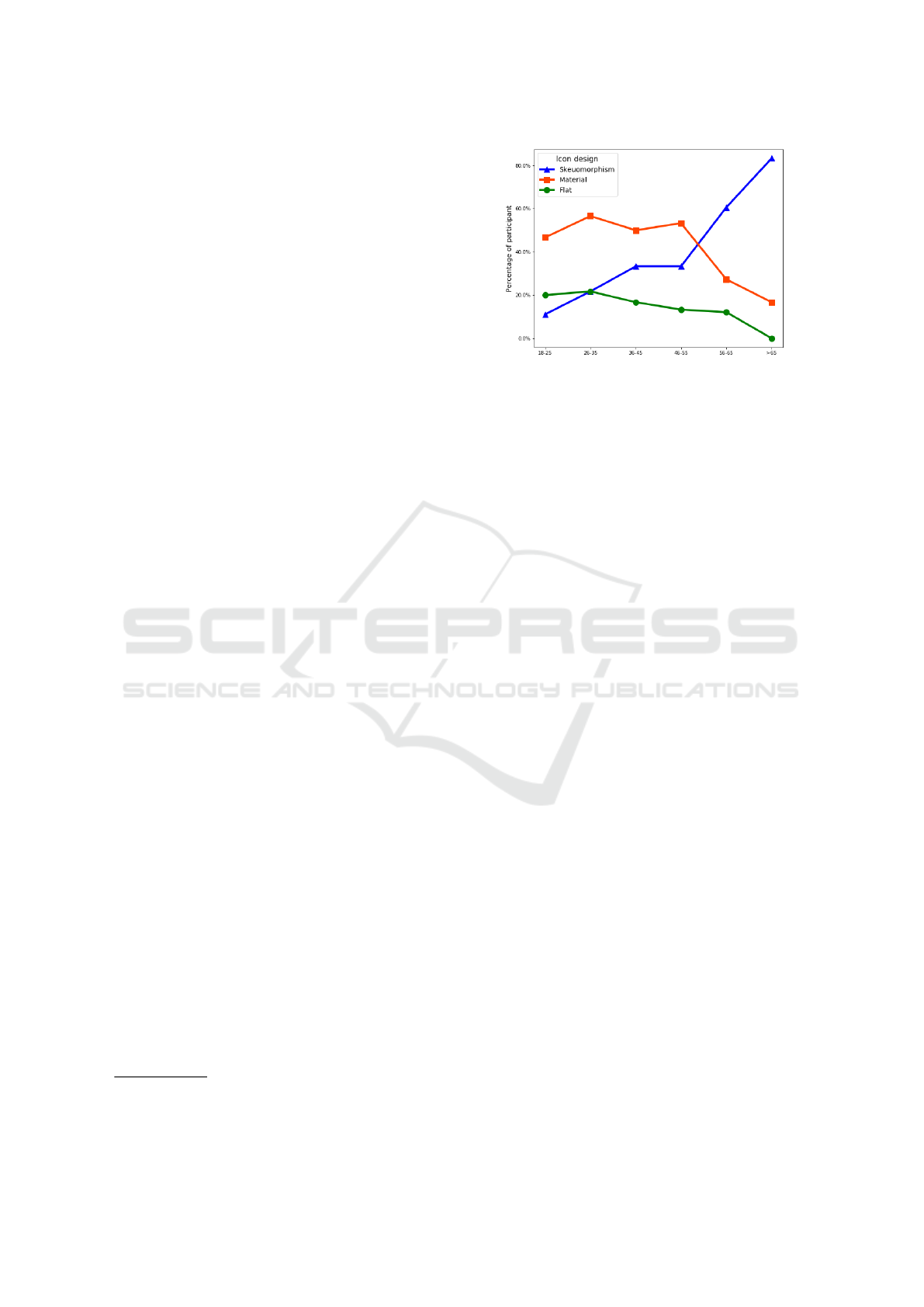
ing age and icon design were significantly related
(p = 0.01), which showed a dramatically increasing
trend of preferring skeuomorphic design with advanc-
ing age (see Figure 2).
2
SPSS Online: data analysis tool. Retrieved from:
https://spssau.com/en/index.html
Figure 2: Correlation between age groups and icon design
preferences.
However, there was no significant difference de-
tected in preferences for Colour theme or Navigation
design. The elderly had a strong preference for warm
colour toned web pages while 18 to 65 aged people
were more likely to choose cool colour themes. It
was possible that the colour preferences among el-
derly were more likely to be based on their visual
perception rather than their fondness of that colour.
Regardless of age, both icon and text remained the
most favourite navigation design, which may be be-
cause both icon and text revealed more transparent
navigation than icon only and were a more impressive
design than text only.
4.2.3 Other Human-centric Aspects
Although there was no significant difference for other
human-centric aspects, our results describe other
human-centric aspects (other than age) including:
Chronic Health Condition - the only significant re-
sult found in people with chronic health conditions
was icon design (p = 0.001). Results showed that
42% of those who answer positively to chronic health
conditions would prefer Skeuomorphism. Those who
responded “Yes” and “Unsure” shared similar prefer-
ences, of which around 70% preferred the bigger font
size. The reason for the font size preference may be
due to a high correlation between having a chronic
health conditions and being an older adult.
Gender - we did not find any significant differences
between genders since they shared the same pattern
of preferences. Female and male participants’ prefer-
ences for cool colour were 55% and 52%, and warm
was 39% and 40% respectively. Similarly, their pref-
erences for icon design were 20% and 21% for Flat,
44% and 42% for Material, 33% and 37% for Skeuo-
morphism. Interestingly, they both had a strong pref-
erence for both icon and text (85% and 79%).
Occupation - there were no significant results found
for occupation. Surprisingly, students were the group
ENASE 2022 - 17th International Conference on Evaluation of Novel Approaches to Software Engineering
76
that most frequently picked “No preferences” while
the other occupations had preferences for colour and
icon design. As for those who are IT developer and
designer, colour theme was generally the most impor-
tant feature compared to icon design and other web
design elements.
5 RQ2: HOW A PROTOTYPE
TAKE INTO ACCOUNT THESE
HUMAN-CENTRIC ASPECTS?
5.1 Real-world eHealth Webs
To see the gaps between real-world eHealth web por-
tals and HCIs, we collected the top eHealth websites
in Australia, Korea from App Annie
3
and China from
Top.chinaz
4
, and eHealth websites collected from the
preliminary survey that will be discussed in the fol-
lowing section.
Forty-four eHealth websites were collected and
reviewed by the first author on their colour tones, icon
design, navigation design, language and font size, and
cross validated by two of the other authors. Compared
to the results from 44 online eHealth web and survey
respondents, it was evident that there was a big gap
between what the end-users need and what the on-
line applications looked like (see Figure 3-5). This
included e-booking systems which this study is using
as an example for how to address HCIs in eHealth de-
velopment.
5.2 e-Booking Prototype
Based on the preliminary survey analysis, we de-
signed an e-booking system prototype using Figma
5
.
The prototype followed Web Content Accessibility
Guidelines (WCAG) V2.0 Level AAA (Isa et al.,
2016). We introduced features, Language, Colour
theme, Dark mode, Enlarge text, Voice Assistant and
Simplify design for the user to modify the website
based on their personal preferences.
As for the layout of “Accessibility Helper”, we
provided two designs for the users: a robot design
3
App Annie: Application/Web data analytics platform.
Top eHealth web usage in Australia and Korea. Retrieved
from http://AppAnnie.com. (data collected by July 25,
2021)
4
Top.chinaz: Website ranking analytics platform.
Top eHealth web usage in China. Retrieved from
http://top.chinaz.com. (data collected by July 25, 2021)
5
Figma: Interface design tool. Retrieved from:
https://www.figma.com/
Figure 3: Gaps on colour between the design of online
applications and the preferences from preliminary survey.
79.5% online websites are using cool colours, which is con-
sistent with the result that most participants in the survey
preferred cool colours.
Figure 4: Gaps on navigation style between the design of
online applications and the preferences from preliminary
survey. 82.6% participants preferred both icon & text style
reported in the survey, while 22.7% online eHealth web-
sites designed in both icon & text. Instead, 77.3% online
websites designed in text only.
Figure 5: Gaps on icon design between the design of on-
line applications and preferences from preliminary survey.
33.5% participants preferred skeuomorph design in the sur-
vey, while one online website (2.3%) adapted skeuomorph
design. 68.2% of online eHealth websites designed in flat
icon, while only 20.3% participants preferred flat design re-
ported in the survey.
(Figure 6a) when the user first accessed the page and
the other one is a button design (Figure 6b) when the
user continued to browse the page. After clicking ei-
ther design of “Accessibility Helper”, a pop-up win-
A Human-centric Accessible eHealth Booking Web Portal
77
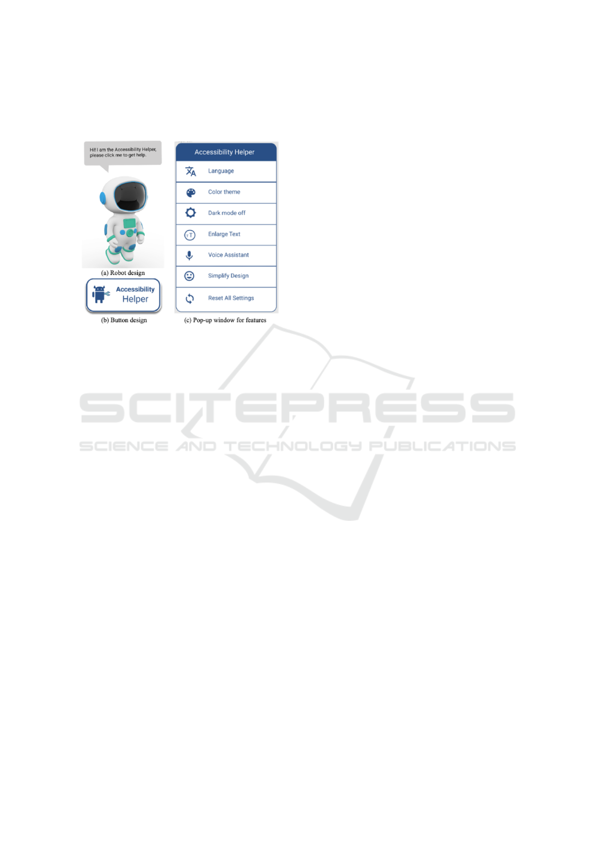
dow (Figure 6c) lists all the corresponding features.
The summary of each feature in the extended tool
“Accessibility Helper” is listed below:
Figure 6: Screenshot of Accessibility Helper.
Language - There is only an English-Chinese trans-
lation in this prototype, each web page of it was de-
signed in both English and Chinese. User could ap-
plied either language and the first author manually did
the translation of the web page.
Colour Theme: We applied the colour palette, which
allows users to feature the significant colour of the
web page. Users were able to choose from 70 dif-
ferent colours, which were pre-defined in the primary
colour palette. Moreover, they could also customise
their preferred colours after clicking “More colour”
option.
Dark Mode: Similarly to the Colour theme, we
also performed light-on-dark colour schemes, namely
Dark Mode. The user was able to select this option to
convert all text, icons, and elements light-colour to a
dark background.
Enlarge Text: Participants could control a scroll bar
to enlarge the font size of the web page. As the pref-
erences on font size varied in the preliminary survey,
there was a need to have a wide range of font sizes
collected from 8pt to 22pt.
Voice Assistant: Since there is no natural language
processing (NLP) tool in Figma, the first author sim-
ulated this for the user study, which would be con-
sidered for implementation in future research. When
the users accessed the web page, if they would like to
have voice instruction, they were able to click the fea-
ture for requiring voice assistance which the author
simulated.
Simplify Design: From the preliminary survey, most
participants, regardless of their age, felt more hesi-
tant and struggled when seeing too many navigation
options or context on a web page. Therefore, we in-
cluded a Simplify design feature to minimise three
different navigation bars into two and shorten mul-
tiple lines of text into three lines.
Reset All Settings: This enabled all customised fea-
tures to go back to the default setting with English
content, blue colour theme (due to 68% of 44 online
eHealth webs mentioned in the background section
are designed in blue), 10pt font size (due to most par-
ticipants responded to it in the preliminary survey),
simplify design and dark mode off.
6 RQ3: HOW TO EVALUATE
SUCH A PROTOTYPE
CONSIDERING
HUMAN-CENTRIC ASPECTS?
6.1 User Study Design
We performed 16 user studies with participants from
different demographic backgrounds to investigate the
usability of the prototype. Participants were recruited
if they positively responded to a subsequent user
study invitation in the preliminary survey or a sec-
ondary recruitment advertisement on social media. To
increase the reach of the survey, the only eligibility
criteria was being able to access the Internet.
The user study was conducted via different Zoom
sessions and held for 30 (±5) minutes on average.
Each session began with a brief explanation, consent
from the participant and instructions about the user
study mediated by the first author, followed by some
basic tasks and a corresponding questionnaire com-
pleted by the participants. The study was approved
by the Monash University Human Research Ethics
Committee. The questionnaires were created in two
languages -English via Google Form and Chinese via
Wenjuanxing- by the first author. The other languages
such as Korean will be discussed in the future.
The questionnaire was divided into two parts: i)
the basic background information including age, gen-
der, whether they have any chronic health issues and
a simple vision test; and ii) four major tasks of ap-
plying personalised features through “Accessibility
Helper” for the website layout before booking an
appointment. Those four steps included changing
colour theme, adjusting font size, setting dark mode,
and applying multi-language translation. During the
tasks, each participant was instructed to share his/her
screen and encouraged to state what they were think-
ing as per the ‘Think-Aloud’ approach (Eccles and
ENASE 2022 - 17th International Conference on Evaluation of Novel Approaches to Software Engineering
78

Arsal, 2017), while the first author recorded their
statements. The accessibility of the prototype was
evaluated through the participants’ statements dur-
ing the tasks and their self-reported evaluation of the
questionnaire. In order to evaluate the prototype, we
categorised four domains from the software quality
characteristics including Effectiveness, Satisfaction,
and Efficiency (Ferreira et al., 2020) and Adaptation
which emerged from the analysis. The evaluation cri-
teria are examined (see Table 1).
Table 1: Evaluation criteria of the user study.
Domain Domain Description
Effectiveness The completeness and the as-
sociated accuracy of follow-
ing the tasks on the e-booking
prototype.
Satisfaction The score the participants
rated to Language, Colour
theme, Dark mode, Font size
and Overall satisfaction.
Efficiency How the participants consider
the e-booking prototype is
easy to learn and easy to re-
member.
Adaptation Which feature/setting of Ac-
cessibility Helper would the
participant adapt on their sec-
ond visit.
6.2 User Study Results
This section follows the four domain evaluation cri-
teria discussed in user study design. The quantitative
outcomes were analysed using SPSS.
6.2.1 Participant Characteristics
Sixteen responses were included in the data analysis
stage. Participant characteristics are presented (see
Table 2). The gender distribution for male and female
participants was 7 to 9, and half of them were over
35-year-old. Four participants responded positively
to having existing chronic health issues and did not
correctly identify all the numbers in the vision tests in
the questionnaire.
6.2.2 Effectiveness
The completeness of tasks was 100%, while the ac-
curacy was 88% since two participants were initially
uncertainty but after being given instructions by the
first author, they completed the tasks. As for the
unclickable places, a female participant aged 26-35
clicked the chatbox to apply “Accessibility Helper”
rather than clicking the robot itself instead. This was
likely because the robot view (Figure 6a) of “Acces-
sibility Helper” was not a traditional mode of interac-
tion such as a button (Figure 6b).
However, three participants over 56 highlighted
the attractiveness of the Robot design of Accessibility
Helper. The elderly were less likely to quickly iden-
tify the desired clickable elements of the web page
if there were several selectors or buttons in distinctly
presented places as they felt distracted by a web page
designed with too many colours and long paragraphs.
This was consistent with the findings from our pre-
liminary survey.
From our survey responses, the third sample
eHealth website had too much text on the web page
(approximately a third of the screen) and was the least
favourable design. 19.2% of people felt a degree of
discomfort and fear; the second sample eHealth web-
site was annoying as it contained too many entries
(eight selectors simultaneously). Participants aged
18-25 could quickly determine the correct approach
to primary navigation, side navigation and foot navi-
gation. At the same time, the elderly preferred to look
at primary navigation first regardless of the tasks and
felt confused having more than two navigation bars
on the same web page.
In our analysis of the existing eHealth web portals,
only eight among the 44 objective eHealth portals
observed offered language translation, even though
eHealth recommendations are to provide local lan-
guages supported by pictures and universal icons
(Wickramasinghe et al., 2006). This is because when
people access an eHealth website, not in their mother
language, they typically look at the intuitive icon and
guess where it would navigate them.
We found that not all icons are able to convey
the correct meanings, for example, flat design icons
lose most of the shadow and shape of content to sim-
plify the design but confuse its meaning, especially
for non-active online users. We showed two buttons
designed in icon only (Figure 1b) in the preliminary
survey to two participants aged over 65 and asked
them to guess what the buttons were for. Not sur-
prisingly, one non-active online user considered the
“Listen” button as a “Light” button by which he could
increase the lightness of the tool, and he had no idea
what the “Print” button was. Another daily active user
in a similar age considered the “Listen” button as a
“Speaker” which was close to the proposed meaning
but felt confused by the “Print” button as to whether it
meant “Next page” or “Download”. In this case, with-
out any context near the icon, skeuomorphism design
seemed to be a better alternative compared to a flat
A Human-centric Accessible eHealth Booking Web Portal
79
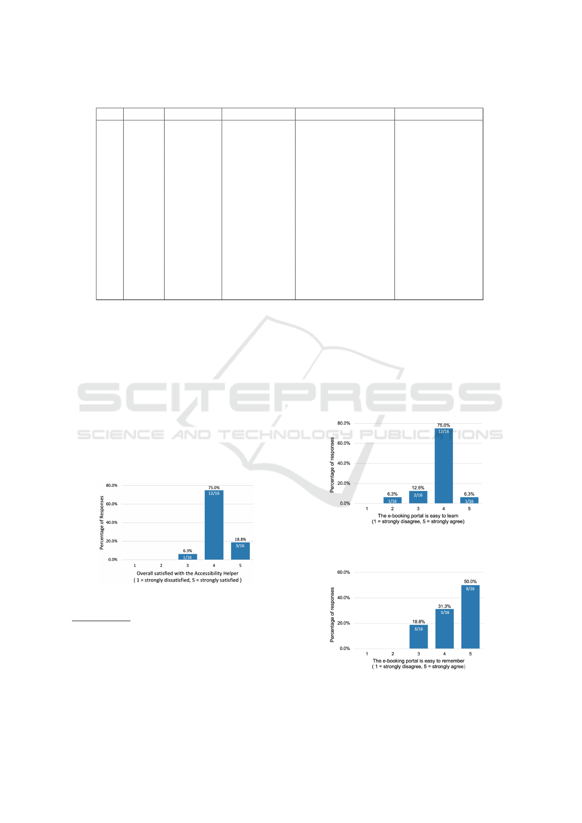
Table 2: Participant characteristics of the user study.
Gender Age group
6
Main Language Chronic health issues
7
Visual impairment
8
P1 Male 26 – 35 English Unsure No
P2 Female 18 – 25 Chinese No No
P3 Male 18 – 25 English No No
P4 Female 26 – 35 Chinese No No
P5 Female 26 – 35 English Unsure No
P6 Male 46 – 55 Chinese Yes Yes
P7 Female 36 – 45 Chinese Yes Yes
P8 Female 46 – 55 Chinese Unsure Yes
P9 Male >65 Chinese Yes Yes
P10 Female 18 – 25 Chinese No No
P11 Male 56 – 65 Chinese No No
P12 Female 56 – 65 Chinese No No
P13 Female 26 – 35 English No No
P14 Male 18 – 25 Chinese No No
P15 Female >65 Chinese Yes Yes
P16 Male >65 Chinese Unsure No
design especially for elderly users.
6.2.3 Satisfaction
No negative feedback on “Accessibility Helper” was
revealed from all the user studies and overall, all par-
ticipants were satisfied with the Accessibility Helper.
Our analysis showed that Language was the feature
people were most satisfied with, with a score of 4.8/5,
followed by Font size 4.4/5, Colour theme 3.7/5, and
Dark mode which was the lowest at 1.9/5. Most par-
ticipants, regardless of age and gender, were pleased
to access an eHealth web portal with the personalised
setting “Accessibility Helper” rating 93.8% satisfac-
tion (see Figure 7).
Figure 7: Distribution of participant agreement with the
prompt “Overall, I am satisfied with the Accessibility
Helper”.
6
Participants were asked to identify their age in a range
rather than specific chronological age.
7
Chronic health issues were self-reported by the partic-
ipant himself/herself, we did not go into detail for specific
health issues if they answered positively to this question.
8
Visual impairment was evaluated by whether or not the
participant could correctly identify all the numbers in the
colour blindness test in the questionnaire.
6.2.4 Efficiency
We found that 81.3% participants considered booking
appointments on the eHealth prototype is easy to learn
(see Figure 8) and same percentage of those who con-
sidered it easy to remember (see Figure 9). However,
the proportion of ”strongly agree” in easy to remem-
ber (50%) is larger than those proportion of ”strongly
agree” in easy to learn (6.3%).
Figure 8: Distribution of participant agreement with the
prompt “I consider this e-booking portal is easy to learn
with the Accessibility Helper”.
Figure 9: Distribution of participant agreement with the
prompt “I consider this e-booking portal is easy to remem-
ber with the Accessibility Helper”.
ENASE 2022 - 17th International Conference on Evaluation of Novel Approaches to Software Engineering
80

The Participants over 65 preferred a software that
was easy to learn rather than a fancy design software
but difficult to figure out. They were more likely to
feel less patient and struggled more when complet-
ing the user study. For instance, a participant aged 81
mentioned that he barely used Internet-based facili-
ties, and as for seeing a doctor, he would generally go
to the clinic in the rural area and wait for an on-site
appointment. The benefit of saving time by using on-
line appointment system did not attract older people
since they were not as time pressured when seeing a
doctor in a non-emergency setting. He also mentioned
that there were too many points where he had to press
on the application which would make him hesitate to
continue:
”The first step for e-booking was to enter a
keyword of clinic or doctor, but I was bad at
typing. Still, there are several ‘Press’ which
I do not think I can perform correctly next
time on my own. . . . I have plenty of time to
waste. . . . I prefer a face-face appointment at
the clinic from where I can ask the nurse for
further instructions.” [P9]
He also pointed out that less click and entry would
be a must for him to master the tool, which should
be considered since a third of all web searches are in-
voked not by typed but by voice query in 2019 (Cam-
bre et al., 2021). Although Voice Assistant was per-
formed as a roughness of functionality in the pro-
totype design, we could still see there was a huge
need for voice assistance among the elderly through
the user study. While the importance of voice inter-
action with Internet-based applications is obvious, a
tiny fraction was estimated to be available in 2019
(Cambre et al., 2021). All participants over 65 used
Voice Assistant during the tasks, and most of them
mentioned that they usually need instructions when
accessing eHealth web portals on their first use.
6.2.5 Adaptation
Studies have shown that the following common prob-
lems affect patients when using web-based schedul-
ing: being unaware of the web-based appointment
service; low penetration and distrust of the Internet;
low computer skills; and the preference for verbal
communication (Zhao et al., 2017). We explored
which accessibility settings the participants preferred
to apply for their subsequent access and found the
features of importance to address for subsequent ac-
cess were Language (13/16, 81.3%), Font size (10/16,
62.5%), Colour theme (4/16, 25%), Dark mode (1/16,
6.3%), although two participants preferred to keep the
default setting unchanged (see Figure 10).
Figure 10: Distribution of participant agreement with the
prompt “I would like to apply this feature on my next access
to the eHealth web portals”.
In order to rank each feature, we combined the
ranking of the Satisfaction and Adaption domains.
Interestingly, we found the ranking of all the features
in the Adaptation domain were the same as those in
Satisfaction, which from high to low were Language,
Enlarge text, Colour theme and Dark mode. We
discuss these in more detail below:
Language - Linguistic differences are one of
the top priorities among human-centric aspects.
Fourteen participants were not native English speak-
ers, and therefore most of them thought Language
was crucial since they were more likely to access
eHealth websites in their mother language. One
Chinese participant aged 26-35 living in Australia
also emphasised the importance of the “Filter doctors
by language” function in the prototype:
“My first appointment in Australia was with
a non-Chinese speaking doctor. Before seeing
her, I checked the terms like “symptom” and
“penicillin” which I had a history of drug al-
lergy, in case I did not understand the medical
words. . . . Well, there were still some terms I
did not catch, and I had to use onomatopoeia
to express where I was in pain.” [P4]
She added that Language should be considered in
eHealth web portals, even for people whose second
language is English since they might not understand
all the medical terms.
Enlarge Text - All elderly participants empha-
sised the necessity for enlarged text functionality.
Usually, they would hold the phone close to their face
if they could not see the font clearly on their phones
but they cannot hold the desktop close to their eyes
at home. They would be more likely to bow their
upper body torso or straighten their neck to actively
approach the computer screen to see the content more
clearly. 57.1% elderly prefer to enlarge the text on
the web page and thus they can see a larger font
clearer with a relatively comfortable posture sitting
on a chair.
A Human-centric Accessible eHealth Booking Web Portal
81

Colour Theme - We should carefully consider the
colour used on the eHealth website since people over
55 usually feel negative if the colour does not fit their
preferences and colour insensitivity and poor eyesight
are strongly correlated older age. For example, an 81
year old participant was only able to identify a red
digit in the colour test, saying that the size of that digit
was the largest even though the size of all the digits
were the same while their contrast colour was not.
Similarly, four participants were not able to recog-
nise a digit in light green colour possibly because they
were not sensitive to light green with less contrast in
background colour. Those four participants with poor
visual impairment had different colour preferences.
Half of them were resistant to the red colour while an-
other half were in blue. It also shows that those with
poor vision or colour blindness demonstrate a more
substantial interest in Colour theme than other users.
Interestingly, most users preferred cool colours,
which was consistent with the results from the
preliminary survey (participants who preferred cool
and warm colours were 53% and 39%, respectively).
This may because participants who preferred the red
colour theme were all from China. This may well be
a cultural association as Chinese people, especially
the elderly with traditional beliefs, consider red as
positive (e.g. luck, marriage and new year) while
others with negative feelings (i.e. anger). These
colour–emotion associations are highly likely to be
reinforced by the culture, given that red is the primary
colour of its national flag (Jonauskaite et al., 2020).
In the same vein, red clothing was highly regarded
as the hierarchy of nobles in ancient times. Even
after thousands of years, this colour has penetrated
the Chinese consciousness and subconsciousness
to affect their feelings and reactions (Ying and
Xiaohong, 2020).
Dark Mode - Among all the features, Dark mode was
the setting with the greatest differentiation among all
the participants. Participants over 65, especially those
with colour cognitive impairment, felt rejected when
seeing a website containing a much darker colour. As
per her comment:
“I do not like this dark design. I feel un-
happy to seek health information. It will leave
a bad impression the first time I see a web in a
mostly dark colour. I will change to a lighter
colour to suit my taste through “Accessibility
Helper.” [P15]
Instead, participants aged 18-25 thought it was cool-
looking and reduced visual fatigue in low-light envi-
ronments when using online tools for a long duration
(Erickson et al., 2021), especially for computer graph-
ics artists and software programmers.
7 DISCUSSION
7.1 Key Findings
The findings of this study suggest that age and lan-
guage are the top priorities among human-centric as-
pects to consider when designing eHealth web por-
tals. Other human-centric aspects, such as gender, oc-
cupation, health condition, and culture, should also be
considered. From the preliminary survey, the design
efforts in the eHealth prototype, and user studies we
conducted, it is obvious that the design elements were
different depending on the users’ age groups and/or
their visual impairment. Their preferences should be
a consideration when designing a more human-centric
tool.
Although there was no statistical significance in
the preference of the colour of the web page, most
participants’ emotions were demonstrated to be af-
fected by the colour. They expressed negative feelings
about the inappropriate colour used on the web appli-
cation and positive emotions about being willing to
access the websites if the colours were in their taste.
people over 55 reported similar accessibility issues as
65 and despite not being in the ‘elderly’ category, they
still need their human aspects to be considered when
developing software, especially since visual impair-
ment post 55 is almost universal.
The user studies to evaluate our e-booking web-
portal with the “Accessibility Helper” option revealed
that evaluating eHealth web portals to satisfy diverse
users and accommodate their needs using a prototype
is vital to improving the user experience. An in-built
all-in-one Accessibility Helper could provide differ-
ent users with all the features designed in human-
centric aspects anticipated. A prototype allows users
to have a more intuitive experience before and after
applying different features, and the ‘Think-Aloud’ ap-
proach is a sound method for capturing their feelings
and responses appropriately.
7.2 Limitations
Limited sample size, and not including sufficient
older adults aged over 65 from diverse backgrounds,
are potential limitations for this research. These
groups are less likely to access the Internet as fre-
quently as the people in their 20s. Online recruit-
ment was difficult, especially for the late-elderly (75
ENASE 2022 - 17th International Conference on Evaluation of Novel Approaches to Software Engineering
82

and older), and the restrictions of conducting face-to-
face user studies were restricted during the COVID-
19 pandemic. We did not include people less than
18 in our participant groups for ethical reasons, and
therefore their needs for eHealth web portals were not
included.
The lack of detail in the preliminary survey about
the specific chronic health conditions people reported
means our results are not generalisable for all chronic
health issues. Similarly, only four vision tests for
colour-blind or visual impairment are insufficient to
diagnose all visual impairment which might bias the
results leading to colour-blind people considering the
Colour theme as the top priority or short-sighted peo-
ple choosing Enlarge text as the main priority.
The race distribution of the elderly was skewed to
Chinese participants and potentially led to bias. This
result in the fact that most elderly preferred red colour
as the main colour tones of a eHealth web portal be-
cuase of the culture and colour–emotion associations.
7.3 Future Work
This research principally analysed fundamental de-
mographics like age, gender and cognitive impair-
ment. Wider demographic area, including more dif-
ferent languages, more respondents, especially elder
ones with a higher participation of chronic problems,
will be our future direction. This research did not
involve other human-centric issues such as person-
ality, education, and users with special needs. Also,
the prototype involved a robot design of “Accessibil-
ity Helper” without a skeuomorphism button designed
for the evaluation, which we will take into account in
our future work. In the future research, we will also
analyse whether such a human-centric eHealth web
portal is applicable to target users and actual patient
data.
8 CONCLUSION
This research investigated human-centric issues in
eHealth web applications. We conducted a prelimi-
nary survey and designed a prototype which we eval-
uated with 16 user studies. The study suggests that
age and language are two contributing factors to con-
sider when developing a human-centric eHealth web
portal. Different colours for the web page are mostly
preferred based on users’ visual status and their per-
ceptions of that colour by personal taste and culture.
The most compelling evidence could be that tradi-
tional Chinese elderly prefer red colour and feel dis-
comfort with mostly dark colours, while the younger
generation aged 18-25 are more likely to use darker
design (i.e. dark mode).
The majority of survey results and user studies in-
dicate that icon and text buttons could be the best way
to navigate web pages where “icon only” appears to
be a poor design practice, especially for non-active
online elderly users. For most elderly participants,
skeuomorphism is more comprehensive instead of flat
design. Similarly, preventing excessive entries and
clicks as well as reducing redundant paragraphs on
the same page could increase efficiency and effec-
tiveness, particularly for the elderly to approach the
eHealth applications by themselves. Not surprisingly,
enlarging font size seems to be a necessary setting for
poor eyesight regardless of age and gender. To em-
phasise, an all-built-in-one “Accessibility Helper” is
sufficiently important for different users when access-
ing the eHealth web portal. Such a helper could con-
sider more human-centric issues and, as a result, in-
crease adaptation of the eHealth applications and sup-
port health information widely accessible for diverse
user groups.
ACKNOWLEDGMENT
Support for this work from ARC Laureate Program
FL190100035 and Discovery Project DP200100020
is gratefully acknowledged.
REFERENCES
Akerkar, S. M. and Bichile, L. S. (2004). Doctor patient re-
lationship: changing dynamics in the information age.
J. Postgrad. Med., 50(2):120–122.
Ancker, J. S., Barr
´
on, Y., Rockoff, M. L., Hauser, D.,
Pichardo, M., Szerencsy, A., and Calman, N. (2011).
Use of an electronic patient portal among disadvan-
taged populations. J. Gen. Intern. Med., 26(10):1117–
1123.
Au, A. M. L., Chan, S. C. Y., Yip, H. M., Kwok, J. Y. C.,
Lai, K. Y., Leung, K. M., Lee, A. L. F., Lai, D. W. L.,
Tsien, T., and Lai, S. M. K. (2017). Age-friendliness
and life satisfaction of young-old and old-old in hong
kong. Curr. Gerontol. Geriatr. Res., 2017:6215917.
Boulos, M. N. K. (2003). The use of interactive graphi-
cal maps for browsing medical/health internet infor-
mation resources. Int. J. Health Geogr., 2(1):1.
Bradshaw, P., Pellicano, E., van Driel, M., and Urbanowicz,
A. (2019). How can we support the healthcare needs
of autistic adults without intellectual disability? Curr.
Dev. Disord. Rep., 6(2):45–56.
Cambre, J., Williams, A. C., Razi, A., Bicking, I., Wallin,
A., Tsai, J., Kulkarni, C., and Kaye, J. (2021). Fire-
fox voice: An open and extensible voice assistant built
A Human-centric Accessible eHealth Booking Web Portal
83

upon the web. In Proceedings of the 2021 CHI Confer-
ence on Human Factors in Computing Systems, New
York, NY, USA. ACM.
Das, A., Faxvaag, A., and Svanæs, D. (2015). The impact of
an ehealth portal on health care professionals’ interac-
tion with patients: Qualitative study. J. Med. Internet
Res., 17(11):e267.
Eccles, D. W. and Arsal, G. (2017). The think aloud
method: what is it and how do I use it? Qual. Res.
Sport Exerc. Health, 9(4):514–531.
Erickson, A., Kim, K., Lambert, A., Bruder, G., Browne,
M. P., and Welch, G. F. (2021). An extended analysis
on the benefits of dark mode user interfaces in opti-
cal see-through head-mounted displays. ACM Trans.
Appl. Percept., 18(3):1–22.
Ferreira, J. M., Acu
˜
na, S. T., Dieste, O., Vegas, S., Santos,
A., Rodr
´
ıguez, F., and Juristo, N. (2020). Impact of
usability mechanisms: An experiment on efficiency,
effectiveness and user satisfaction. Inf. Softw. Tech-
nol., 117(106195):106195.
Goel, M. S., Brown, T. L., Williams, A., Hasnain-Wynia,
R., Thompson, J. A., and Baker, D. W. (2011). Dis-
parities in enrollment and use of an electronic patient
portal. J. Gen. Intern. Med., 26(10):1112–1116.
G
´
ongora Alonso, S., Toribio Guzm
´
an, J. M., Sainz de
Abajo, B., Mu
˜
noz S
´
anchez, J. L., Mart
´
ın, M. F., and
de la Torre D
´
ıez, I. (2020). Usability evaluation of the
ehealth long lasting memories program in spanish el-
derly people. Health Informatics J., 26(3):1728–1741.
Gordon, N. P. and Hornbrook, M. C. (2018). Older adults’
readiness to engage with ehealth patient education and
self-care resources: a cross-sectional survey. BMC
Health Serv. Res., 18(1).
Grundy, J., Khalajzadeh, H., and Mcintosh, J. (2020). To-
wards human-centric model-driven software engineer-
ing. In Proceedings of the 15th International Confer-
ence on Evaluation of Novel Approaches to Software
Engineering. SCITEPRESS - Science and Technology
Publications.
Isa, W. A. R. W. M., Suhaimi, A. I. H., Ariffrn, N., Ishak,
N. F., and Ralim, N. M. (2016). Accessibility evalua-
tion using web content accessibility guidelines (wcag)
2. 0. In International Conference on User Science and
Engineering (i-USEr), pages 1–4. IEEE.
Jonauskaite, D., Parraga, C. A., Quiblier, M., and Mohr, C.
(2020). Feeling blue or seeing red? similar patterns of
emotion associations with colour patches and colour
terms. Iperception, 11(1):2041669520902484.
Kotronis, C., Routis, I., Politi, E., Nikolaidou, M., Dim-
itrakopoulos, G., Anagnostopoulos, D., Amira, A.,
Bensaali, F., and Djelouat, H. (2019). Evaluating in-
ternet of medical things (IoMT)-based systems from
a human-centric perspective. Internet of Things,
8(100125):100125.
Maramba, I., Chatterjee, A., and Newman, C. (2019). Meth-
ods of usability testing in the development of ehealth
applications: A scoping review. Int. J. Med. Inform.,
126:95–104.
Oh, H., Rizo, C., Enkin, M., and Jadad, A. (2005). What is
ehealth?: a systematic review of published definitions.
World Hosp. Health Serv., 41(1):32–40.
Par
´
e, G., Trudel, M. C., and Forget, P. (2014). adaption,
use, and impact of e-booking in private medical prac-
tices: mixed-methods evaluation of a two-year show-
case project in canada. JMIR medical informatics,
2(2):3669.
Schnipper, J. L., Gandhi, T. K., Wald, J. S., Grant, R. W.,
Poon, E. G., Volk, L. A., Businger, A., Siteman, E.,
Buckel, L., and Middleton, B. (2008). Design and im-
plementation of a web-based patient portal linked to
an electronic health record designed to improve med-
ication safety: the patient gateway medications mod-
ule. Inform. Prim. Care, 16(2):147–155.
Shamsujjoha, M., Grundy, J., Li, L., Khalajzadeh, H., and
Lu, Q. (2021). Human-centric issues in ehealth app
development and usage: A preliminary assessment.
In 2021 IEEE International Conference on Software
Analysis, Evolution and Reengineering (SANER).
IEEE.
Smail-Crevier, R., Powers, G., Noel, C., and Wang, J.
(2019). Health-related internet usage and design fea-
ture preference for e-mental health programs among
men and women. J. Med. Internet Res., 21(3):e11224.
Van Gemert-Pijnen, J. E. W. C., Peters, O., and C, H.
(2013). Improving ehealth.
Venkatesh, V. and Morris, M. G. (2000). Why don’t men
ever stop to ask for directions? gender, social influ-
ence, and their role in technology acceptance and us-
age behavior. MIS Q, 24(1):115.
Wickramasinghe, N., Geisler, E., and Schaffer, J. (2006).
Assessing E-Health. In E-Health Systems Diffusion
and Use, pages 294–323. IGI Global.
Ying, Q. and Xiaohong, Z. (2020). Research on the colour
culture of red in chinese traditional costume. JOUR-
NAL OF THE COLOR SCIENCE ASSOCIATION OF
JAPAN, 44(3+):186.
Zhao, P., Yoo, I., Lavoie, J., Lavoie, B. J., and Simoes, E.
(2017). Web-based medical appointment systems: A
systematic review. J. Med. Internet Res., 19(4):e134.
ENASE 2022 - 17th International Conference on Evaluation of Novel Approaches to Software Engineering
84
