
Gideon-TS: Efficient Exploration and Labeling of Multivariate
Industrial Sensor Data
Tristan Langer
a
, Viktor Welbers
b
and Tobias Meisen
c
Chair of Technologies and Management of Digital Transformation,
University of Wuppertal, Lise-Meitner-Straße 27-31, 42119 Wuppertal, Germany
Keywords:
Labeling, Time Series Analysis, Sensor Data, Visual Analytics.
Abstract:
Modern digitization in industrial production requires the acquisition of process data that is subsequently used
in analysis and optimization scenarios. For this purpose, the use of machine learning methods has become
more and more established in recent years. However, training advanced machine learning models from scratch
requires a lot of labeled data. The creation of such labeled data is a major challenge for many companies, as
the generation process cannot be fully automated and is therefore very time-consuming and expensive. Thus,
the need for corresponding software tools to label complex data streams, such as sensor data, is steadily in-
creasing. Existing contributions are not designed for handling large datasets and forms common for industrial
applications, and offer little support for the labeling of large data volumes. For this reason, we introduce
Gideon-TS — an interactive labeling tool for sensor data that is tailored to the needs of industrial use. Gideon-
TS can integrate time series datasets in multiple modalities (univariate, multivariate, samples, with and without
timestamp) and remains performant even with large datasets. We also present an approach to semi-automatic
labeling that reduces the time needed to label large volumes of data. We evaluated Gideon-TS on an industrial
exemplary use case by conducting performance tests and a user study to show that it is suitable for labeling
large datasets and significantly reduces labeling time compared to traditional labeling methods.
1 INTRODUCTION
Collecting data and analyzing it through the use of ad-
vanced machine learning models offers great potential
for decision making, improving product quality, and
optimizing maintenance cycles throughout the pro-
duction process (Lasi et al., 2014). Therefore, plant
and machine manufacturers as well as users of the
same have drastically increased the number and scope
of installed sensors, resulting in more and more data.
Despite the growing volume of data, many compa-
nies are finding it difficult to exploit the aforemen-
tioned potential and put it into practice. One of the
biggest obstacles in this regard is that the training
of machine learning models suitable for use in pro-
duction requires a large amount of accurately labeled
data (Bernard et al., 2018; Adi et al., 2020). Hereby,
the labeling process itself is very time-consuming and
expensive, since it cannot be performed automatically
most of the time (Hu et al., 2016). Therefore, the
a
https://orcid.org/0000-0002-4946-0388
b
https://orcid.org/0000-0002-1335-6810
c
https://orcid.org/0000-0002-1969-559X
sensor data must be evaluated by process experts and
conspicuous behavior must be identified and anno-
tated (Walker et al., 2015). Further complicating mat-
ters, process experts are typically experts in assessing
the production process, but do not necessarily have
the skills to import data and label it using scripts. In-
teractive labeling tools that let process experts interact
directly with data and enable visual labeling provide
a solution to this problem. Unfortunately, such tools
do not necessarily fit to the needs of industrial appli-
cations with large data volumes of multiple sensors.
They often do not support multivariate data samples
in which the data is recorded and are either specific
to a use case or only designed for small datasets. In
addition, they do not necessarily provide a labeling
support system to assist and speed up the labeling pro-
cess.
In this paper, we present Gideon-TS, a general pur-
pose semi-automatic labeling tool, which is tailored to
the needs of industrial sensor data. The tool supports
datasets that are available in a wide range of time se-
ries forms (see section 3.2.1) and contain an arbitrary
number of label classes. It is also suitable for visual-
Langer, T., Welbers, V. and Meisen, T.
Gideon-TS: Efficient Exploration and Labeling of Multivariate Industrial Sensor Data.
DOI: 10.5220/0011037200003179
In Proceedings of the 24th International Conference on Enterprise Information Systems (ICEIS 2022) - Volume 1, pages 321-331
ISBN: 978-989-758-569-2; ISSN: 2184-4992
Copyright
c
2022 by SCITEPRESS – Science and Technology Publications, Lda. All rights reserved
321

izing and interactively labeling large amounts of data
by storing sensor data in a time series database and,
based on the size of the retrieved data, sampling and
aggregating it if necessary. We also develop a support
system to obtain label suggestions and thus to explore
and label even large amounts of data in a short time.
In order to do this, we divide the time series into win-
dows and use an unsupervised learning approach to
detect anomalous windows and flag them as potential
error cases if they exceed a threshold configured by
the user. Based on errors already labeled, we perform
a similarity search and assign a corresponding error
class. Finally, we evaluate our tool and its labeling
support system using the data from an exemplary in-
dustrial use case. We carry out performance testes and
conduct a qualitative user study in which we compare
a traditional labeling process against the processes of
several participants who labeled the dataset using our
tool.
In summary, our contribution is a semi-automatic
labeling tool that is suitable for (1) integration of time
series of various forms, (2) features performant visu-
alization and (3) label predictions from an integrated
labeling support system for even large time series
datasets. Furthermore, we contribute (4) an evalua-
tion of the performance and effectiveness of our ap-
plication based on a real world industrial exemplary
use case.
The rest of this paper is organized as follows. In
section 2 we give an overview of related work re-
garding the forms of time series and interactive label-
ing with regards to requirements from industrial use
cases. In section 3 we describe our own approach to
create a labeling tool that meets all the requirements
described before. Then, we evaluate and discuss per-
formance and usability of our tool in section 4. Fi-
nally, we offer conclusion and future directions of our
research in section 5.
2 RELATED WORK
In this section, we take a look at existing approaches
and tools for labeling time series data that are suitable
to label sensor data. We highlight the research gap
that we tackle to fill with our approach. In particu-
lar, we focus on the three factors: supported forms of
time series, performance for processing and display-
ing large datasets, and integrated support for efficient
labeling of large datasets.
2.1 Forms of Time Series
L
¨
oning et al. (L
¨
oning et al., 2019) gave an overview
of forms that a time series dataset may take. They
first distinguished between univariate and multivari-
ate time series, where univariate means that the series
consists of the values of only one variable and mul-
tivariate of the values of several variables over time
(e.g., if multiple sensors are observed over the same
time period). They also observed that sometimes mul-
tiple independent instances of the same kinds of mea-
surements are observed. These are generally called
panel data, which in case of time series are usually
several samples of the same observation that do not
immediately follow each other in time (Dudley and
Kristensson, 2018) (e.g. if a production process runs
in irregular intervals throughout the day and the data
is only recorded during the process). Furthermore,
from the UEA time series repository (Bagnall et al.,
2018), we observed that time series can contain im-
plicit or explicit information about time as they can
occur with or without timestamps. In the case of miss-
ing timestamps, one simply assumes that the mea-
sured values are recorded at a regular interval one af-
ter the other and that the specific time is not relevant.
From these findings, in section 3.2.1, we derive the
forms of time series that we need to support in our
tool to be applicable in the majority of use cases.
2.2 Interactive Labeling
Visual interactive labeling has become a common task
in a variety of domains like text (Heimerl et al., 2012),
images (von Ahn and Dabbish, 2004) or handwrit-
ing (Saund et al., 2009). In this regard, Bernard et
al. (Bernard et al., 2018) generalized this process and
purposed the concept of Visual-Interactive Labeling
to label data by a human expert with the aid of an
appropriate tool. They also categorized labels as cat-
egorical, numerical, relevance score or relation be-
tween two instances.
Several tools already exist in the field/area of time
series data. We review a non-exhaustive but represen-
tative selection of relevant related systems. Table 1
shows an overview of the reviewed tools and their
functional scope in terms of our evaluation factors
for use in an industrial context. Eirich et al. (Eirich
et al., 2021) presented IRVINE, a tool to label audio
data (univariate data samples) in production to detect
previously unknown errors in the production process.
IRVINE comes with an algorithm tailored for label-
ing data in this one specific use case, aggregating data
into specialized views and presenting them in the user
interface for interactive labeling. Thus, also allowing
ICEIS 2022 - 24th International Conference on Enterprise Information Systems
322

Table 1: Overview of reviewed time series labeling tools:
IRVINE (Eirich et al., 2021), Label-less (Zhao et al.,
2019), VA tool (Langer and Meisen, 2021), Label Stu-
dio (Tkachenko et al., 2021), Curve (Curve, 2021) and
TagAnomaly (TagAnomaly, 2021).
Supported forms of
time series
Use case
independent
Visualization of
large datasets
Label prediction for
large datasets
IRVINE
univariate
samples
7 3 3
Label-
less
univariate
samples
7 7 3
VA
tool
univariate
samples
3 7 3
Label
Studio
multivariate
series
3 7 7
Curve
multivariate
series
3 7 3
Tag-
Anomaly
multivariate
series
3 7 3
visualization and labeling of larger data volumes. An-
other specialized tool is Label-Less (Zhao et al., 2019)
by Zhao et al. The use case of their tool is the detec-
tion and labeling of anomalies in a Key Performances
Indicator (KPI) dataset (univariate data samples). The
authors presented an algorithm to support fast label-
ing of large datasets. The algorithm first identifies
anomaly candidates based on an isolation forest and
second, assigns them to existing anomaly categories
using a similarity metric based on an optimized ver-
sion of Dynamic Time Warping. However, the visual-
ization does not support the display of large amounts
of data. Langer et al. (Langer and Meisen, 2021) pre-
sented a tool for visual analytics (VA tool) of sensor
data. They support time series in .ts-format contain-
ing univariate samples and assist the labeling process
by applying different clustering methods, where the
user labels the resulting clusters and refines the labels
afterwards. Finally, the user can evaluate the quality
of the current labels by selecting test data and viewing
a confusion matrix. The application is not designed to
handle large amounts of data as it works only on plain
files and does not contain mechanisms for visualizing
larger data volumes. Furthermore, there are several
community-driven open source projects that deal with
time series labeling. The highest rated labeling tool
on Github with 7k stars is Label Studio (Tkachenko
et al., 2021). Similar projects with a smaller func-
tional scope are Baidu’s Curve (Curve, 2021) and Mi-
crosoft’s TagAnomaly (TagAnomaly, 2021). These
applications support multivariate time series, but not
samples of panel data. Thus, each sample must be
integrated and labeled individually. In addition, they
have no mechanism for displaying large amounts of
data. While Curve and TagAnomaly use algorithms
for anomaly detection in time series to support label-
ing, Label Studio only provides an API to implement
such an algorithm.
In summary, with IRVINE, Label-less and the VA
tool, entire samples are labeled, whereas with the
communiy-driven solutions, only parts of the time se-
ries are annotated. None of the reviewed tools support
labeling of multivariate time series samples. Further-
more, they are either designed for a specific use case,
do not support large datasets or do not provide label
prediction mechanisms. In the following section, we
present our approach to a labeling tool that meets all
of the criteria discussed here.
3 EXPLORATION AND
LABELING OF MULTIVARIATE
INDUSTRIAL SENSOR DATA
In this section, we describe our approach for explor-
ing and labeling industrial sensor data. First, we
present our industrial use case that we use to develop
and evaluate our approach. Afterwards, we elaborate
on the design goals and functional implementation of
our approach.
3.1 Motivating Exemplary Use Case
Deep drawing is a sheet metal forming process in
which a metal sheet is radially drawn into a forming
die by the mechanical force of a punch (DIN 8584-3,
2003). Our dataset was collected from a smart deep
drawing tool that is equipped with eight strain gauge
sensors at the blank holder of the tool. Each sen-
sors contains a strain sensitive pattern that measures
the mechanical force exerted by the punch to the bot-
tom part of the tool. The data from the sensors are
recorded per stroke. Thus, the dataset contains mul-
tivariate time series divided into several samples (one
sample per stroke).
The deformation of the metal during a stroke
sometimes causes cracks in the metal sheet, which are
shown by a sudden drop in the values of the sensors
caused by a brief loss of pressure to the bottom of the
tool. For the use case, it is desirable to detect cracks
early, as they can damage the tool. Figure 1 shows
two exemplary sensor value curves: sensor curves of
Gideon-TS: Efficient Exploration and Labeling of Multivariate Industrial Sensor Data
323

strain gauge sensor (normalized)
strain gauge sensor (normalized)
Figure 1: Two exemplary strokes of the deep drawing use
case with data from eight sensors each (distinguished by
color). Top shows a good stroke with a smooth progres-
sion of all strain gauge sensor curves. Bottom shows an
erroneous stroke with a sudden drop of some strain gauge
sensor values caused by a crack.
a good stroke at the top where the progression of the
sensor values is smooth and no crack occurred and
curves of a bad stroke at the bottom where a sudden
drop in sensor values is present. We analyzed the sen-
sor data and classified three different types of curves:
clean, small crack and large crack. The data is pub-
licly available at the following URL: https://perma.cc/
TPL7-MU58 and comprise about 3,400 strokes with
data from the eight sensors, which in turn contain
about 7,000 measurements each. So, in total, the
dataset consists of about 190,400,000 data points (4.4
GB).
3.2 Labeling Tool
Based on the presented exemplary use case and the
overview of related tools that we reviewed in sec-
tion 2.2, we derive design goals for our own label-
ing tool. We present Gideon-TS, a semi-automatic
labeling tool that supports all time series forms men-
tioned in section 2.1, is use case independent, has
a user interface that is suitable for interactive label-
ing of large data volumes and includes a function for
semi-automated labeling of large datasets. In the pre-
sented exemplary use case, our tool significantly re-
duces the time for labeling the dataset compared to
traditional labeling methods and enables accurate la-
bels (i.e. only those areas are labeled with errors
where the error actually occured). The source code
of our tools is open source and available at https:
//github.com/tmdt-buw/gideon-ts.
3.2.1 Data Formats and Forms
For data integration we support either JSON files,
where the key time contains the timestamps of the se-
ries and the remaining keys contain the sensor val-
ues, or the ts format (see (L
¨
oning et al., 2019) for
more information) dedicated for time series. Since
data transformation is not the focus of our work, we
leave it to the data provider to bring the data into one
of the supported formats. After a file is transferred
to our server, we integrate the data into the time series
database TimescaleDB (TimescaleDB, 2021). This al-
lows us to define high performance queries and ag-
gregated views on the data. We create hypertables for
dimensions, samples and time to retrieve data faster
if it is queried by these columns. Hypertables in
TimescaleDB refer to a virtual view on many differ-
ent tables, which are called chunks. These chunks are
generated by partitioning the data of a hypertable by
the values present in a column, whereby an interval
is used to determine how the chunks are split. E.g.
if the interval is chosen as a day for a time column,
data for a respective day would only be present in a
single chunk, while data for other days would be as-
signed to their own chunk. A query that is send to
a hypertable is forwarded to the responsible chunk,
where a local index is used, which results in a bet-
ter query performance for many aspects of time series
data retrieval (TimescaleDB, 2021).
3.2.2 Visualization
Figure 2 shows a screenshot of the user interface of
our labeling tool. The components of the view are
based on common components needed for interac-
tive labeling and derived from the user interfaces of
the tools reviewed in section 2.2. It has been modi-
fied and extended e.g. to support the aforementioned
time series forms and performance improvements. On
the left side (1) there is a project overview as tree
view with the contained samples (here: deep draw-
ing strokes) and dimensions (here: sensors). For time
series without samples, we only display the dimen-
sions. In the middle (2) there is an overview of the
complete dataset and a freely configurable chart area
(3). In this area, the user creates charts by dragging
and dropping the samples and dimensions from the
project area. Each chart also contains its own leg-
end to temporarily hide individual samples and di-
mensions. This allows the user to compare, for exam-
ple, two samples that contain similar errors. During
dragging, available drop zones are highlighted above
ICEIS 2022 - 24th International Conference on Enterprise Information Systems
324
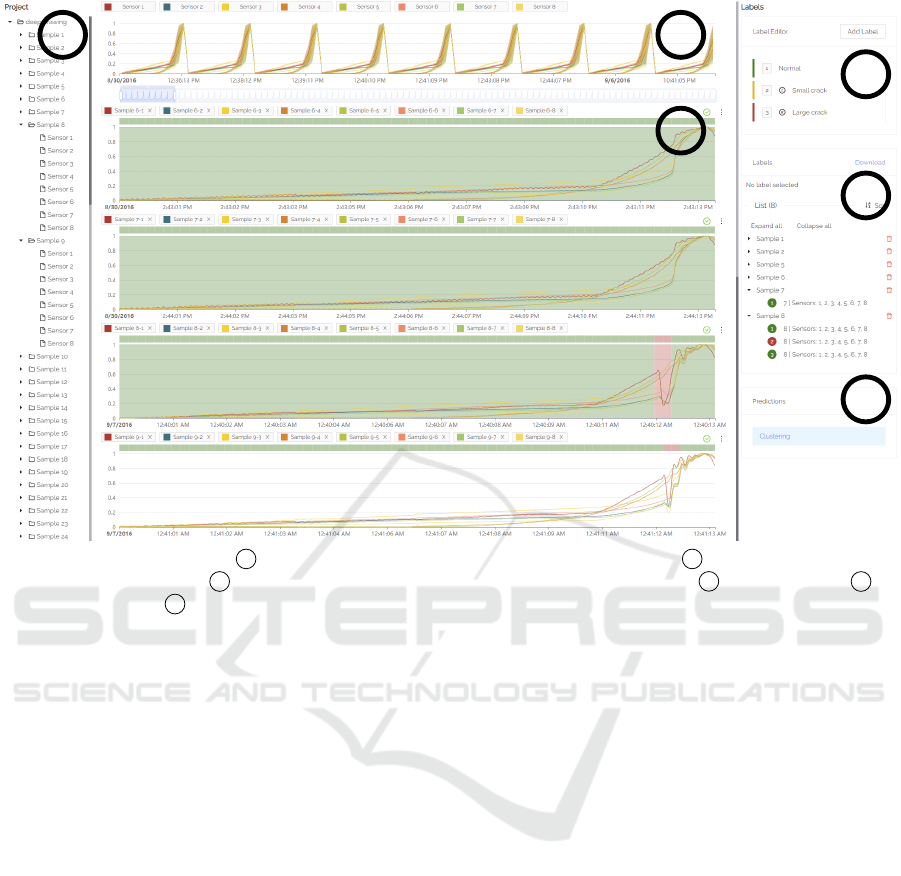
1 2
3
4
6
5
Figure 2: Overview of our tool: 1 project structure to select sensor samples and dimensions, 2 aggregated overview of all
sensor data with data zoom, 3 configurable charts to label individual samples and dimensions, 4 label class editor 5 list
of assigned labels and 6 list of prediction algorithms for semi-automatic labeling.
or below the existing charts. On the right side (4-6)
there is an area that offers all interactions for the ac-
tual labeling of data. These will be discussed in more
detail in the following sections.
Since displaying a large number of elements
within a web browser can slow it down considerably,
we used virtual scroll components from the Angu-
lar CDK Scrolling module (Angular CDK Scrolling,
2021) for the tree views (project overview and label-
ing) and the freely configurable area of the charts to
avoid performance issues. This way, only the ele-
ments that are in the currently visible area of the user
interface are rendered. This allows us to support ar-
bitrarily large trees (e.g. overview of projects with
many samples and dimensions) and an arbitrary num-
ber of charts.
3.2.3 Label Classes and Format
In order to be able to label time periods within a time
series, label classes (typically the type of an error,
e.g., large crack) are created. For this purpose we
have added an editor in the upper label area (4) of our
labeling tool. New label classes can be added, where
a label class has a name and a severity (okay, warning,
error). On the one hand, these can be used by a data
scientist afterwards, e.g., to analyze only errors of a
certain type, and on the other hand, we use the sever-
ity in our prediction algorithm of the labeling support
system to map new error candidates to already cre-
ated error classes (see section 3.3.2). By selecting a
label class with either a click or its number shortcut,
a brush mode is activated in the displayed charts, al-
lowing the user to create labels of the selected class
directly inside a chart. For each label, the start and
end time, the corresponding label class, as well as
the sample and dimensions in the selected range are
stored in our database. A label can never span sev-
eral samples, since there can be any amount of time
between the samples. If a brush operation would span
several samples, the selection will be split by sample,
thus, creating one label per sample. There is a view of
all assigned labels (5). Labels can be displayed sorted
by time or grouped by label class or sample as a tree
view. The labels can also be downloaded with the
mentioned information in JSON-format to use them
e.g. for training a machine learning model.
3.2.4 Aggregation of Data for Large Queries
A common problem with visualizing large data vol-
umes is that web applications become slow and unre-
sponsive because of the sheer number of data points
that need to be rendered in a web browser. To prevent
Gideon-TS: Efficient Exploration and Labeling of Multivariate Industrial Sensor Data
325
this, we implemented an aggregation policy which
is utilized when a defined maximum number of data
points is exceeded. Hereby an exploratory approach
suggested that 500,000 data points was a suitable
maximum.
For the realization of this policy, Continuous Ag-
gregates from TimescaleDB were used. Continuous
Aggregates allow to define time intervals in which
data points are aggregated (TimescaleDB, 2021),
whereby minimum, maximum, and average for each
respective interval can be retrieved. For the applica-
tion at hand, the intervals are calculated by multiply-
ing the average time delta between two timestamps in
a series or sample t
delta
with the number of queried
data points n
datapoints
divided by the maximum num-
ber of data points n
max
:
t
interval
= t
delta
∗
n
datapoints
n
max
(1)
The amount of data points n
datapoints
is available from
the database, where it is saved for each dimension
and sample upon integration and can therefore be re-
quested before a query is attempted.
This method of calculating intervals achieves that
the amount of data points that are to be visualized are
always smaller or equal to the maximum number of
data points. Another advantage of using Continuous
Aggregates is the speed with which queries can be
performed, which was particularly important for the
underlying application. With Continuous Aggregates,
the calculations for aggregation only need to be per-
formed once and are then stored in cached views that
can be retrieved at a much higher speed than recalcu-
lating these each time (TimescaleDB, 2021).
Figure 3 shows an exemplary aggregation of data
points. Here, different colored lines show the aggre-
gated mean value of a sensor, whereby the shadows
in the respective color show the range between maxi-
mum and minimum in the particular interval.
Figure 3: Aggregated view of first three deep drawing
strokes (top) vs. original view of those strokes (bottom).
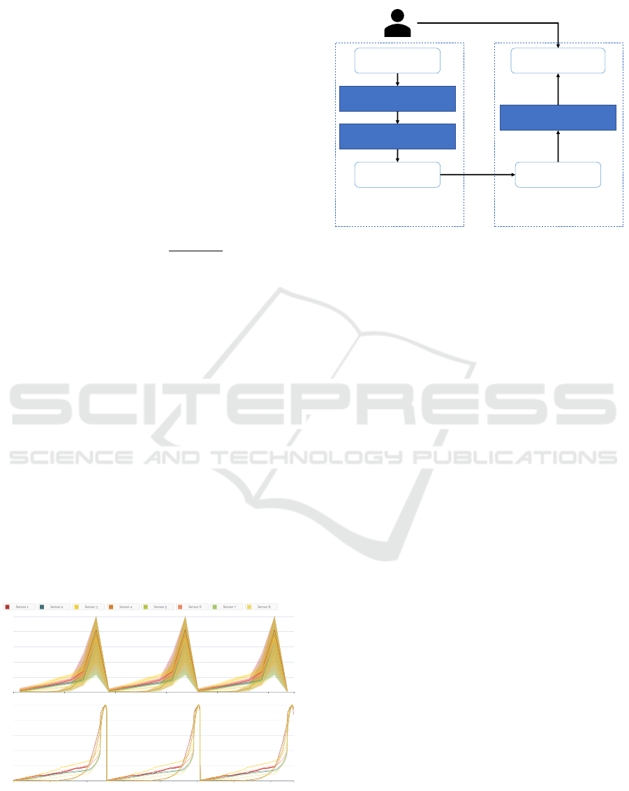
3.3 Label Predictions
Unlabeled Data
Parametrize
DBSCAN
Candidate Errors Error Templates
Optimized DTW
Label Predictions
Investigate / accept
Unsupervised Anomaly
Detection Error Similarity Search
Figure 4: Overview of our labeling support system. The
system consists of two steps: first, we identify candidate
errors using DBSCAN. Second, we match those candidates
to patterns extracted from already assigned labels using an
optimized version of DTW.
We derived our approach for label prediction from
Zhao et al. (Zhao et al., 2019), who used feature
extraction and an isolation forest to detect outliers
in univariate KPI samples. From the outliers, error
classes were derived and assigned using an optimized
version of dynamic time warping. Instead of using
isolation forest for outlier detection, we developed a
similar approach based on DBSCAN. An overview of
our two-step label prediction approach is presented in
figure 4.
3.3.1 Unsupervised Anomaly Detection
For unsupervised anomaly detection in our work, we
employ DBSCAN. We relied on DBSCAN because it
provides an efficient way to detect outliers at a fast
runtime. DBSCAN is a density based clustering ap-
proach, that finds core samples in areas of high den-
sity and creates clusters from them. Hereby an out-
lier is defined by not being in EPS distance from any
of the resulting clusters (Ester et al., 1996). Samples
that are within the distance EPS from any core sample
are called non-core samples, which are still a member
of the respective cluster. For our implementation, we
utilized scikit-learn and set the parameter min sam-
ples as fixed. The min samples parameter describes
the minimum amount of data points in proximity of
a data point to be considered as a core sample (Pe-
dregosa et al., 2011). This means that only a single
algorithm specific parameter that needs to be adjusted
by the user is required. This parameter was the pre-
viously mentioned distance EPS, which describes the
maximum distance between two points to be consid-
ICEIS 2022 - 24th International Conference on Enterprise Information Systems
326
ered as neighbors.
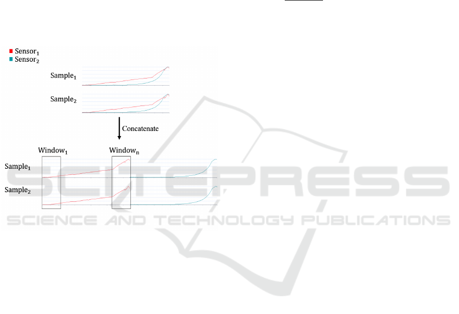
For the clustering of time series data, we split each
time series into multiple windows, whereby each win-
dow is clustered and outliers (i.e. that cannot be as-
signed to a cluster) are returned as possible error can-
didates. Therefore, the user is also required to select
a fitting window size for the specific use-case. For
multivariate time series, we concatenate the n-th win-
dow of each dimension into a single time series and let
DBSCAN cluster these concatenated windows. This
concatenation is suitable for the problem at hand be-
cause the calculation of the Euclidean distance is per-
formed point-wise (O’Searcoid, 2006). Thus, only
distances between windows of the same dimensions
are calculated, which is shown in figure 5.
Figure 5: Presentation of the concatenation of samples and
their division into windows, which are used for DBSCAN
clustering.
In conclusion, the user only needs to set two numeri-
cal parameters via the user interface. Hereby, the win-
dow size describes the accuracy of the labels: larger
windows result in more inaccurate suggestions, while
smaller windows are more precise but also require
longer runtimes. The EPS parameter describes the
threshold at which a window is declared as an out-
lier. When compared to the isolation forest based ap-
proach purposed by Zhao et al., we can omit the ad-
ditional feature engineering through this implemen-
tation, which would require more methodical knowl-
edge from the user, and also reduce the runtime as
we only work on distance and not on multiple fea-
tures. While we do not entirely eliminate that the user
needs to have a basic intuition of the two parameters
that they need to adjust, our implementation is meant
to make it simpler to use compared to the aforemen-
tioned tool.
3.3.2 Error Class Similarity Search
As an output from unsupervised outlier detection, we
get candidates that we can propose as potential er-
rors to the user. Nevertheless, we still have to sug-
gest the correct error classes (e.g. small crack or large
crack). In order to determine these, we construct ref-
erence patterns from the previously labeled instances
and assign candidates to one of these patterns using
a similarity metric. The reference pattern re f
c
(x) of
an error class c is calculated as the average series
re f
c
(x) =
f
1
(x)+ f
n
(x)
n
of all 1..n time series segments
f
n
(x) that have been labeled with this class by the user
so far (i.e. of which we are sure that it is actually this
error). We calculate the similarity of the new error
candidate to each of the reference patterns using an
optimized version of Dynamic Time Warping (DTW)
to check whether it matches any of these reference
patterns. DTW is a similarity measure between two
time series that has been suggested to perform best
in most domains compared to other measures (Ding
et al., 2008). Since DTW has a quadratic runtime by
default, we have adopted two commonly used opti-
mizations for the algorithm. We constrain the search
space for the shortest warping path using the Sakoe-
Chiba band (Sakoe and Chiba, 1978) and implement a
specialized version of early stopping (Rakthanmanon
et al., 2012), which stops the search for the best er-
ror pattern as soon as the currently processed pattern
can no longer be better than the best pattern currently
found.
With this approach we accomplish that the refer-
ence patterns become more accurate with each manu-
ally labeled instance and also that the suggestions be-
come more accurate the more data has already been
labeled.
4 EVALUATION
We evaluated several factors of our tool. We mea-
sured the performance of loading times of the exem-
plary use case presented in section 3.1. Based on the
results, we derived to what extent our tool is suitable
for large amounts of data. Then, we conducted a qual-
itative user study to evaluate the efficiency and usabil-
ity of our tool. We compared the time it takes to label
with our tool and the quality of the resulting labels
with traditional labeling without a special tool to see
if it provided a significant advantage in practical use.
Gideon-TS: Efficient Exploration and Labeling of Multivariate Industrial Sensor Data
327
4.1 Performance
In order to evaluate how the performance of our tool
is related to the amount of data, we extracted several
test datasets from the entire dataset of 3,400 samples
(4.4 GB) of the data from our exemplary use case. An
overview of those datasets is shown in table 2.
Table 2: An overview of our test datasets. We extracted
subsets from the dataset presented in section 3.1.
Samples
Data points
(approx. mil.)
Data size
(approx. MB)
500 28 650
1000 56 1315
2000 112 2637
3400 190 4400
We then integrated each of the datasets on a notebook
with an Intel Core i9-9980HK CPU and 64 GB of
RAM main memory and cross-referenced all the data
in the overview.
Figure 6: Results of performance test: integration perfor-
mance (top) and query and label prediction performance
(bottom).
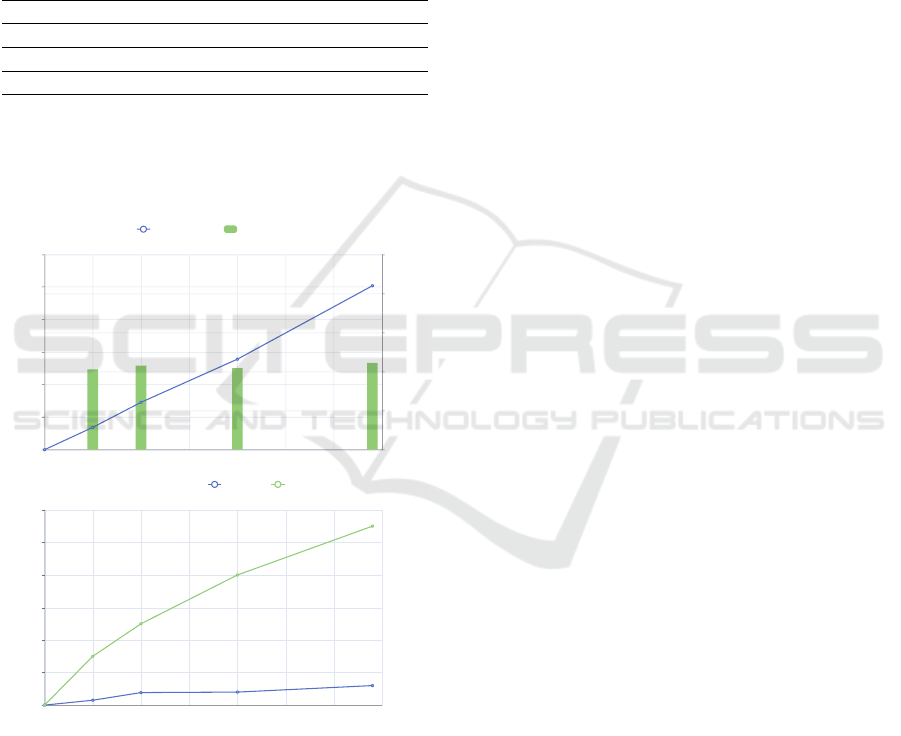
Figure 6 shows the measured times. In the upper
chart, the number of samples is plotted on the x-axis
and the integration times on the y-axis. The integra-
tion time increases linearly with the number of sam-
ples from 3 minutes and 26 seconds for 500 sam-
ples to 25 minutes and 12 seconds for the complete
dataset, i.e. 3,400 samples. The integration time per
sample remains almost constant at just over 0.4 sec-
onds. In the chart below, we measured the query times
and label prediction times of our labeling support sys-
tem for the test datasets. We loaded the overview
chart for the corresponding dataset and tracked the
times of the request in the browser. The times ranged
from 300 milliseconds for 500 samples to 1.2 seconds
for the complete dataset. Prediction times of our sup-
port system ranged from 3 seconds to 11 seconds for
the test datasets.
Our performance tests indicate that our system is
well suited for large data volumes. While integration
takes much longer relative to query time, it increases
only linearly with data volume. That means that it
scales well with increasingly large datasets and also
allows for good estimation of waiting times, e.g., for
progress indicators. By caching specific views, we
stay within the recommended time range of 2 to 4 sec-
onds for common tasks (i.e., visualizations) and 8 to
12 seconds for more complex tasks (i.e., label pre-
diction) for interactive systems (Shneiderman et al.,
2016). Even though we are close to the limit with
our labeling support system, the individual calcula-
tions there can be parallelized well and thus scale
well, especially when using better hardware. Fur-
thermore, it has been shown that distance-based ap-
proaches can also be calculated well on sampled parts
of the dataset (Zhu et al., 2018), which opens up a lot
more potential for scaling of our support system.
4.2 User Study
The study was carried out with twelve participants
with a STEM background. We first let a process ex-
pert label a randomly selected subset of one hundred
consecutive samples of the data from the exemplary
use case (section 3.1) with a tool of his choice to ob-
tain a reference for time required for manual labeling
and to evaluate the quality of the labels generated by
the participants with our tool. This process took him
about one and a half hours, first spending 30 minutes
exploring and visualizing the data and then one hour
actually labeling the data. In doing so, he labeled two
small and six large cracks in the dataset.
In the study, the participants first got a short intro-
duction to the user interface and the functionalities of
our tool and had time to familiarize themselves with
it. We then asked the participants to label this dataset
as well as possible using our tool at their own discre-
tion. For evaluation, we measured the time required
and obtained the labels saved as a JSON export. In ad-
dition, the participants were free to give us comments
on the general usability and workflow of the tool.
ICEIS 2022 - 24th International Conference on Enterprise Information Systems
328

Figure 7: Summary of our user study results performed with
12 participants: labeling speed (left) and labeling quality
(right).
Figure 7 shows an overview of the labeling time
and quality that our participants achieved while com-
pleting our study. All participants proceeded in the
same way by first tuning the clustering algorithm of
the labeling support system, then quickly going over
the generated label predictions and accepting predic-
tions that they felt were correct, and finally spending
time refining the range of labels for error cases. Over-
all, participants took a median of 20 minutes to label
the complete dataset. These were distributed in me-
dian on four minutes tuning of the support system,
nine and a half minutes labeling of all samples and
six minutes refinement of label ranges. They labeled
a median of two small cracks and 5.5 large cracks.
The alignment of the labels with our reference dataset
was at a median difference of 60 milliseconds and at
a maximum difference of 500 milliseconds. With a
sampling rate of two milliseconds and 7,000 values
per sample, this corresponds to a maximum difference
of 3.5% within the sample.
In summary, the time required to label the dataset
was significantly reduced compared to our reference.
The labels were mostly assigned in the same way, but
there were also deviations in the number of identified
small and large cracks. On the one hand, we attribute
this to the fact that the distinction between small and
large cracks is subjective. On the other hand, it also
became apparent that the participants relied on the la-
beling support system, which also led to cracks being
overlooked in individual cases if the parameterization
was not optimal. The assigned labels did not deviate
much from our reference labels, so we conclude that
our system predicts labels that assist users in produc-
ing qualitatively comparable results after minor ad-
justments.
4.3 Discussion
When optimizing performance, we had to choose be-
tween the time it takes to integrate the data and the
query times, since integration takes longer to cre-
ate cached views (like the aggregates) on the dataset.
However, the data can be retrieved much faster com-
pared to the ad-hoc calculation. We decided to opti-
mize the query times at the expense of the integration
time, since we have an interactive tool and users have
less problems with waiting for a long integration pro-
cess at the beginning than with each individual query.
During our study, we noticed a change in the
workflow compared to manual labeling. In the man-
ual labeling process, our data scientists first scanned
the entire dataset to get an overview and see how
anomalies might look like within the dataset. Subse-
quently, they looked closely at each sample to decide
whether or not it needed to be labeled, and labeled
errors if they applied. Using our tool, our partici-
pants spent a short time parameterizing the prediction
algorithm and then very quickly went over all sam-
ples and accepted the labeling suggestions. Finally,
they went back to the errors to fine-tune the labeling
range. Therefore, we also often got the feedback that
an accept all button would be desired. However, we
have also observed that participants rely on the label-
ing support system. As with all support systems, this
carries the risk that errors are overlooked and the qual-
ity of the labels suffers. This effect would likely be
amplified with such a feature, as participants would
then look at each sample even less closely.
Although we tried to keep our approach to la-
bel prediction as generally applicable as possible, we
only tested it on one use case in our study. For typical
use cases where errors in the form of outliers, spikes,
or pattern changes rarely occur, clustering will work
well. But since time series analysis is an extremely
broad domain and the form of the data can also be
very different, the existing approach will not provide
good results for all use cases. Therefore, in such a
case, our tool must be extended with better fitting al-
gorithms.
5 CONCLUSION AND OUTLOOK
As the need for labeled sensor data for the use of
machine learning in industry continues to grow, we
looked at the extent to which existing labeling tools
satisfy the requirements for use in industrial appli-
cations. We found that not all time series forms are
supported, that the tools are only use case specific
or that they do not perform well on large data vol-
Gideon-TS: Efficient Exploration and Labeling of Multivariate Industrial Sensor Data
329

umes. Based on this observation, we have developed
our own labeling tool that supports these aspects. We
used a time series database that allows us to integrate
time series data in a uniform way and run efficient
queries on it, as well as cache aggregated views for
displaying many data points. We developed our own
user interface, which allows the exploration and la-
beling of time periods with appropriate label classes
and is also designed for large data volumes through
the use of virtual scrolls. Furthermore, we have im-
plemented a labeling support system based on unsu-
pervised anomaly detection and error class search. Fi-
nally, we evaluated the entire tool with an exemplary
use case and a user study. The results indicate that
it is well suited for use in an industrial context and
efficiently generates qualitative labels.
We see the greatest potential for further devel-
opment of our tool in the integration of a dedicated
view for evaluating the current clustering result. This
would allow the user to optimize the parameterization
of the algorithm in a short time and the subsequent ad-
justment of individual labels would require less effort.
Thus, better results would be achieved even faster.
In addition, the integration of active learning aspects
into the interactive labeling process has shown partial
benefits and could help improve labeling suggestions
based on the labels already assigned (Bernard et al.,
2017).
REFERENCES
Adi, E., Anwar, A., Baig, Z., and Zeadally, S. (2020). Ma-
chine learning and data analytics for the iot. Neural
Computing and Applications, 32(20):16205–16233.
Angular CDK Scrolling (2021).
https://material.angular.io/cdk/scrolling/overview.
Accessed: 01.11.2021.
Bagnall, A., Dau, H. A., Lines, J., Flynn, M., Large, J.,
Bostrom, A., Southam, P., and Keogh, E. (2018).
The uea multivariate time series classification archive,
2018.
Bernard, J., Hutter, M., Zeppelzauer, M., Fellner, D., and
Sedlmair, M. (2017). Comparing visual-interactive la-
beling with active learning: An experimental study.
IEEE transactions on visualization and computer
graphics, 24(1):298–308.
Bernard, J., Zeppelzauer, M., Sedlmair, M., and Aigner, W.
(2018). Vial: a unified process for visual interactive
labeling. The Visual Computer, 34(9):1189–1207.
Curve (2021). baidu/curve. https://github.com/baidu/Curve.
Accessed: 01.11.2021.
DIN 8584-3 (2003). Manufacturing processes forming un-
der combination of tensile and compressive conditions
- Part 3: Deep drawing; Classification, subdivision,
terms and definitions. Beuth Verlag, Berlin.
Ding, H., Trajcevski, G., Scheuermann, P., Wang, X., and
Keogh, E. (2008). Querying and mining of time
series data: Experimental comparison of representa-
tions and distance measures. Proc. VLDB Endow.,
1(2):1542–1552.
Dudley, J. J. and Kristensson, P. O. (2018). A review of
user interface design for interactive machine learning.
ACM Transactions on Interactive Intelligent Systems
(TiiS), 8(2):1–37.
Eirich, J., Bonart, J., Jackle, D., Sedlmair, M., Schmid, U.,
Fischbach, K., Schreck, T., and Bernard, J. (2021).
Irvine: A design study on analyzing correlation pat-
terns of electrical engines. IEEE Transactions on Vi-
sualization and Computer Graphics, pages 1–1.
Ester, M., Kriegel, H.-P., Sander, J., and Xu, X. (1996).
A density-based algorithm for discovering clusters in
large spatial databases with noise. In Proceedings of
the Second International Conference on Knowledge
Discovery and Data Mining, KDD’96, page 226–231.
AAAI Press.
Heimerl, F., Koch, S., Bosch, H., and Ertl, T. (2012). Visual
classifier training for text document retrieval. IEEE
Transactions on Visualization and Computer Graph-
ics, 18(12):2839–2848.
Hu, B., Chen, Y., and Keogh, E. (2016). Classifica-
tion of streaming time series under more realistic as-
sumptions. Data mining and knowledge discovery,
30(2):403–437.
Langer, T. and Meisen, T. (2021). Visual analytics for in-
dustrial sensor data analysis. In Proceedings of the
23rd International Conference on Enterprise Informa-
tion Systems - Volume 1: ICEIS, pages 584–593. IN-
STICC, SciTePress.
Lasi, H., Fettke, P., Kemper, H.-G., Feld, T., and Hoffmann,
M. (2014). Industry 4.0. Business & information sys-
tems engineering, 6(4):239–242.
L
¨
oning, M., Bagnall, A., Ganesh, S., Kazakov, V., Lines, J.,
and Kir
´
aly, F. J. (2019). sktime: A Unified Interface
for Machine Learning with Time Series. In Workshop
on Systems for ML at NeurIPS 2019.
O’Searcoid, M. (2006). Metric spaces. Springer Science &
Business Media.
Pedregosa, F., Varoquaux, G., Gramfort, A., Michel, V.,
Thirion, B., Grisel, O., Blondel, M., Prettenhofer,
P., Weiss, R., Dubourg, V., Vanderplas, J., Passos,
A., Cournapeau, D., Brucher, M., Perrot, M., and
Duchesnay, E. (2011). Scikit-learn: Machine learning
in Python. Journal of Machine Learning Research,
12:2825–2830.
Rakthanmanon, T., Campana, B., Mueen, A., Batista, G.,
Westover, B., Zhu, Q., Zakaria, J., and Keogh, E.
(2012). Searching and mining trillions of time se-
ries subsequences under dynamic time warping. In
Proceedings of the 18th ACM SIGKDD International
Conference on Knowledge Discovery and Data Min-
ing, KDD ’12, page 262–270, New York, NY, USA.
Association for Computing Machinery.
Sakoe, H. and Chiba, S. (1978). Dynamic programming
algorithm optimization for spoken word recognition.
IEEE Transactions on Acoustics, Speech, and Signal
Processing, 26(1):43–49.
ICEIS 2022 - 24th International Conference on Enterprise Information Systems
330

Saund, E., Lin, J., and Sarkar, P. (2009). Pixlabeler: User
interface for pixel-level labeling of elements in docu-
ment images. In 2009 10th International Conference
on Document Analysis and Recognition, pages 646–
650.
Shneiderman, B., Plaisant, C., Cohen, M. S., Jacobs, S.,
Elmqvist, N., and Diakopoulos, N. (2016). Design-
ing the user interface: strategies for effective human-
computer interaction. Pearson.
TagAnomaly (2021). microsoft/taganomaly.
https://github.com/Microsoft/TagAnomaly. Ac-
cessed: 01.11.2021.
TimescaleDB (2021). https://docs.timescale.com/. Ac-
cessed: 01.11.2021.
Tkachenko, M., Malyuk, M., Shevchenko, N., Holmanyuk,
A., and Liubimov, N. (2020-2021). Label Studio:
Data labeling software. Open source software avail-
able from https://github.com/heartexlabs/label-studio.
von Ahn, L. and Dabbish, L. (2004). Labeling images
with a computer game. In Proceedings of the SIGCHI
Conference on Human Factors in Computing Systems,
CHI ’04, page 319–326, New York, NY, USA. Asso-
ciation for Computing Machinery.
Walker, J. S., Jones, M. W., Laramee, R. S., Bidder, O. R.,
Williams, H. J., Scott, R., Shepard, E. L., and Wilson,
R. P. (2015). Timeclassifier: a visual analytic system
for the classification of multi-dimensional time series
data. The Visual Computer, 31(6):1067–1078.
Zhao, N., Zhu, J., Liu, R., Liu, D., Zhang, M., and Pei,
D. (2019). Label-less: A semi-automatic labelling
tool for kpi anomalies. In IEEE INFOCOM 2019
- IEEE Conference on Computer Communications,
pages 1882–1890.
Zhu, Y., Yeh, C.-C. M., Zimmerman, Z., Kamgar, K.,
and Keogh, E. (2018). Matrix profile xi: Scrimp++:
Time series motif discovery at interactive speeds. In
2018 IEEE International Conference on Data Mining
(ICDM), pages 837–846.
Gideon-TS: Efficient Exploration and Labeling of Multivariate Industrial Sensor Data
331
