
Designing a Learning Analytics Dashboard to Provide Students with
Actionable Feedback and Evaluating Its Impacts
Xiaojing Duan
1
, Chaoli Wang
1
and Guieswende Rouamba
2
1
University of Notre Dame, Notre Dame, IN, U.S.A.
2
Purdue University Fort Wayne, Fort Wayne, IN, U.S.A.
Keywords:
Learning Analytics Dashboard, Machine Learning, Self-regulated Learning, Actionable Feedback.
Abstract:
Various educational settings have begun to increasingly leverage the power of data analytics to optimize the
learning environment and enhance the learning experience for students. However, despite this effort, sig-
nificant research gaps still exist around utilizing educational data mining to provide students with actionable
feedback and assess the comprehensive impact of data-informed feedback on students. In this study, a learning
analytics dashboard was designed to provide students with actionable feedback to advance their self-regulated
learning skills and improve their course performance. A rigorous inquiry using mixed methods was also con-
ducted to study the dashboard’s impacts on students. It found that students’ use of the dashboard was positively
correlated with their course performance, and those who viewed the dashboard had higher course ranks. In
addition, it showed that students’ use of the dashboard was positively correlated with their homework submis-
sion time, and those who viewed the dashboard submitted homework earlier as the course progressed. The
inquiry also revealed that students had mixed feelings about the dashboard, including motivation and anxiety.
1 INTRODUCTION
With the emergence of computer-supported learning
environments, much data about the learners and their
context became available. As a result, a large body of
research in the learning analytics and educational data
mining community has begun to leverage the power of
data to provide learners a better learning experience
optimized to their individual preferences and needs
(Clow, 2013; Siemens and Baker, 2012). The ini-
tial focus of that effort was to identify the at-risk stu-
dents and provide them with just-in-time and person-
alized support to prevent potential drop-outs (Wong
and Li, 2020; Syed et al., 2019; Choi et al., 2018).
Although these studies reported success with their in-
terventions targeted at-risk students, it is unclear what
effects these systems have on a broader range of stu-
dents or how to scale them to support all students.
Other studies have explored using learning ana-
lytics dashboard (LAD) as a form of personalized
feedback for all students, such as Course Signals
(Arnold and Pistilli, 2012) and StepUp! (Santos et al.,
2013). However, the information presented in those
dashboards is not actionable: students cannot use it
to change their learning behavior and achieve better
course performance. Additionally, few of the existing
LADs were built upon established learning theories
(Sawyer, 2014). The lack of theoretical background
threatens the effectiveness of LADs. Furthermore,
what impact LADs have on students is an important
topic that remains underexplored. As suggested by
Wong and Li (2020), there is a great need for more
rigorous inquiries on the impact of LADs on students.
To bridge the gaps mentioned above, we designed
a LAD that targets all students, not only those at-
risk. The primary goals of the dashboard include:
(1) raising students’ awareness of the correlation be-
tween their learning progress and learning behavior;
(2) motivating students to adopt more effective learn-
ing behaviors and improve their self-regulated learn-
ing (SRL) skills. The dashboard design is grounded in
the widely adopted SRL model (Winne and Hadwin,
1998). The rationales are as follows: (1) LADs can
assist students in evaluating their current state of SRL
and progression towards their learning goals (Kim
et al., 2016); (2) LADs can motivate students and as-
sist them in reflecting on their SRL process (Muldner
et al., 2015).
Our dashboard provides students with action-
able feedback on their weekly learning progress and
their patterns on the key learning activities that were
proved to influence course performance. Those key
Duan, X., Wang, C. and Rouamba, G.
Designing a Learning Analytics Dashboard to Provide Students with Actionable Feedback and Evaluating Its Impacts.
DOI: 10.5220/0011116400003182
In Proceedings of the 14th International Conference on Computer Supported Education (CSEDU 2022) - Volume 2, pages 117-127
ISBN: 978-989-758-562-3; ISSN: 2184-5026
Copyright
c
2022 by SCITEPRESS – Science and Technology Publications, Lda. All rights reserved
117

activities were identified through machine learning
(ML) models and confirmed by the subject matter ex-
perts. This study helps educators and researchers bet-
ter understand the dashboard’s impacts on students.
It examined the correlation between students’ use of
the dashboard and their course performance. It also
assessed the association between students’ use of the
dashboard and their learning behavior change. In ad-
dition, it investigated what emotions were triggered
by viewing the dashboard and why. This study ad-
dresses the following research questions:
• RQ1. What learning activity features strongly in-
fluence students’ course performance?
• RQ2. How do we design a LAD that provides stu-
dents with actionable feedback on the key learn-
ing activities?
• RQ3. What impacts does this dashboard have on
students’ course performance, learning behavior,
and emotions?
In the remainder of the paper, we first review
related work in Section 2. Next, we describe the
methodology for the present study in Section 3, fol-
lowed by the results in Section 4. Then we discuss
the findings in Section 5, followed by the limitations
and future opportunities in section 6. We conclude the
study in section 7.
2 RELATED WORK
Identification of Influencing Learning Features.
Determining what learning features to present is one
of the most important steps in LAD design. Matcha
et al. (2019) suggested using the user-centered design
approach to discover new features. Ott et al. (2015)
used predictors previously identified to predict stu-
dent success and visualized them. Feild (2015) con-
ducted an exploratory data analysis to determine the
indicators that were accustomed to their study sub-
jects. They analyzed data points, including days of the
semester, days of the week, hours of the day, and start
and submit times of students’ assignments. To deter-
mine the learning activity features for our dashboard,
we followed the process suggested by Bodily and Ver-
bert (2017). It includes reviewing the literature, con-
ducting exploratory data analysis, and using a theoret-
ical framework. We also utilized ML techniques and
discussed the identified features with course instruc-
tors and other domain experts.
ML in Educational Data Mining. A variety of ML
techniques, such as classification, regression, deep
neural networks, and reinforcement learning, have
been utilized to predict students’ course performance
and model their learning behavior (Baradwaj and
Pal, 2011; Okubo et al., 2017; Zhou et al., 2018;
Moreno-Marcos et al., 2018; Wan et al., 2019; Deng
et al., 2019). Additionally, ML techniques have been
adopted to model learning sequences and detect learn-
ing strategies. For example, Akpinar et al. (2020)
used pattern mining and Natural Language Processing
(NLP) models to extract learning strategies from stu-
dents’ clickstream data and found those strategies are
correlated with students’ course homework grades.
Jovanovic et al. (2019) clustered students’ pre-class
activities and identified learning strategies from those
activities that are correlated with students’ course
grades. In our study, we followed the human-centered
artificial intelligence principle. We discussed the re-
sults of ML models with the course instructors, so
the features we selected were better aligned with the
course design.
LAD. Most LADs provide at-a-glance views of var-
ious information collected from the learning envi-
ronment, such as the frequency of logins, click se-
quences, and time spent on a task by utilizing in-
formation visualization techniques. Examples in-
clude PerformanceVis (Deng et al., 2019), Moodle
(Podgorelec and Kuhar, 2011), LOCO-Analyst (Ali
et al., 2012), SNAPP (Bakharia and Dawson, 2011),
and Students Success System (Essa and Ayad, 2012).
Those examples demonstrate that the initial effort
on utilizing LADs to support students focused on
highlighting students at risk of academic failure and
proposing interventions for instructors. Our dash-
board aimed to provide all students with actionable
feedback on their learning activities, motivate them
to develop more effective learning activities, and help
them perform better.
SRL and Feedback. The SRL model defined by
Winne and Hadwin (1998) is widely used in research
related to computer-supported learning. It includes
five recursive components: conditions, operations,
products, evaluation, and standards (COPES). In this
COPES model, feedback occurs internally when stu-
dents evaluate their learning against the goals they
set for themselves. However, as shown by Bjork
et al. (2013), students may not be able to assess
themselves accurately. More specifically, the under-
achieving students tend to overestimate their learning
while the overachieving students tend to underesti-
mate themselves. Winne and Jamieson-Noel (2003)
also found that students’ self-reports were not com-
pletely aligned with their own actions. Additionally,
Malmberg et al. (2014) showed that students’ mis-
perception between their learning progress and learn-
ing outcome could lead to the choice of less effec-
tive learning practices. Therefore, our dashboard is
CSEDU 2022 - 14th International Conference on Computer Supported Education
118

designed to provide students with external feedback
enhanced through intuitive and interactive visualiza-
tions, help them develop a more accurate estima-
tion of their learning progress, and thus better self-
regulate their learning. We followed the conceptual
model proposed by Sedrakyan et al. (2020) that in-
corporates SRL theory, feedback theory, and LAD de-
sign. According to that model, LADs can provide
four different types of feedback: cognitive, behav-
ioral, outcome, and process-oriented feedback. Our
dashboard focused primarily on behavioral, outcome,
and process-oriented feedback.
3 METHODOLOGY
3.1 Study Context and Data Collection
The study was conducted on an introductory cod-
ing course required for all business major students at
the University of Notre Dame. The primary goal of
this course is to help students learn the fundamen-
tals of coding and develop fluency with the Python
programming language. The course consisted of 13
modules, and each module introduced a new pro-
gramming topic. The course was delivered using the
flipped classroom model in which students were ex-
pected to complete several learning tasks before the
in-person class. During the in-person session, instruc-
tors guided students to do more practice on the topics
they learned in the preparation materials. Except for
the in-class participation, all the other learning activ-
ities were conducted in Canvas (a learning manage-
ment system), Vocareum (a cloud programming sys-
tem), and Panopto (a video streaming and manage-
ment system). When students interacted with those
systems, their learning activities were captured in the
system logs. We collected data from the course when
it was offered in Spring 2021 and Fall 2021. There
were 45 and 69 students enrolled in the two semesters,
respectively. After consolidating the data, we cap-
tured the activity data that reflect students learning
behaviors and habits, as described in Table 1.
The course performance data we captured in-
cluded students’ final letter grades (on a range from
A, A-, B+, B, B-, C+, C-, D, to F) and calculated
grades (on a scale from 100 to 0).
3.2 Feature Extraction
One of our goals with the collected data was to iden-
tify the learning activity features that greatly influ-
enced students’ course performance. As we learned
from the literature review, the significance of the fea-
tures in predicting student success depends on the set-
ting and structure of the course. Therefore, we con-
sulted with the course instructors and extracted a set
of features that are better aligned with the course de-
sign, as described in Table 2. The features represent-
ing students’ click count on the course materials are
commonly used in student success prediction. The
new features proposed in this study include how many
days before the deadline a student opened a home-
work (tutorial/lab), submitted it for the first/last time,
and how many days passed between the opening of
the homework and the first/last submission. Those
features are proxies for how early students started
homework and how much time they spent on it.
3.3 Model Building and Evaluation
We ran several ML models on the extracted features to
determine their predictive significance for the course
grade. The models we used include logistic regres-
sion, k-nearest neighbors, na
¨
ıve Bayes, decision tree,
and random forest regression. We evaluated those
models’ performances using accuracy, precision, re-
call, F-measure, and area under the PRC. The evalu-
ation showed the random forest regression model had
the best performance. Another reason we chose this
model was that its result was easy to interpret, so we
could discuss it with the instructors.
3.4 Dashboard Design
After identifying the learning activity features that
strongly influenced students’ course performance, our
next step is to design a dashboard that provides stu-
dents with actionable feedback on those important
features. We followed a user-centered iterative pro-
cess to create the dashboard. The design process is
illustrated in Figure 1.
Figure 1: User-centered iterative design process.
Participatory Design. We started with a participa-
tory design session with the course instructors. In this
session, we discussed the important learning activity
features determined by the random forest regression
model. They confirmed that the features with higher
predictive significance represented the critical learn-
ing activities for the course from the pedagogical per-
spective. They also commented that watching lecture
Designing a Learning Analytics Dashboard to Provide Students with Actionable Feedback and Evaluating Its Impacts
119
Table 1: Collected data field names and descriptions.
Name Description System
overview click Date and time when a student clicked on the module overview pages Canvas
quiz review click Date and time when a student clicked on a quiz to review Canvas
discussion view Date and time when a student viewed an online discussion thread Canvas
discussion post Date and time when a student posted an online discussion thread Canvas
survey respond Date and time when a student responded a homework survey Canvas
recording click Date and time when a student clicked on a class recording Canvas
hw start time Date and time when a student opened a tutorial/lab Vocareum
hw submit time Date and time when a student submitted a tutorial/lab Vocareum
submit count Submit count on the tutorials/labs by a student Vocareum
video watched second Watch length in seconds of the lecture videos by a student Panopto
video watched perc Watch percentage of the lecture videos duration by a student Panopto
video watched time Date and time when videos were watched by a student Panopto
Table 2: Extracted feature names and descriptions.
Name Description
overview count Click count on the module overview pages by a student
assgn count Click count on the tutorials/labs by a student
quiz count Review count of the quizzes after submission by a student
discussion view count View count of the online discussions by a student
discussion post count Post count on the online discussions by a student
survey count Respond count to the lab surveys by a student
recording count Click count on the class recording pages by a student
due start days Days before the deadline a student opened a tutorial/lab
due first days Days before the deadline a student submitted a tutorial/lab for the first time
first start days Days between a student opened a tutorial/lab and submitted it for the first time
final start days Days between a student opened a tutorial/lab and submitted it for the last time
submit count Submit count on the tutorials/labs
video sum mins Watch length in minutes of the lecture videos by a student
video avg diff Average watch percentage of the lecture videos by a student
videos was a key learning activity, although the model
did not rank its significance as high as the lab survey
responding activity. They wanted to cultivate video-
watching behavior. Therefore, we decided to show
students’ tutorials submission and video watching ac-
tivities in the dashboard. After each module in the
dashboard, we also included their accumulated grade
rank to raise students’ awareness of the correlation be-
tween their learning activities and performance. To
motivate students to regulate their learning behaviors,
we decided to show the tutorial submission and video
watching patterns of students ranked in the top 25%
of the class. We chose the top 25% as the benchmark
because the course had a competitive grading policy,
which requires the average GPA to fall into the range
of 3.2 to 3.5. We sketched a dashboard prototype us-
ing paper and pencil in the participatory design ses-
sion.
Iterative Design. After the participatory design ses-
sion, we converted the paper sketch into a prototype
using Tableau (an interactive data visualization soft-
ware focused on business intelligence). There were
a couple of reasons we chose Tableau to create the
dashboard. First, the university where the study was
conducted has deployed a Tableau server with the
single-sign-on feature, which means students can ac-
cess the Tableau dashboard with their university IDs.
Second, Tableau supports user-filtering, which allows
us to map a student with his/her data so users can only
see their own data in the dashboard. Finally, we chose
a line graph for the accumulated grade rank because
it is easy to interpret. We decided to use a Gantt bar
graph to compare an individual’s tutorial submission
and video-watching behaviors with those of the top
25% performers. The Gantt bar graph shows the con-
trast clearly and is easy to understand.
Focus Group. With the dashboard prototype, we had
a focus group with two of the course instructors and
a learning research director from the same univer-
sity. During the focus group, we had an unmoder-
ated discussion while the participants interacted with
the prototype. The reason for the unmoderated dis-
CSEDU 2022 - 14th International Conference on Computer Supported Education
120

cussion was to observe how the participants inter-
acted with the dashboard and record their feedback.
For example, one instructor interacted with the line
chart showing the students’ accumulated grade rank
trend. She was concerned that showing the exact
grade rank would mislead/discourage students be-
cause a low rank does not necessarily mean a bad
grade. The other instructor suggested showing only
when the rank falls into or outside the top 25%. They
also changed their minds to include the lab submis-
sion activity, which is another homework component.
Additionally, they suggested changing the dashboard
layout so the explanatory text is closer to the associ-
ated graphs and users can easily reference them when
viewing the graphs. We redesigned the dashboard
based on their feedback and presented the new design
for more feedback. We repeated this process three
times until they were satisfied with the design.
User Study. We conducted a user study with four stu-
dents (n
f emale
= 2, n
male
= 2) who took this course in
Spring 2021 to evaluate the dashboard design. They
were in the same year and similar majors as the tar-
geted audience of the dashboard. We used the think-
aloud protocol during the study and asked them sev-
eral pre-designed questions. The participants joined
the study via Zoom. During the study, the inter-
viewer shared with the participants a link to a dash-
board that was built on some hypothetical data and
told them to assume those data were theirs. Then
the interviewer asked the participants to share their
screens in turn when they interacted with the dash-
board and encouraged them to talk aloud about their
thoughts. From this study, We learned that all partici-
pants could interpret all the charts in the dashboard as
they were designed. They also cross-referenced them
and drew some high-level insights such as “home-
work activity and video activity are kind of like vari-
ables going into the grades percentile range, so you
can look at those to explain” and “if you start ear-
lier, it’ll work out better”. Their overall impression
of the dashboard usability was “the color is good”,
the message “is very clear”, the text “ makes a lot of
sense and it helps explain”, and the dashboard con-
tains “the right amount/mix of information”. They all
viewed the dashboard as a useful tool and made com-
ments like “yeah I definitely do think it’s useful” and
“I feel like the two graphs cover different aspects of
the course pretty well, so I think it’s good”. Addi-
tionally, they offered helpful suggestions on the im-
provement of the dashboard design. For the chart
displaying a student’s grade rank, they suggested em-
phasizing that the rank was based on the accumulated
grades. So, we repeated that information in the tooltip
of the chart. For the chart showing a student’s video
watching pattern, one participant suggested adding la-
bels showing “what module the videos attached” so
students can easily cross-reference their grade rank-
ings with video watching patterns. We followed his
suggestion and added the module information to the
video labels.
3.5 Empirical Study
Study Protocol. To study the dashboard’s impacts,
we conducted an empirical study with students who
took the course in Fall 2021. Fifty-five out of the en-
rolled 69 students agreed to participate voluntarily.
We created a dashboard for every participant using
his/her homework (tutorial&lab) submission, video
watching, and grade data. We also integrated the
dashboard into the course site in Canvas so partici-
pants can easily access it. The dashboard was first re-
leased after the class completed Module 7 and started
Module 8. It contained students’ accumulated grade
ranks after Modules 3, 4, 5, 6, and 7. Modules 1
and 2 did not have any graded assessments. It also
included students’ homework submissions and video
watching patterns in the first seven modules. Since
then, the dashboard has been updated weekly. A re-
minder email was also sent to the participants, inform-
ing them that the dashboard was updated with the lat-
est module they had completed.
Survey. Throughout the empirical study, participants
were encouraged to submit their feedback through
a Google Form survey embedded in the dashboard.
The survey started with one multiple-choice ques-
tion asking how the participants felt after viewing
the dashboard. The question provides a list of emo-
tions that address the activity emotions (enjoyment,
confusion, boredom), prospective outcome emotions
(hope, motivated-to-improve, anxiety, and hopeless-
ness), and retrospective outcome emotions (pride, re-
lief). This instrument also measures both positive and
negative emotions as well as the activating and deac-
tivating emotions. Combining both the valence and
activation dimensions, as suggested by Pekrun et al.
(2011), the emotions we tried to measure fall into
these four categories: positive activating (enjoyment,
hope, motivated-to-improve, pride), positive deacti-
vating (relief), negative activating (confusion, anxi-
ety), and negative deactivating (hopelessness, bore-
dom). Participants can choose multiple emotions in
their answers. On the second update of the dashboard,
we added two more questions. One asked how easy
or hard it was to understand the dashboard; the other
asked what actions the participants would likely take
after viewing the dashboard.
Designing a Learning Analytics Dashboard to Provide Students with Actionable Feedback and Evaluating Its Impacts
121
Statistical Analysis. We captured participants’ in-
teraction with the dashboard, such as when they ac-
cessed it and how many times they viewed it. We
used this data in conjunction with the participants’
course performance and learning activity data to in-
vestigate if the participants who viewed the dash-
board performed better or demonstrated any behav-
ior change. We used Pearson’s correlation analysis
to evaluate any correlation between viewing the dash-
board and grade rank. We also compared the grade
ranks of participants who viewed the dashboard and
those who did not. Because the grade ranks of both
groups were not in a normal distribution, we used
the one-tailed Mann–Whitney U test to determine if
there was a significant difference in the grade rank
between those two groups. In addition, we compared
the tutorial/lab submission habit change between par-
ticipants who viewed the dashboard and those who
did not. The change measured in hours was not in
normal distribution for either group, so we used the
one-tailed Mann–Whitney U test again to test if those
two groups demonstrated a significant difference.
Interview. We conducted a semi-structured interview
with five of the empirical study participants (n
f emale
=
2, n
male
= 3). The goal was to understand their re-
actions to the dashboard and its impacts on them.
The interview followed the think-aloud protocol and
was complemented by some pre-designed questions.
The questions include how participants used the dash-
board, what is their perceived usefulness of the dash-
board, what actions they took after viewing the dash-
board and why, and how they felt after using the dash-
board and why. The participants joined the interview
via Zoom. Before the interview started, the inter-
viewer explained the goal to the participants and re-
ceived their oral consent for audio and video record-
ings of the interview. Next, the interviewer screen-
shared a dashboard with hypothetical data to guide
the conversation. The interview lasted for around 30
minutes. After the interview, we performed thematic
analysis on the transcript.
4 RESULTS
4.1 RQ1: Features Identification
Predictive Features. The result of the random for-
est regression model is presented in Table 3. As it
indicates, the top three features that are most signifi-
cant in predicting the course grade are due first days
(p = 0.4527), survey count (p = 0.1552), and
video avg diff (p = 0.1003). The model’s mean abso-
lute error (MAE) is 2.089, and the root-mean-square
Table 3: Predictive significance of the extracted features.
Features Predictive Significance
due first days 0.4527
survey count 0.1552
video avg diff 0.1003
overview count 0.1002
discussion view count 0.0661
assgn count 0.0660
quiz count 0.0425
recording count 0.0170
error (RMSE) is 2.272. Given the predicting label
(course calculated grade) is on a scale from 0 to 100,
this error rate is acceptable.
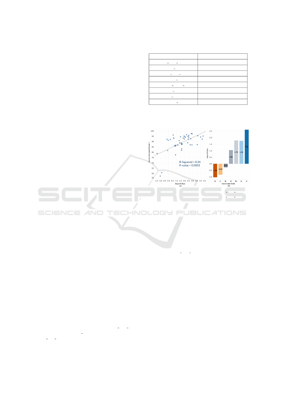
Figure 2: (a) Linear correlation between due first day fea-
ture and calculated grade (b)Patterns on due first day fea-
ture by different grades group.
4.2 RQ2: Dashboard Design
Predictive Features Evaluation. To further evaluate
the significance of the identified predictive features,
we visualized their correlations with the course grade
and the feature patterns demonstrated by students in
different grade groups. For example, as shown in Fig-
ure 2(a), the due first days feature has a positive lin-
ear correlation with the course calculated grade. Fig-
ure 2(b) shows the first submission of students in the
A group (2.61 days before the deadline) was earlier
than the students in any other grades group. On the
other hand, the first submission of students in the D
(1.03 days after the deadline) and C- (0.84 days af-
ter the deadline) groups were later than the students
in any other grades group. When we showed those
visualizations during the focus group, the instructors
agreed that the top features reflect the important learn-
ing activities from the pedagogical perspective. They
were not surprised that how early students submit-
ted the homework had the most significant influence
on their course performance. It is due to the flipped
classroom nature of this course. Students were ex-
pected to learn the course content in the tutorials and
CSEDU 2022 - 14th International Conference on Computer Supported Education
122
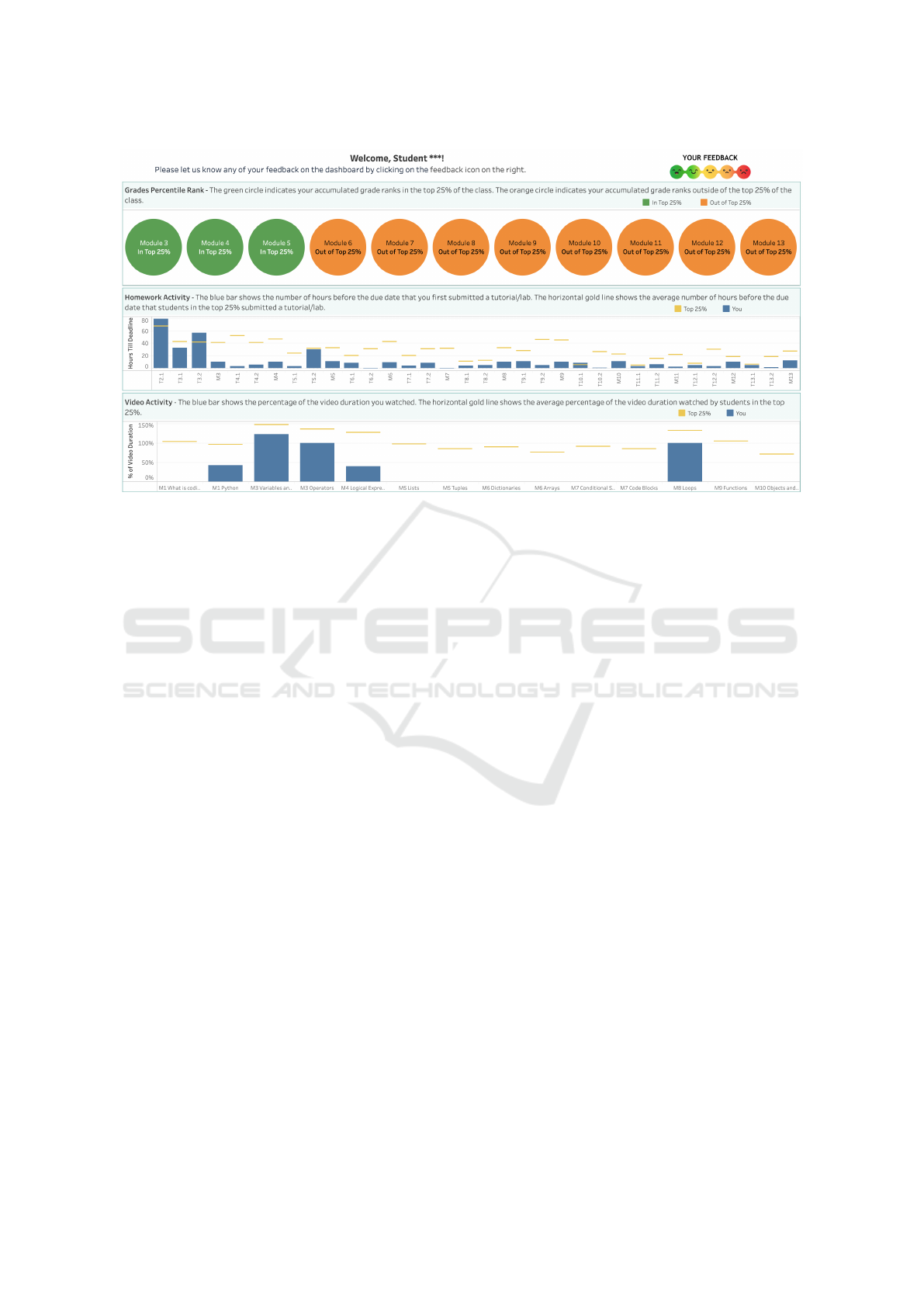
Figure 3: Our final dashboard design. Top to bottom: grades percentile rank, homework activity, and video activity charts.
practice them before the in-person class. The earlier
they started that task and the more time they had to
study the material, the better their performance was.
If the students put off that task, they might not have
sufficient time to learn the content, which leads to an
undesired outcome.
Dashboard. Figure 3 shows the version of the dash-
board that the instructors and learning research direc-
tor were all satisfied with. It also incorporates the
suggestions we received. The dashboard contains an
embedded feedback form and three charts:
• The YOUR FEEDBACK button directs viewers to
the Google Form.
• The grades percentile rank chart shows if a stu-
dent’s accumulated grade rank after a module is
ranked in the class top 25% or not. The green cir-
cle indicates the grade rank falls into the top 25%
and the orange circle indicates the grade rank falls
outside of the top 25%.
• The homework activity chart shows how early a
student submitted a tutorial or lab for the first
time compared to the top 25% performer’s aver-
age submission status. The blue bar indicates the
number of hours before the deadline that a stu-
dent submitted a tutorial/lab for the first time. The
horizontal gold line shows the average number of
hours before the deadline that the top 25% per-
formers had their first submission on the same tu-
torial/lab.
• The video activity chart shows how much of the
lecture video a student watched compared to the
top 25% performers’ average watched ratio. The
blue bar shows the percentage of the video dura-
tion a student watched. The horizontal gold line
shows the average percentage of the video dura-
tion watched by students in the top 25%.
Dashboard Evaluation. The dashboard was evalu-
ated through the embedded survey and the interview.
The insights we gained from the survey and the inter-
view are as follows:
• Usability of the dashboard: among the 23 re-
sponses to the survey question on how easy or
difficult it was to understand the dashboard, 9
(37.5%) were very easy, 11 (45.8%) were easy,
1 (4.2%) was neutral, and 3 (12.5%) were hard.
Among the five interview participants, 3 (60%)
thought the dashboard was very easy to under-
stand, and 2 (40%) thought it was easy to under-
stand. All five interviewees agreed that students
could use the dashboard without any training.
• Perceived usefulness of the dashboard: among the
five interview participants, 3 (60%) commented
that the dashboard raised their awareness of the
correlation between their grade and learning ac-
tivity, and 2 (40%) held a neutral opinion. When
asked if they like to have a similar dashboard
for other courses, 3 (60%) interviewees answered
with strongly yes, 1 (20%) was yes, and 1 (20%)
was neutral.
• Follow-up actions after viewing the dashboard:
among the 23 responses to the survey ques-
tion asking the participants what actions they
will likely take after viewing the dashboard: 12
(52.3%) were starting the tutorials & labs early,
Designing a Learning Analytics Dashboard to Provide Students with Actionable Feedback and Evaluating Its Impacts
123
5 (21.7%) were watching more lecture videos, 3
(13%) were nothing because they were ranked in
top 25%, and 3 (13%) were nothing because they
feel confident with their study strategies. Among
the five interviewees, one shared he “reviewed the
tutorial more” after viewing the dashboard. An-
other interviewee added she spent “more time to
complete the assignments”.
• Impact of the dashboard: when asked about the
dashboard impact, one interviewee shared, “I do
think that it has been motivating and driving for
me. It’s just kind of a reminder every week to
keep working hard”. Another participant added,
“I would say it’s definitely motivating for me be-
cause like I said I’ve been outside the top 25%
for a bit. So every week, I want to get the email,
I hope that I’ve hopped back in the top 25%”.
The third participant shared that the dashboard
raised his awareness of the correlation between
his grades and learning activity. He commented,
“I was in the top 25% for the start and then
there were a couple homework assignments that I
started real late or videos I didn’t watch and that’s
what I dropped out of top 25%”.
4.3 RQ3: Dashboard Impacts
Impact on Students’ Course Performance. The
Pearson correlation analysis showed a positive corre-
lation between the number of times a student viewed
the dashboard and their grade rank. As shown in Ta-
ble 4, the number of times students viewed the dash-
board is positively correlated to their accumulated
grade rank after Module 9, r(67) = 0.26, p = 0.033.
More importantly, the coefficient increases to 0.3 af-
ter Module 10 and 0.35 after Modules 11, 12, and 13.
In the meantime, the p-value decreases to 0.011 after
Module 10 and 0.003 after Modules 11, 12, and 13. It
indicates that the positive correlation becomes more
significant as the course progresses. The analysis also
showed that the number of times students viewed the
dashboard was positively correlated to their accumu-
lated grade rank change from Module 8 to Module
13, r(67) = 0.31, p = 0.01. We also compared the fi-
nal accumulated grade rank (after Module 13) of stu-
dents who viewed the dashboard and those who did
not. As the results in Table 5 show, both the aver-
age and median grade ranks of students who viewed
the dashboard are higher than those who did not. We
performed a one-tailed Mann-Whitney U test to test
if that difference is statistically significant. The result
is U = 699, n
Viewed
= 49, n
Not Viewed
= 20, p = 0.003,
showing that the group who viewed the dashboard has
a higher rank than the group who did not.
Table 4: Pearson correlation between students’ viewing
count of the dashboard and their grade rank.
Pearson Coefficient P-Value
Grade Rank M9 0.26 0.033
Grade Rank M10 0.30 0.011
Grade Rank M11 0.35 0.003
Grade Rank M12 0.35 0.003
Grade Rank M13 0.35 0.003
Table 5: Grade rank comparison between students who
viewed the dashboard and those who did not.
Viewed Not Viewed
Student Count 49 20
Mean Rank (Std) 0.55 (0.27) 0.34 (0.29)
Median Rank 0.57 0.24
Impact on Students’ Learning Behaviors. Regard-
ing the dashboard’s impact on students’ learning be-
haviors, we focused on their homework submission
behavior because the instructors recommended they
watch the lecture videos to prepare for the final exam.
That recommendation might influence students’ video
watching behavior change. We defined the submis-
sion behavior change as the difference of students’
average submission statuses between Modules 9-13
(after the dashboard was released) and Modules 3-
8 (before and during the dashboard release). The
Pearson correlation analysis showed a positive corre-
lation between the number of times students viewed
the dashboard and their homework submission be-
havior change, r(67) = 0.33, p = 0.006. We also
compared the submission behavior change of students
who viewed the dashboard and those who did not. As
shown in Table 6, on average, students who viewed
the dashboard submitted homework 8.62 hours ear-
lier than what they did before the dashboard was re-
leased. On the contrary, students who did not view the
dashboard submitted homework 1.29 hours later than
what they did before the dashboard was released on
average. We performed a one-tailed Mann-Whitney U
test to test if that difference is statistically significant.
The result is U = 655, n
Viewed
= 49, n
Not Viewed
= 20,
p = 0.015, showing that the group who viewed the
dashboard demonstrates a more positive submission
behavior change than the group who did not.
Impact on Students’ Emotions. We received 38 re-
sponses to the survey question asking how the partici-
Table 6: Submission behavior change comparison between
students who viewed the dashboard and those who did not.
Viewed Not Viewed
Student Count 49 20
Mean Change (Std) 8.62 (20.43) -1.29 (9.63)
Median Change 5.11 0.94
CSEDU 2022 - 14th International Conference on Computer Supported Education
124
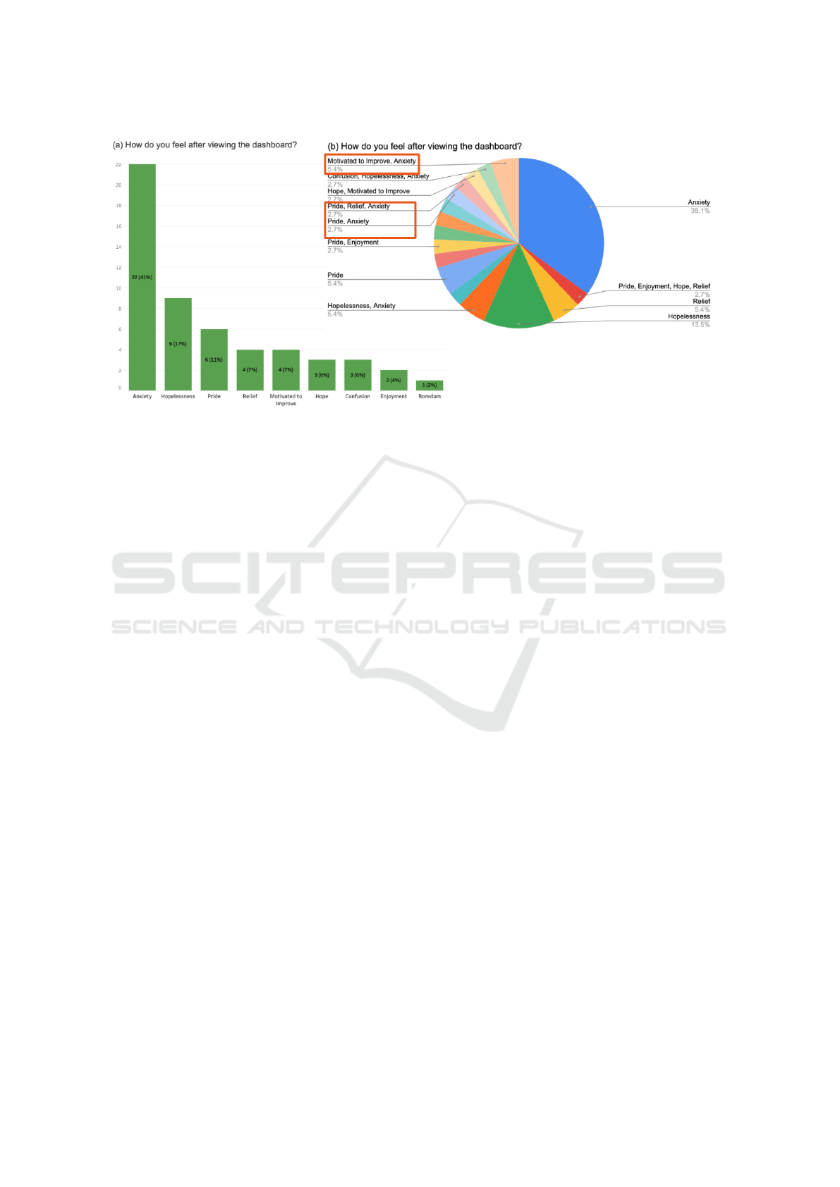
Figure 4: Reported emotions after viewing the dashboard.
pants felt after viewing the dashboard. As Figure 4(a)
shows, 35 of the reported emotions were negative, in-
cluding anxiety, hopelessness, confusion, and bore-
dom. Nineteen of the reported emotions were pos-
itive, including pride, relief, motivated to improve,
hope, and enjoyment. The top negative emotion was
anxiety, and the top positive emotion was pride. Since
the participants can answer this question by choos-
ing multiple emotions, we broke down the responses.
As Figure 4(b) shows, some of the responses include
both positive and negative emotions at the same time.
For example, 5.4% of the responses were motivated
to improve and anxiety, 2.7% were pride and anxiety,
and another 2.7% were pride, relief, and anxiety. We
included a similar question during the interview and
asked the participants to elaborate on why they had
certain emotions. Four of the 5 participants answered
that question. All of the four responses were moti-
vated to improve. One response goes like this, “The
dashboard motivates me to do better when I am be-
hind the top 25% of the class in a category, and it
makes me feel satisfied when I am in the top 25% of a
category”. Another one was “while it could be disap-
pointing to see a[n] orange circle, it does positively
motivate me to work towards becoming the top 25%”.
The third one was “rather than inciting negative emo-
tions, it encourages me to improve my studying habits
for the next module. If I see that I have performed in
the top 25%, that is a pretty positive note so it incites
positive emotions for me”. The fourth one was “it gen-
erally prompts positive emotions, especially when I
see that I fall within the top 25%. I enjoy seeing how
my learning activities impact my grade and what I
can do to improve my grade when I fall out of the top
25%”. These findings are consistent with the liter-
ature suggesting that social comparison generally ap-
pears to be motivating; however, some students do not
like it (Bennett and Folley, 2021).
5 DISCUSSION
RQ1 focused on identifying the learning activity fea-
tures that strongly influence course performance. The
workflow we used to answer this question can be sum-
marized into three steps: feature engineering, model
building & evaluation, and verifying the identified
features through visualizations. Other educational re-
searchers or practitioners can adopt this workflow to
identify the influencing features from their own data.
Our result showed one of the new features we pro-
posed in this study had the highest significance in
predicting students’ course performance. That fea-
ture measures how early before the deadline a stu-
dent submitted homework for the first time. It is a
proxy for measuring students’ level of procrastination
and time-on-task. Since accurately measuring time-
on-task has been a challenge, our study sheds light on
how to overcome that challenge. Our result also un-
derscores the importance of the ML model’s explain-
ability. With an easy-to-interpret model, we can en-
gage the instructors and other domain experts to eval-
uate the result effectively.
The answer to RQ2 describes the user-centered it-
erative design process for our dashboard. It demon-
strates the benefits of involving the instructors, learn-
ing scientists, and students in the design process. By
observing how they interact with the dashboard pro-
totypes and listening to their feedback, we developed
a deeper understanding of the sense-making process
Designing a Learning Analytics Dashboard to Provide Students with Actionable Feedback and Evaluating Its Impacts
125

of different audiences. This deeper understanding
helped us and can also aid the LAD researchers and
practitioners in designing more effective and intuitive
dashboards.
RQ3 studied the dashboard’s impacts on students’
course performance, learning behaviors, and emo-
tions. To the best of our knowledge, this study is
the first one that evaluated the dashboard’s impacts
from those three perspectives. Our results show a sta-
tistically significant correlation between students’ use
of the dashboard and their course performance. Fur-
thermore, the correlation strengthens over time. Our
results also reveal a statistically significant correla-
tion between students’ use of the dashboard and their
homework submission behavior change. More impor-
tantly, we found that students who used the dashboard
submitted homework earlier than they did before the
dashboard was released. Finally, our evaluation of
the dashboard’s impact on students’ emotions showed
mixed results. While some students reported they
were motivated to improve by the dashboard, others
reported anxiety. It was interesting to learn some stu-
dents felt both pride and anxiety simultaneously. One
interviewee helped us understand why. Her comment
was “I am proud of the progress I has achieved while
feel anxious about maintaining the high performance
moving forward”. This reveals the complexities of the
emotional impact of technology-mediated feedback.
6 LIMITATIONS AND FUTURE
WORK
We admit that there exist a few limitations in this
study. First, it was conducted in a single course with
55 participants. This relatively small sample size lim-
its the generality of the findings. Second, all the par-
ticipants were business majors. It’s unclear what im-
pacts the dashboard would have on students in other
majors. Third, the users of the dashboard were vol-
untarily signed-up but not randomly assigned, which
could result in a biased evaluation of the dashboard’s
impacts on students. We did not use a randomized
controlled trial in this study because the instructors
were not comfortable randomly deciding who has ac-
cess to the dashboard and who does not. The dash-
board could potentially benefit all students, and they
consider it unethical to withhold it from any students
who want to access it.
To overcome the limitations mentioned above, we
will expand the study to include multiple large gate-
way courses offered in three different institutions in
the future. With a large group of diversified partic-
ipants, we can gain more insights on the dashboard
design and further evaluate the dashboard’s impact on
students with different demographics and academic
backgrounds. In addition, the large diversified sample
will allow us to experiment with releasing the dash-
board to different groups at different times and study
the impact of when to release the dashboard on stu-
dents. We will also explore the ethical options of ran-
domly assigning students as dashboard users.
7 CONCLUSIONS
This study presents the design process of a dashboard
that provides all students actionable feedback to im-
prove their SRL skills. It also shares the dashboard’s
impacts on students’ course performance, learning be-
haviors, and emotions. To the best of our knowl-
edge, this study is the first one that evaluated the dash-
board’s impacts from those three perspectives. The
results reveal new perspectives of the dashboard’s im-
pacts on students and open the door for future studies
to gain more insights.
ACKNOWLEDGEMENTS
This research was supported in part by the U.S.
National Science Foundation through grant IIS-
1955395. We would like to thank everyone in our
team for their feedback and suggestions, especially
Alex Ambrose, Frederick Nwanganga, and Steve
Sporinsky. We would also like to thank the students
who participated in this study.
REFERENCES
Akpinar, N.-J., Ramdas, A., and Acar, U. (2020). Analyz-
ing student strategies in blended courses using click-
stream data. arXiv preprint arXiv:2006.00421.
Ali, L., Hatala, M., Ga
ˇ
sevi
´
c, D., and Jovanovi
´
c, J. (2012).
A qualitative evaluation of evolution of a learning an-
alytics tool. Computers & Education, 58(1):470–489.
Arnold, K. E. and Pistilli, M. D. (2012). Course signals
at Purdue: Using learning analytics to increase stu-
dent success. In Proceedings of International Con-
ference on Learning Analytics and Knowledge, pages
267–270.
Bakharia, A. and Dawson, S. (2011). SNAPP: A bird’s-eye
view of temporal participant interaction. In Proceed-
ings of International Conference on Learning Analyt-
ics and Knowledge, pages 168–173.
Baradwaj, B. and Pal, S. (2011). Mining educational data
to analyze student’s performance. International Jour-
nal of Advanced Computer Science and Applications,
6(2):63–69.
CSEDU 2022 - 14th International Conference on Computer Supported Education
126

Bennett, L. and Folley, S. (2021). Students’ emotional re-
actions to social comparison via a learner dashboard.
In Visualizations and Dashboards for Learning Ana-
lytics, pages 233–249. Springer.
Bjork, R. A., Dunlosky, J., and Kornell, N. (2013). Self-
regulated learning: Beliefs, techniques, and illusions.
Annual Review of Psychology, 64:417–444.
Bodily, R. and Verbert, K. (2017). Review of research on
student-facing learning analytics dashboards and ed-
ucational recommender systems. IEEE Transactions
on Learning Technologies, 10(4):405–418.
Choi, S. P., Lam, S. S., Li, K. C., and Wong, B. T. (2018).
Learning analytics at low cost: At-risk student predic-
tion with clicker data and systematic proactive inter-
ventions. Journal of Educational Technology & Soci-
ety, 21(2):273–290.
Clow, D. (2013). An overview of learning analytics. Teach-
ing in Higher Education, 18(6):683–695.
Deng, H., Wang, X., Guo, Z., Decker, A., Duan, X., Wang,
C., Ambrose, G. A., and Abbott, K. (2019). Perfor-
manceVis: Visual analytics of student performance
data from an introductory chemistry course. Visual
Informatics, 3(4):166–176.
Essa, A. and Ayad, H. (2012). Student success system:
Risk analytics and data visualization using ensembles
of predictive models. In Proceedings of International
Conference on Learning Analytics and Knowledge,
pages 517–520.
Feild, J. (2015). Improving student performance using
nudge analytics. In Proceedings of International Con-
ference on Educational Data Mining, pages 464–467.
Jovanovic, J., Mirriahi, N., Ga
ˇ
sevi
´
c, D., Dawson, S., and
Pardo, A. (2019). Predictive power of regularity of
pre-class activities in a flipped classroom. Computers
& Education, 134:156–168.
Kim, J., Jo, I.-H., and Park, Y. (2016). Effects of
learning analytics dashboard: Analyzing the relations
among dashboard utilization, satisfaction, and learn-
ing achievement. Asia Pacific Education Review,
17(1):13–24.
Malmberg, J., J
¨
arvel
¨
a, S., and Kirschner, P. A. (2014). El-
ementary school students’ strategic learning: Does
task-type matter? Metacognition and Learning,
9(2):113–136.
Matcha, W., Ga
ˇ
sevi
´
c, D., Pardo, A., et al. (2019). A sys-
tematic review of empirical studies on learning ana-
lytics dashboards: A self-regulated learning perspec-
tive. IEEE Transactions on Learning Technologies,
13(2):226–245.
Moreno-Marcos, P. M., Mu
˜
noz-Merino, P. J., Alario-Hoyos,
C., Est
´
evez-Ayres, I., and Kloos, C. D. (2018).
Analysing the predictive power for anticipating as-
signment grades in a massive open online course. Be-
haviour & Information Technology, 38(10-11):1021–
1036.
Muldner, K., Wixon, M., Rai, D., Burleson, W., Woolf, B.,
and Arroyo, I. (2015). Exploring the impact of a learn-
ing dashboard on student affect. In Proceedings of
International Conference on Artificial Intelligence in
Education, pages 307–317.
Okubo, F., Yamashita, T., Shimada, A., and Ogata, H.
(2017). A neural network approach for students’ per-
formance prediction. In Proceedings of International
Conference on Learning Analytics and Knowledge,
pages 598–599.
Ott, C., Robins, A., Haden, P., and Shephard, K. (2015).
Illustrating performance indicators and course charac-
teristics to support students’ self-regulated learning in
CS1. Computer Science Education, 25(2):174–198.
Pekrun, R., Goetz, T., Frenzel, A. C., Barchfeld, P., and
Perry, R. P. (2011). Measuring emotions in students’
learning and performance: The achievement emo-
tions questionnaire (AEQ). Contemporary Educa-
tional Psychology, 36(1):36–48.
Podgorelec, V. and Kuhar, S. (2011). Taking advantage of
education data: Advanced data analysis and reporting
in virtual learning environments. Elektronika ir Elek-
trotechnika, 114:111–116.
Santos, J. L., Verbert, K., Govaerts, S., and Duval, E.
(2013). Addressing learner issues with StepUp!: An
evaluation. In Proceedings of International Confer-
ence on Learning Analytics and Knowledge, pages
14–22.
Sawyer, R. K. (2014). The future of learning: Grounding
educational innovation in the learning sciences. In The
Cambridge Handbook of the Learning Sciences, pages
726–746. Cambridge University Press.
Sedrakyan, G., Malmberg, J., Verbert, K., J
¨
arvel
¨
a, S., and
Kirschner, P. A. (2020). Linking learning behavior
analytics and learning science concepts: Designing a
learning analytics dashboard for feedback to support
learning regulation. Computers in Human Behavior,
107:105512.
Siemens, G. and Baker, R. S. J. d. (2012). Learning ana-
lytics and educational data mining: towards commu-
nication and collaboration. In Proceedings of Interna-
tional Conference on Learning Analytics and Knowl-
edge, pages 252–254.
Syed, M., Anggara, T., Lanski, A., Duan, X., Ambrose,
G. A., and Chawla, N. V. (2019). Integrated closed-
loop learning analytics scheme in a first year expe-
rience course. In Proceedings of International Con-
ference on Learning Analytics and Knowledge, pages
521–530.
Wan, H., Liu, K., Yu, Q., and Gao, X. (2019). Peda-
gogical intervention practices: Improving learning en-
gagement based on early prediction. IEEE Transac-
tions on Learning Technologies, 12(2):278–289.
Winne, P. H. and Hadwin, A. F. (1998). Studying as self-
regulated learning. In Metacognition in Educational
Theory and Practice, pages 277–304. Lawrence Erl-
baum Associates Publishers.
Winne, P. H. and Jamieson-Noel, D. (2003). Self-regulating
studying by objectives for learning: Students’ reports
compared to a model. Contemporary Educational
Psychology, 28(3):259–276.
Wong, B. T.-M. and Li, K. C. (2020). A review of learn-
ing analytics intervention in higher education (2011–
2018). Journal of Computers in Education, 7(1):7–28.
Zhou, Y., Huang, C., Hua, Q., Zhu, J., and Tang, Y.
(2018). Personalized learning full-path recommenda-
tion model based on LSTM neural networks. Infor-
mation Sciences, 444:135–152.
Designing a Learning Analytics Dashboard to Provide Students with Actionable Feedback and Evaluating Its Impacts
127
