
Data Visualization, Accessibility and Graphicacy: A Qualitative
Study of Communicative Artifacts through SUS Questionnaire
Alessio Caccamo
a
Department of Planning, Design, Technology of Architecture, Sapienza, University of Rome, Italy
Keywords: Data Visualization, Usability, Graphicacy, SUS Questionnaire, Information Design.
Abstract: The study presented here examines the accessibility of information conveyed through the language of
infographics, analyzing the usability by users in the fruition of information content of five Data Visualization
artifacts, selected according to the degree of iconicity of representation by Anceschi. Specifically, the study
compared the SUS evaluation by two groups [F=100 – M=100] homogeneous in educational grade and age
but distinguished in owning proven Visual Design competence or not. It is therefore investigated, whether
basic soft skill, is sufficient to achieve an optimal level of accessibility or rather, whether Graphicacy
competence is discriminated. Therefore, understanding whether infographic language could be considered ad
a universal language or no. A three–variable correlation design was therefore constructed: two independent
variables, the System Usability Scale (SUS) along with the degree of iconicity of the representation, and one
dependent variable, namely the amount of information extracted from the infographic. The results show that
in both Group A and B is evident a general difficulty in accessibility of information correlated to the degree
of iconicity of the infographic representation. Specifically, in “non designer” group, no infographics achieved
the minimum usability rating, which, on the other hand, in “designer” group, is achieved by the only two
artifacts with a medium/low degree of iconicity. From the analysis of the data, Graphicacy – acquired within
the educational curriculum of Designers – would appear to be a determinate element in the correct decoding
of communicative artifacts. The contribution, through existing data and literature, leads, on the one hand, to
confirm that Graphicacy has been found to be neglected in comparison to Literacy, Numeracy, and Articulacy
and that the complexity and sophistication of infoaesthetic may be incomprehensible without timely data
visualization literacy.
1 INTRODUCTION
Historically, it were Balchin and Coleman (1966)
who coined the term Graphicacy referring to the
skills of orientation, comprehension and use of
cartography for educational purposes. The scholars
point out that activities related to the consumption of
cartographic artifacts are only possible provided
knowledge of visual codes, and the ability to orient
with respect to canonical systems of visual
representation, which cannot be conveyed solely
using written language or by simple numbers such as
coordinates. Wilmot (1999) through his own studies
in South Africa, takes up the research of Balchin and
Coleman and affirms the need and urgency to
establish curricula related to the teaching of
Graphicacy within all educational systems. Wilmot
a
https://orcid.org/0000-0002-2045-6385
states how this skill should be considered the 'Four
R's' within each individual child's basic cultural
background, alongside the skills of Articulacy,
Numeracy, and Literacy, as "encountering visual
representations, such as infographics, matrices, maps,
logos, diagrams, word clouds, and icons, on a daily
basis, require symbolic language" to translate
concepts into "spatial relationships" (Wilmot, 1999,
p. 91). In these terms, Graphicacy represents a
competence that combines mathematical, textual,
media, technological and graphic skills; additionally,
Graphicacy is the competence related to
infographic language skills. An infographic literate
citizen therefore can read and write through the
language of graphs, mastering its grammar and using
it critically to shape and form. Such interaction is
further referred to as the "language of Design" by
422
Caccamo, A.
Data Visualization, Accessibility and Graphicacy: A Qualitative Study of Communicative Artifacts through SUS Questionnaire.
DOI: 10.5220/0011587700003318
In Proceedings of the 18th International Conference on Web Information Systems and Technologies (WEBIST 2022), pages 422-430
ISBN: 978-989-758-613-2; ISSN: 2184-3252
Copyright
c
2022 by SCITEPRESS – Science and Technology Publications, Lda. All rights reserved

Schön (1983). In this regard, a study conducted by
Culbertson and Powers (1959) examined various
types of graphs and tried to detect the effectiveness of
correlations between Graphicacy and other skills,
such as verbal skills. So, can we argue about an innate
competence?
Infographics has be able to communicate complex
topics in a quickly, simply, and easily way to be
understood by a wide audience (Tufte, 1982/2001)
due to the visual nature of their representation, which
should allow them to "communicate more
immediately than other systems (primarily writing)"
(Falcinelli, 2014, p. 148). In order to achieve this
goal, accessibility of information is crucial.
Paraphrasing Dieter Ramhs' concept of the usability
of good Design (Kirk, 2019), a Data Visualization
product must meet certain criteria: functional,
psychological, and aesthetic; so, good Design – i.e. a
good visualization emphasizes the usefulness of a
product while ignoring anything that might detract
from it. To do this, certain principles of good design
can be applied that enable us to develop an artifact
that tends to be functional.
For example, Kosslyn (1989) provides a broad
framework for evaluating both graphs and diagrams
to convey information effectively, classifying the
constituents of the basic–level graph into four
components: the background, the picture, the
indicator, and the labels. In Information Design,
information accessibility is defined as the ability of
information systems to deliver services and provide
information usable, without discrimination, even by
those who due to disabilities require assistive
technologies or special configurations (Ware, 2019).
On the one hand, it has been suggested by
Lewandowsky and Spence (1989) that most graphs
are easy to interpret and Wainer (1980) for example,
argued that children at age 9, had, on average, reached
the minimum acceptable level of comprehension on
par with an adult. Ainley (2000) reported intuitive
reading of graphs among 6–year–olds as an example
of the universality of some aspects of graphical
representation capable, therefore, of decreeing a good
level of reading of diagrams and maps. Additionally,
pictures and visual artifacts in general have been
considered easier to read than prose because they do
not involve the use of words (Hittleman, 1985).
There is numerous evidence of improvements in
cognition and access to information when it is
translated through visual formats. Indeed, research in
psychology and communication has demonstrated the
benefits of nonverbal language (Dansereau and
Simpson, 2009). Nevertheless, numerous studies
have investigated the difficulties in the population in
perceiving graphs, arguing that comprehension and
aspects beyond the most obvious proportional
relationships can cause extreme difficulties (Bowen
and Roth, 2003; Preece, 1983; Bowen, Roth, and
McGinn, 1999; Åberg–Bengtsson and Ottosson,
2006). Since it is possible to consider
communicative–infographic artifacts to be part of the
broader discipline of Information Design – which
leads it to be defined as an information system (Botta,
2006) – it was decided to associate the concept of
infographic accessibility with that of digital
accessibility, according to Jakob Nielsen (1993) that
defines accessibility as a quality attribute that
assesses how user–friendly user interfaces are, i.e.
how an information is easily extracted from an
information design artifact.
2 METHODOLOGY
The study examines the accessibility of information
that is conveyed through infographic language and
specifically in five Data Journalism artifacts. The
perception and interpretation of users in the fruition
of such content is analysed. Two groups –
homogeneous in terms of educational level and age
but differ in having or not studies in the field of Visual
Communication Design – are compared. Therefore, it
is investigated whether the basic knowledge offered
by educational curricula or mere prior experience, is
sufficient to reach a good level of access to
information or on the other hand, Graphicacy skill –
theoretically more developed in the subjects of the
'Designer' Group – is discriminated in the perception,
interpretation and therefore accessibility of
information. Starting from these premises, the study
focuses on the following questions:
Q1. Is the infographic language accessible to
all?
Q2. Is there a correlation between the
accessibility to data visualization and the
degree of iconicity of its representation?
Q3. Is graphical competence innate?
Q4. Is the design education path necessary in
order to develop the graphical competence?
For the study, it was selected the System Usability
Scale (SUS) (Brooke, 1996), a one–dimensional
rating system that can assess the usability of a variety
of products or services and the most widely used
(Lewis and Sauro, 2018). According to Bangor,
Korum and Miller (2009), three aspects characterize
the success and effectiveness of this tool: (i) it
Data Visualization, Accessibility and Graphicacy: A Qualitative Study of Communicative Artifacts through SUS Questionnaire
423
consists of 10 items and is therefore easily
administered (ii); it is a royalty free questionnaire;
and (iii) it is technologically agnostic, being able to
be applied to any artifact resulting from the discipline
of Information Design. The standard version of the
SUS consists of ten items, each with five mandatory
“evaluation” from "Strongly Disagree" to "Strongly
Agree.". Based on research over the years, a SUS
score above 68 pt would be considered the threshold
above average for usability. For the purposes of the
study, the items were adapted – in terms – to avoid
possible misunderstanding by the study sample. The
items submitted were as follows:
I think I would like to read this kind of
infographic frequently.
I found the infographic unnecessarily complex.
I found the infographic very easy to read.
I think I would need the support of a person in
order to understand this infographic.
I found the various graphic elements of this
infographic well integrated.
I found inconsistencies in the graphic elements
of this infographic.
I think most people can learn to understand this
infographic easily.
I found the infographic very difficult to
understand.
I felt comfortable reading the infographic.
I needed to learn many processes before I could
read and understand the infographic.
Along with the SUS questionnaire, two specific
questions were administered about the amount of
information that could be extracted from the
infographic and their relevance.
2.1 The Usability Study
In the usability study presented, five infographics
were evaluated by a homogeneous sample of 200
university graduates [M=100 – F=100 – mean age 22
– Italian], divided into two groups according to the
criterion of certified competence. Namely:
Group A. Graduates in other disciplines.
Group B. Graduates in Visual Design and
related fields (i.e., product, industrial etc.).
The infographics examined were published in
Italian – and English–language newspapers (Fig. 1).
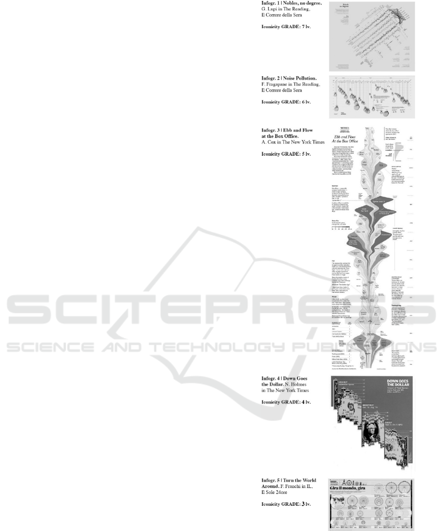
Figure 1: Selected Infographics and related Iconicity Grade.
Disclaimer: Fair use of images for research purpose.
The infographics were selected according to the
degree of iconicity of the representation, applying
Anceschi's scale of depiction (1992) from a more
properly figurative degree to an abstract one, that
WEBIST 2022 - 18th International Conference on Web Information Systems and Technologies
424
should be considered "two [extremes of] possibilities
on the level of graphic expression, not being
exclusive of each other, since the formal properties of
a graphic symbol do not prejudice the functions, in
terms of effectiveness and efficiency of linguistic
encoding, necessary to realize a written text" (Botta,
2006, p.31). The act of representation, in fact, should
be understood as an action of analysis–reduction and
synthesis–restitution: thus, accomplishing data
analysis and Data Visualization. Studies on
representation can be found in the work of De
Saussure (1916) and Peirce (1958) from the
mathematical theories of communication processes of
Shannon and Weaver (Mannori, Borello, 2007).
Anceschi, within 'The Object of Representation'
(1992), takes up the studies of Massironi and Moles,
proposing a seven–factor classification (Branzaglia,
2011) – from 1 to 7 – that was selected for the
presented study, applying the latter classification to
the communicative–infographic artifact results in the
following classification:
Grade 1 iconicity: Photograph Retouching or
Illustrative Function.
Grade 2 iconicity: Simplification to the stroke
or Taxonomic–descriptive function.
Grade 3 iconicity: Technical Drawing or
Operational Function.
Grade 4 iconicity: Normalized Construction
Diagram.
Grade 5 iconicity: Flowchart.
Grade 6 iconicity: Field diagram or evocative
function or hypothethesia.
Grade 7 iconicity: Abstract art or perfect
abstraction.
2.1.1 Procedure, Design of Correlations and
Measurements
For each of these studies conducted on the individual
infographic, usability tests were conducted
individually through an online administration. No
participant was aware of those who would take the
test, and all forms of security in terms of privacy and
data protection were ensured in compliance with
GDPR regulations. The user, upon receiving the link
to the test, completes the related task – i.e.,
perception, extraction, processing, and
comprehension of information – and completes the
related assessments, highlighting the amount of
information extracted.
This study used a three–variable correlation
design: two independent variables, the System
Usability Scale (SUS), and the degree of iconicity of
the representation; and one dependent variable,
namely the amount of information extracted from the
infographic. The SUS scores were calculated using
the method developed by John Brooke (1996), while
the summary assessment according to the Lewis–
Sauro’s model (2018). For the scores related to the
amount of information extracted, the proportion of
information that each participant extracted, was
calculated on a scale from 0 to 5. For degrees of
iconicity, the 7–point scale remained unchanged.
3 RESULTS AND DISCUSSION
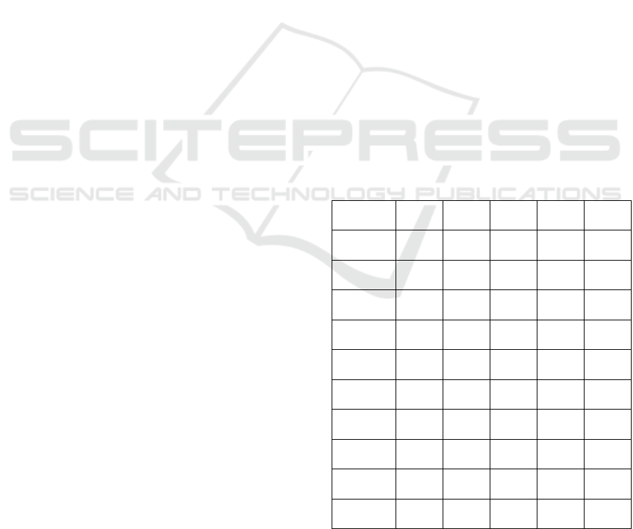
Tables 1 and 2 provide the mean, standard deviation,
and skewness values for the SUS questionnaire
scores, and the number of information extracted from
all infographics, broken down for the two groups of
the sample. In general, in both group A and B there is
evidence of a general usability of the infographics
evaluated in relation to the degree of iconicity of their
representation. In Group A, no infographic exceeds
the minimum threshold of 68 average points.
Nevertheless, in group B, this threshold is exceeded
only by the artifact of F. Franchi and A. Cox.
Table 1: Sus Questionnaire Results – Group A.
Mean Std. D. Asym. Grade Ico-Lv
Infogr. 1 37,78
16,71
-0,39
F
7
Extracted
info
1,71
1,35
0,39
Infogr.2 45,17
21,33
1,47
F
6
Extracted
info
2,72
1,02
-0,2
Infogr.3 46,45
20,66
-0,28
F
5
Extracted
info
2,43
1,38
0,12
Infogr.4 55,68
20,8
1,59
D
4
Extracted
info
2,61
-0,15
-0,43
Infogr.5 58,02
23,97
-0,23
D
3
Extracted
info
2,87
1,66
-0,13
Data Visualization, Accessibility and Graphicacy: A Qualitative Study of Communicative Artifacts through SUS Questionnaire
425
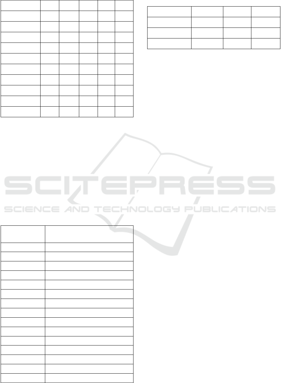
Table 2: Sus Questionnaire Results – Group B.
Mean Std. D. Asym. Grade Ico-Lv
Infogr. 1 60,62
23,63
-0,52
D
7
Extracted info 2,95
1,61
-0,18
Infogr.2 65,32
20,80
-1,22
C
6
Extracted info 4,33
1,38
-2,10
Infogr.3 65,9
20,64
-1,12
C
5
Extracted info 3,76
1,33
-0,87
Infogr.4 69,4
18,17
-0,77
C
4
Extracted info 3,63
1,41
-0,50
Infogr.5 74,65
15.39
-1,09
B
3
Extracted info 3,75
1,32
-0,74
To verify the research questions and analyse the
scores obtained from the SUS questionnaire, the
amount of information extracted and the degree of
iconicity of the representation, it was chosen to
calculate the different correlations through the
Bravais–Pearson r coefficient.
Table 3 shows that in both Group A and B, the
average usability performance and the number of
information extracted in individual infographics
follows a significant positive progression (r12) with
values between 0.61 and 0.79.
Table 3: Correlation between Sus Questionnaire Results and
extracted information.
r 12 | SUS and Extracted
Information
Infogr. 1
Group A 0,66
Group B 0,73
Infogr. 2
Group A 0,69
Group B 0,61
Infogr. 3
Group A 0,64
Group B 0,64
Infogr. 4
Group A
0,69
Group B
0,79
Infogr. 5
Group A
0,70
Group B
0,63
Table 4: Correlation between Sus Questionnaire Results,
extracted information and grade of iconicity.
r12 r13 r23
Group A+B 0,87 -0,53
-0,29
Group A 0,82 -0,97
-0,77
Group B 0,27 0,97
-0,28
In Table 4, two highly significant data emerge.
The first is the negative correlation between SUS and
Iconicity (r13), a sign of an inversely proportional
relationship between the abstraction of the
representation and its ease of use. The second, related
to the first, shows that the tendency to extract
information from the communicative–infographic
artifact tends to be favoured by its iconicity (r23).
While in the first case we see an almost perfect
correlation – with value -0.97 on both groups – in the
second case, the range of values widens, oscillating
between -0.77 in Group A and 0.28 in Group B.
In general terms, the scores made by the two
groups show an almost linear progressive trend as the
proposed infographic acquires lower and lower levels
of iconicity. On average, Group B obtain 38 percent
higher ratings than Group A, thus suggesting how a
prior competence could be decisive in terms of
perception and understanding of the displayed
information as argued by Kosslin (1994) and Cairo
(2017). However, analysing the results of individual
infographics in detail reveals interesting findings in
order to answer the research questions posed in the
beginning.
Let us consider the Grade 7 infographic and the
Grade 3 infographic (see Table 6 and fig. 1). The first
infographic obtains, on the one hand, 37.78 pts
(Grade F) from Group A, and on the other hand, 60.30
pts (Grade D) from Group B, marking a variation of
60.8% between the two results. In the second
infographic, the SUS value obtained by the first group
is 58.02 pts (Grade D), while the second has an
average value of 74.65 pts (Grade C), marking a
positive variance of 28.7%. The percentage
difference between the two groups is a relevant
finding as there is a progressive decrease in the
performance gap, the more the degree of iconicity
tends to value of less than 5. In fact, as shown in
Table 4 the SUS values of group B go from
practically sustained increases of +60.5%
(infographic by G. Lupi) to values of +41.9 %
(infographic by N. Holmes), marking the lowest
increase value at + 24.7 % (infographic by A. Cox).
WEBIST 2022 - 18th International Conference on Web Information Systems and Technologies
426
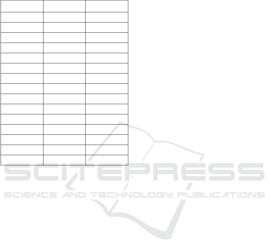
Table 5: Group A and B - Differences between SUS results
compared.
SUS | Mean
Difference
Extracted
fi
Infogr. 1
Group A 37,78 -
Group B
60,92
+ 60,5%
Infogr. 2
Group A
45,17 -
Group B 65,32 + 44,6 %
Infogr. 3
Group A 46,45 -
Group B
65,90 + 41,9 %
Infogr. 4
Group A
55,68 -
Group B
69,40 + 24,7 %
Infogr. 5
Group A
58,02 -
Group B
74,65 + 28,7 %
Such preliminary evidence allows us to be able to
begin discussing about question Q2, namely, whether
iconicity of representation affects the usability of
infographics. In both groups, there is an improvement
in SUS ratings as the degree of iconicity tends toward
the figurative over the abstract. Group A increases by
53.6%, Group B by 23.2%. The more sustained
increase in the first group may be since 'non–design
literate' subjects have greater difficulty in processing
abstract representations, and conversely, 'literate'
subjects have less difficulty and for that reason, more
uniform performance. On the one hand, keeping these
values in mind, it’s possible to reflect on the fact that
the performance gap tends to narrow according to the
degree of iconicity; pointing to a possible relationship
between basic graphic competence and infographic
reading ability. On the other hand, grade 6 and 7
infographics make use of a complex visual alphabet
whose grammar doesn’t seem to be intuitive, as
underlined by the large gap between the values of
60.%. In contrast, a grade 3 infographic, in addition
to being generically rated better by both groups,
shows a smaller delta of performances.
With reference to question Q1 i.e., whether
infographic language is accessible, Tables 1 and 2
provide a preliminary answer. The results of the SUS
show that the infographics submitted for testing –
except for the Holmes and Franchi artifacts evaluated
by Group B – do not, as an average score, exceed the
minimum levels of accessibility despite being in
power excellent visual artifacts. However, if we were
to make a combined average of ratings between
Group A and Group B – plausible in reflecting the
state of the art – no infographic would achieve the
minimum rating of 68 pts (the highest value would be
set at 66.3 pts for the grade 3 infographic).
The individual ratings of the two groups with
respect to the individual infographic bring out how
accessibility of information is particularly variable
within the same groups. Lupi's infographic (iconicity
grade 7) received ratings above 68 pts from 47% of
Group B and only 1% of Group A. Fragapane's
infographic, on the other hand, 13% (A), 51% (B).
Holmes' infographic, 10% (A), 59% (B). Cox's
infographic, 30% (A), 59% (B). Finally, Franchi's
infographic, 33% (A), 75% (B). Such a fluctuation
prompts one to hypothesize – answering question Q1
and Q3 – that the ability to read visual artifacts cannot
be considered an innate endowment and that
infographics themselves are not as accessible in terms
of information acquisition.
With respect to Q4, prior competence in the
discipline of Design seems to favour greater reading
ability than the performance obtained by Group A.
Basic competence in Design seems to be a crucial
factor in decoding artifacts in which language gives
the final product a representation tending toward
hypotheticalization or pure abstraction – see Lupi and
Fragapane's infographic – but nevertheless it does not
appear –from the data extracted from the study – a
transversely acquired competence that is decisive in
accessing the higher levels of information offered by
data visualization. Preliminary data in possession
point out how the competence defined as Graphicacy
acquired within the training paths of Designers, may
turn out to be a key element in the correct decoding
of communicative–infographic artifacts.
Alongside this, since infographics are the result of
a design action, a second competence relative to the
way of processing knowledge could be considered:
the Designerly way of thinking (Cross, 1982) as the
way of thinking with which the designer achieves
knowledge. According to Levin (1966), in fact, the
Designer through the application of an ordering
principle, applies his critical and creative reasoning in
the search for the missing elements to solve the design
problem. In these terms, it is the basis of problem-
solving ability. Such thinking skill is in fact related to
visual language ability (Cross, 1982). The variability
of the results obtained within the individual group and
the objectively lower ratings below the 68 pts
Data Visualization, Accessibility and Graphicacy: A Qualitative Study of Communicative Artifacts through SUS Questionnaire
427

threshold, put the attention on the fact that this skill
either (i) is not acquired correctly by the whole
population – a fact that could be confirmed by the
strong discrepancy of results between Group A and B
– or (ii) that this skill within the curricula in Design is
not perfectly consolidated in the programs – a fact
that would confirm how an average of 58.5% of the
'literate' Group can rate accessible the infographics.
Preliminary analysis of this data shows how data
visualization literacy is necessary today and that
studies on key skills to proper decoding are as
necessary as ever. It seems that Graphicacy and the
level of competence acquired through current
educational systems does not fulfil its task of
facilitating this cognitive process, probably for its
purely notionistic nature that doesn’t cover other
cognitive domine as processual or metacognitive;
therefore, it brings out the importance of the design
thinking component i.e., the Designerly way of
thinking. Since infographics are endowed with
language that only in power can become universal, it
needs more specific skills and in accordance with
Roth and McGinn (1997), a greater experiential
approach and encounter with the visualization itself,
since as with verbal languages it is constant practice
that is decisive. In addition, Designers themselves
within their course of study, address the issue of
spatial–visual configuration through the propaedeutic
course of Basic Design (Anceschi, 2011), i.e., the
foundation of training in the discipline, found in the
literature related to the Bauhaus and Ulm school
(Anceschi, 1972) as a propaedeutic course for design.
In Johannes Itten, the first to lead from 1920 the
propaedeutic course – Grundkurs – within the
Bauhaus and in Kandinsky, we can see the approach
to bias correction. In fact, the purpose of the
Grundkurs is to undertake a deconstructive course for
the removal of bias and the preparation of the student
for the foundational theories of the project, based on
the predominance of art and technique over science.
According to Itten's pedagogical model, the
exploration of sensoriality arises, as the necessary and
sufficient condition for skills and knowledge to be
acquired. Therefore, by cross–referencing the data
obtained, to the theory in the literature, it is possible
to state that the ability to "generate, retain and
manipulate abstract visual images" (Lohman, 1979, p.
188), can effectively influence the comprehension
performance of communicative–infographic artifacts
(Kozhevnikov, Thornton, 2006). Therefore, a low
level of spatial–visual skills would thus be related to
the misinterpretation of graphs.
4 CONCLUSIONS
The study conducted also raises questions regarding
the design sphere. The data held by the SUS
evaluations make one reflect on the role of the design
work of the Information Designer. If, nevertheless, on
the one hand, as stated by Tufte (1982/2001) the
purpose of infographics is to facilitate access to more
complex knowledge by configuring the artifact as an
intellectual prosthesis (Maldonado, 2005), and on the
other hand, that accessibility to information is a
fundamental criterion of good Information Design
(Cairo, 2020; Kirk, 2019; Avgerinour and Petterson,
2016; Pettersson, 2011) arises the question of a
manneristic approach to data visualization that
generates an inaccessible third–party artifact, at the
risk that communication may "resolve itself into a
self–referential process, not very useful because it
does not put itself in the shoes (i.e., in the eyes and
culture) of those who look at things with a different
background behind them, i.e., the majority of the
public" (Falcinelli, 2014 p. 16). Moreover, while
there is a clear educational need for the recipients of
such artifacts, there is also a need for debate on data
visualization in the terms of emerging criticality of
the communicative effectiveness of representation,
"shifting the centre of gravity by observing by new
means [to] somewhat lighten the deliberately
overloaded formal aspect by giving more vigour to
the content aspect" (Klee and Barison, 2011/1959
p.81). Nevertheless, this fact should be read in the
awareness of the historical condition in which we
live. The infoaesthetic dimension has now reached a
level of linguistic sophistication and innovation
(Manovich, 2016) that does not keep pace with the
population's ability to properly appreciate such
products. Using a metaphor, a parallel between the
current state of the art of Information Design with the
work of Dante Alighieri can be show, as we are facing
an unprecedented innovation of language,
anticipating a new way of shaping society (Mauri, et
al., 2019). In fact, even though the sample possessed
an undergraduate level of education, the data at hand,
and the existing literature, leads us to confirm what
McCall (Schwartz, 2018) said, namely that
Graphicacy has been neglected compared to its 'older'
siblings namely Literacy, Numeracy and Articulacy
and that the complexity and sophistication of
infoaesthetic may be incomprehensible, as regarded
by Balchin (1996). To bridge the gap between
Designer and user of the communicative–infographic
artifact it becomes necessary to invest in a systemic
and democratic educational plan that unites the
factual and conceptual dimension of Graphicacy with
WEBIST 2022 - 18th International Conference on Web Information Systems and Technologies
428

the procedural and metacognitive dimension of the
Designerly way of thinking, implementing a
pedagogical methodology that makes clear the
knowledge of the Design process (Oxman, 1999).
People today need to analyse information that is
interconnected with society and the environment and
that is continuously transmitted, remixed, and shared
(Manovich, 2005). The visual translation of data into
information makes use of a language that possesses a
specific grammar of signs and channels (Horn, 1998;
Bertin, 1967/2011). However, reading images is far
from intuitive in that understanding the message can
only occur if one is aware of the codes–such as "the
use of type; the iconographic choices and the
employment of colour [as well as] the arrangement of
the pieces of a table" (Falcinelli, 2014, p.145)
"distilled over millennia of figurative and scriptural
conventions" (Falcinelli, 2014 p.16). If proper
encoding and decoding (Cairo, 2020; Wilmot, 1999)
does not occur, communication fails (Meirelles,
2013). The issue thus described, fits into the
international debate that has developed in recent years
on the centrality of policy investment in digital
literacy and digital skills to provide citizens with
adequate cognitive tools to decode and encode
information from data (Carretero, Vuorikari and
Punie, 2017; Ferrari and Punie, 2013). The
difficulties are due – first – to a low level of what
Balchin and Coleman (1966) define as Graphicacy
and which plays a key role in the cognitive learning
process (Danos, 2018) and particularly in Data
Literacy (Jones, 2020; Cairo, 2017).
In summary, the paper – starting from the
evidence in the literature – focused on the issue of
usability and the accessibility of information when
represented through Information Design languages.
In particular, the results obtained, and the correlations
made, may confirm the trends found in the literature
on the need for visual literacy for proper decoding and
perception of displayed information. In general,
almost all the infographics under study did not meet
the minimum threshold of usability, thus opening the
reflection to two questions, in terms of competence
and design. The data lead us to hypothesize that
Graphicacy – tending to be more developed in Group
B of Designers assisted by the Designerly component
– is instrumental of achieving higher, though not
excellent, levels of usability of communicative–
infographic artifacts. This points to the need for
democratization of such skills not from a
professionalizing perspective but from a culture and
access perspective. Finally, the low level of usability
achieved by communicative–infographic artifacts
raise questions in terms of design and the proper use
of high levels of iconicity of data representation.
The scientific evidence of the low level of
acquisition of the competence of coding and decoding
visual artifacts is to be found, moreover, in the
general side-lining of the teaching of the same,
relegating it, on the one hand, to disorganized
activities detectable in educational curricula around
the world (Danos, 2018), and on the other hand, its
presence in different educational frameworks. Thus
emerges the need for a systemic design of
competence in order to offer a structured pedagogical
model of competence, and an updating of it through a
transfer of the cognitive thinking of the Designer: the
Designerly way of thinking.
REFERENCES
Åberg‐Bengtsson, L., and Ottosson, T. (2006). What lies
behind graphicacy? Relating students' results on a test
of graphically represented quantitative information to
formal academic achievement. Journal of Research in
Science Teaching, 43(1), 43–62.
Ainley, J. (2000). Transparency in graphs and graphing
tasks: An iterative design process. The Journal of
Mathematical Behavior, 19(3), 365–384.
Anceschi, G. (1992). L'oggetto della raffigurazione.
Milano: Etaslibri.
Avgerinour, M.D., and Pettersson, R. (2016). Teang
Reports: Information design with teang and learning in
mind. Journal of Visual Literacy, 35 (2): 253–267.
Balchin, W. G. V., and Coleman, A. M. (1966). Graphicacy
should be the fourth ace in the pack. Cartographica. In
The International Journal for Geographic Information
and Geovisualization, 3(1), 23–28.
Bangor, A., Kortum, P. T., and Miller, J. T. (2008). An
empirical evaluation of the system usability scale. Intl.
Journal of Human–Computer Interaction, 24(6), 574–
594.
Bertin, J. (2011). Semiology of Graphics. Amsterdam:
Amsterdam University Press. (1° ed. 1967).
Borello, E., and Mannori, S. (2007). Teoria e tecnica delle
comunicazioni di massa (Vol. 6). Firenze University
Press.
Botta, M. (2006). Design dell'informazione: tassonomie per
la progettazione di sistemi grafici auto–nomatici.
Valentina Trentini.
Bowen, G. M., and Roth, W. M. (2003). Graph
interpretation practices of science and education
majors. Canadian Journal of Science, Mathematics and
Technology Education, 3(4), 499–512.
Branzaglia, C. (2011). Comunicare con le immagini.
Milano: Mondadori.
Brooke, J. (1996). Sus: a “quick and dirty’usability.
Usability evaluation in industry, 189(3).
Cairo, A. (2017). Uncertainty and graphicacy: How should
statisticians, journalists, and designers reveal
Data Visualization, Accessibility and Graphicacy: A Qualitative Study of Communicative Artifacts through SUS Questionnaire
429

uncertainty in graphics for public consumption? In
Errea, J., and G. (2017). Visual Journalism:
Infographics from the World’s Best Newsrooms and
Designers (Translation ed.). Neustadt: Gestalten.
Cairo, A. (2020). Come i grafici mentono. Capire meglio le
informazioni visive. Milano: Cortina Raffaello.
Carretero G. S., Vuorikari, R. and Punie, Y. (2017).
DigComp 2.1: The Digital Competence Framework for
Citizens with eight proficiency levels and examples of
use. EUR 28558 EN. Londra: Publications Office of the
European Union.
Cox, R., and Brna, P. (1995). Supporting the use of external
representations in problem solving: The need for
flexible learning environments. Journal of Artificial
intelligence in Education, 6, 239–302.
Cross, N. (1982). Designerly ways of knowing. Design
studies, 3(4), 221–227.
Culbertson, H. M., and Powers, R. D. (1959). A study of
graph comprehension difficulties. Audio Visual
Communication Review, 97–110.
Danos, X. (2018). Graphicacy and Culture: Refocusing on
Visual Learning. Loughborough: Design Press Ltd.
Dansereau, D. F., and Simpson, D. D. (2009). A picture is
worth a thousand words: The case for graphic
representations. Professional Psychology: Research
and Practice, 40(1), 104.
De Saussure, F. (1916). Nature of the linguistic sign.
Course in general linguistics, 1, 65–70.
Falcinelli, R. (2014). Critica portatile al visual design: da
Gutenberg ai social network: [come informano,
narrano e seducono i linguaggi che ci circondano].
Torino: Einaudi.
Hittleman, D. R. (1985). A picture is worth a thousand
words… if you know the words. Childhood Education,
62(1), 32–36.
Horn, R. E. (199). Visual Language: Global
Communication for the 21st Century. Bainbridge
Island: MacroVU.
Kirk, A. (2019). Data Visualisation: A Handbook for Data
Driven Design. Thousand Oaks: SAGE Publications
Ltd (1a ed. 2016).
Klee, P., and Barison, M. (2011). Teoria della forma e della
figurazione. Mimesis. (1° ed. 1959).
Kosslyn, S.M. (1989). Understanding charts and graphs.
Applied Cognitive Psychology, 3.
Kosslyn, S.M. (1994). Elements of graph design. New
York: W.H. Freeman and Company.
Kozhevnikov, M., and Thornton, R. (2006). Real–time data
display, spatial visualization ability, and learning force
and motion concepts. Journal of Science Education and
Technology, 15(1), 111–132.
Lewandowsky, S., and Spence, I. (1989). The perception of
statistical graphs. Sociological Methods and Research,
18
(2–3), 200–242.
Lewis, J. R. (1992). Psychometric evaluation of the post–
study system usability questionnaire: The PSSUQ.
Proceedings of the human factors society annual
meeting. Los Angeles: Sage Publications.
Lewis, J. R., and Sauro, J. (2018). Item benchmarks for the
system usability scale. Journal of Usability Studies,
13(3).
Maldonado, T. (2005). Reale e virtuale. Milano: Feltrinelli.
Manovich L. (2005). Remixability and Modularity, URL:
http://manovich.net/content/04–projects/046–remixa
bility–and–modularity/43_article_2005.pdf.
Manovich, L. (2016). Info–Aesthetics. Londra: Bloomsbury
Academic.
Mauri, M., Colombo, G., Briones, M. D. L. Á., and
Ciuccarelli, P. (2019). Teaching the critical role of
designers in the data society: the DensityDesign
approach. In Börekçi, N., Koçyıldırım, D., Korkut, F.
and Jones, D. (eds.), Insider Knowledge, DRS Learn X
Design Conference 2019, 9–12 luglio,
Meirelles, I. (2013). Design for Information: An
Introduction to the Histories, Theories, and Best
Practices Behind Effective Information Visualizations.
Londra: Rockport Publishers.
Moles, A. A. (1958). Theorie de linformation et perception
esthetique.
Nielsen, J. (1993). Usability Engineering (1st ed.).
Burlington: Morgan Kaufmann.
Oxman, R. (1999). Educating the designerly thinker.
Design studies, 20(2), 105–122.
Pettersson, R. (2011). A model for teaching information
design. Educational Technology, 12–19.
Peirce, C. S. (1958). Collected Papers of Charles Sanders
Pierce. Vols. 5 – 8. Cambridge: Belknap Press of
Harward University
Preece, J. (1983). A survey of graph interpretation and
sketching errors. Open University.
Roth, W. M., and McGinn, M. (1997). Graphing: Cognitive
ability or practice?. Science Education, 81, 91–106.
Schön, D. (1983). The Reflective Practitioner. Londra:
Temple–Smith.
Schwartz, J. (2018). Visual literacy: academic libraries
address 21st century challenges. Reference Services
Review.
Tufte, E. (2001). The Visual Display of Quantitative
Information (2nd ed.). Graphics Press. (1a ed. 1982).
Wainer, H. (1980). A test of graphicacy in children. Applied
Psychological Measurement, 4(3), 331–340.
Ware, C. (2019). Information visualization: perception for
design. Burlington: Morgan Kaufmann. (1° ed. 2004).
Wilmot, P. D. (1999). Graphicacy as a form of
communication. In South African Geographical
Journal, 81(2), 91–95.
WEBIST 2022 - 18th International Conference on Web Information Systems and Technologies
430
